TAKEAWAYS
- The S&P 500, Dow Jones Industrial Average, and the Nasdaq Composite close at all-time highs
- Bond prices also moved higher, as did gold and silver
- The VIX remains low, indicating investors are complacent
The bull market hasn't gone anywhere. Despite of worrying about the possibility of a correction and a long wait for movement in either direction, the stock market has finally showed its prowess.
The Dow Jones Industrial Average ($INDU) is within reach of 40K, the S&P 500 ($SPX) could reach 5,500, and the Nasdaq Composite ($COMPQ) could hit 20K. It may look like a stretch for the Nasdaq, but, with how the index has moved, why rule out the possibility? Today's stock market action showed the return of bullish sentiment.
Investor Confidence Returns
It wasn't too long ago when investors were worried the stock market might correct a lot more than it did. That was followed by a period of lethargic stock market action. Now that the market got the inflation data it was waiting for and liked what it heard, the equity market moved higher during the trading day, closing at or close to its highs of the day.
The Dow, S&P 500, and Nasdaq Composite hit record closes. There was a lot of excitement in the stock market today. Investors are not worried about interest rates or if the market is overbought; you can sense investor confidence in this market.
The CBOE Volatility Index ($VIX) closed at 12.44, indicating that investors are complacent. With broader indexes closing at new highs, low volatility, and all 11 S&P sectors closing in the green (Consumer Staples, just barely), you've got a perfect recipe for a strong market that can continue moving higher.
Wednesday's CPI came in a little cooler than expected, which was encouraging for investors. Treasury yields fell on the news, and stocks, bonds, Bitcoin, and precious metals rose. Optimism should be the word of the day.
Click here for live chart.

The daily chart of the iShares 20+ Year Treasury Bond ETF (TLT) below shows the ETF hitting a key resistance level. If it breaks through it, bonds could move higher with equities. It's an unusual correlation, but there were a lot of surprises today (more on that below).
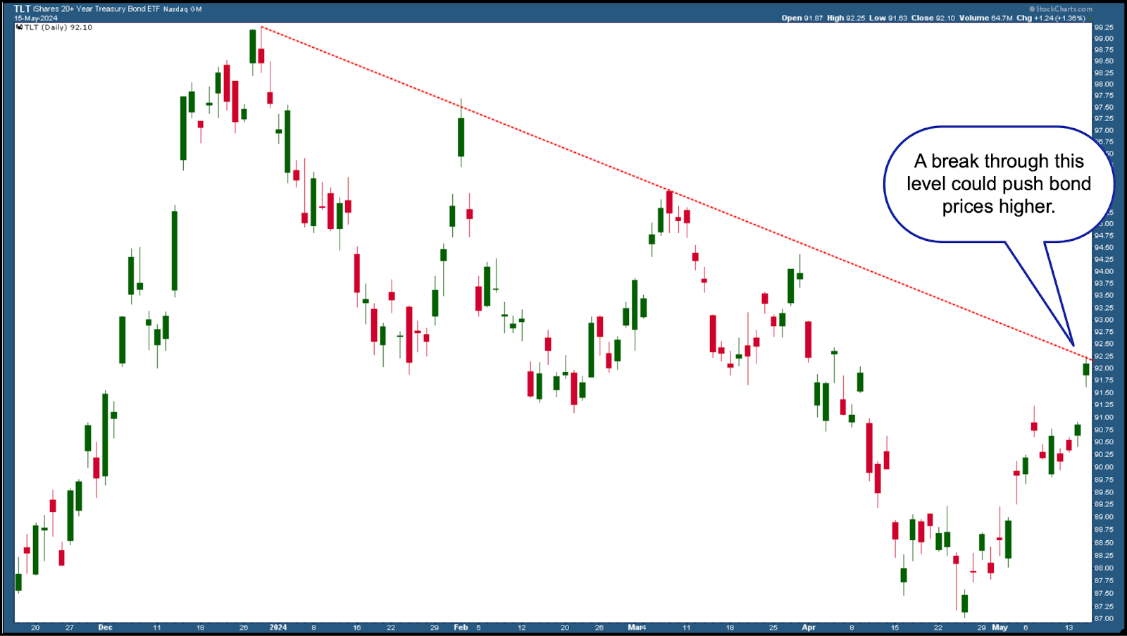
CHART 1. DAILY CHART OF ISHARES 20+ YEAR TREASURY BOND ETF (TLT). Bond prices rose and are now testing a key resistance level. If price breaks through the resistance of its downward-sloping trendline, bond bulls will be in the spotlight.Chart source: StockCharts.com. For educational purposes.
The equity markets are technically strong. Given that they've hit new highs, you will have to look for slowing momentum for signs of a trend reversal.
Click here for live chart.

The Linear Regression Forecast (LRF) indicator, overlaid on the chart of the S&P 500 (see below), indicates that the S&P 500 is trending higher. The S&P 500 closed above the LRF line, well above its 50-day simple moving average.
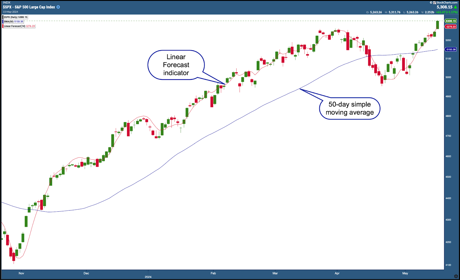
CHART 2. DAILY CHART OF THE S&P 500 INDEX ($SPX). Technically, the S&P 500 looks strong. It's trending higher, is above its LRF line, and well above its 50-day moving average.Chart source: StockChartsACP. For educational purposes.
As long as this scenario holds, expect the S&P 500 to continue moving higher.
Click here for live chart.
Another area that's looking strong is precious metals. Gold is on its way to reaching its all-time high, as you can see from the SPDR Gold Shares ETF (GLD) below.
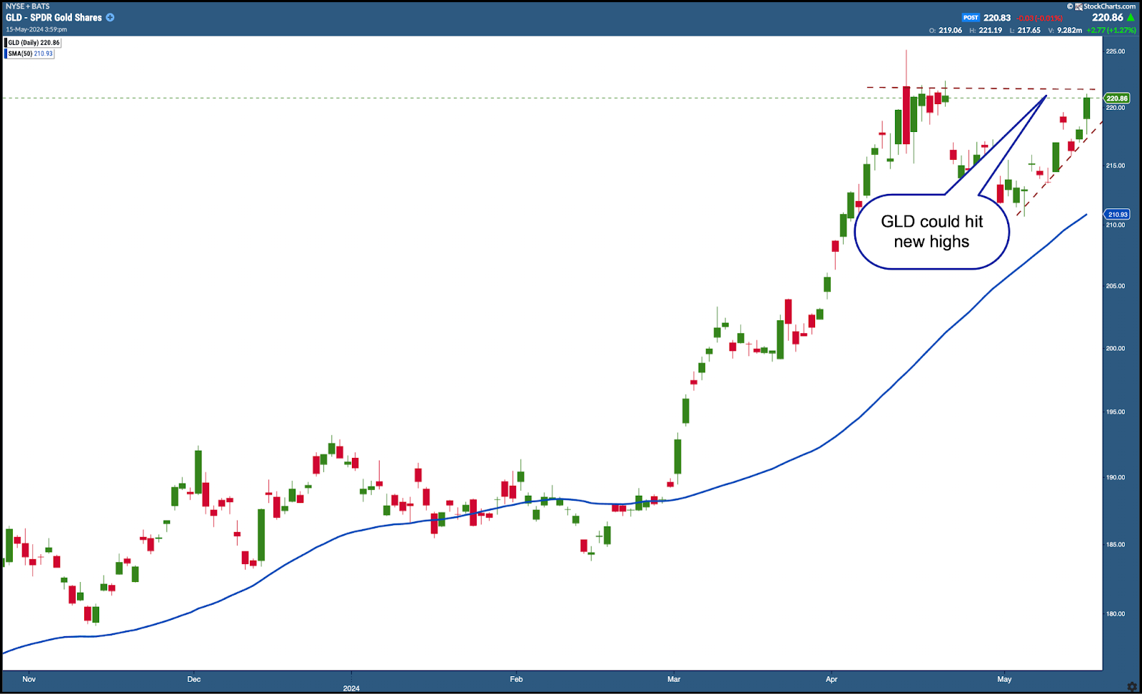
CHART 3. GOLD CONTINUES TO SPARKLE. Gold prices are close to their all-time highs. If price breaks above the previous highs, it could move higher along with equities. Chart source: StockChartsACP. For educational purposes.
Gold could break through previous highs and continue to move higher. It's unusual to see a correlation between gold and equities, but, as long as the trend is higher, you may as well take advantage of the move.
Click here for live chart.
Moreso than gold, silver is looking interesting. You'll have to look at a longer-term chart of silver to see that it's testing its 2020 and 2021 highs. If it manages to push through this level, it could reach its 2011 high (see chart below). It's something to watch and consider adding to your portfolio.
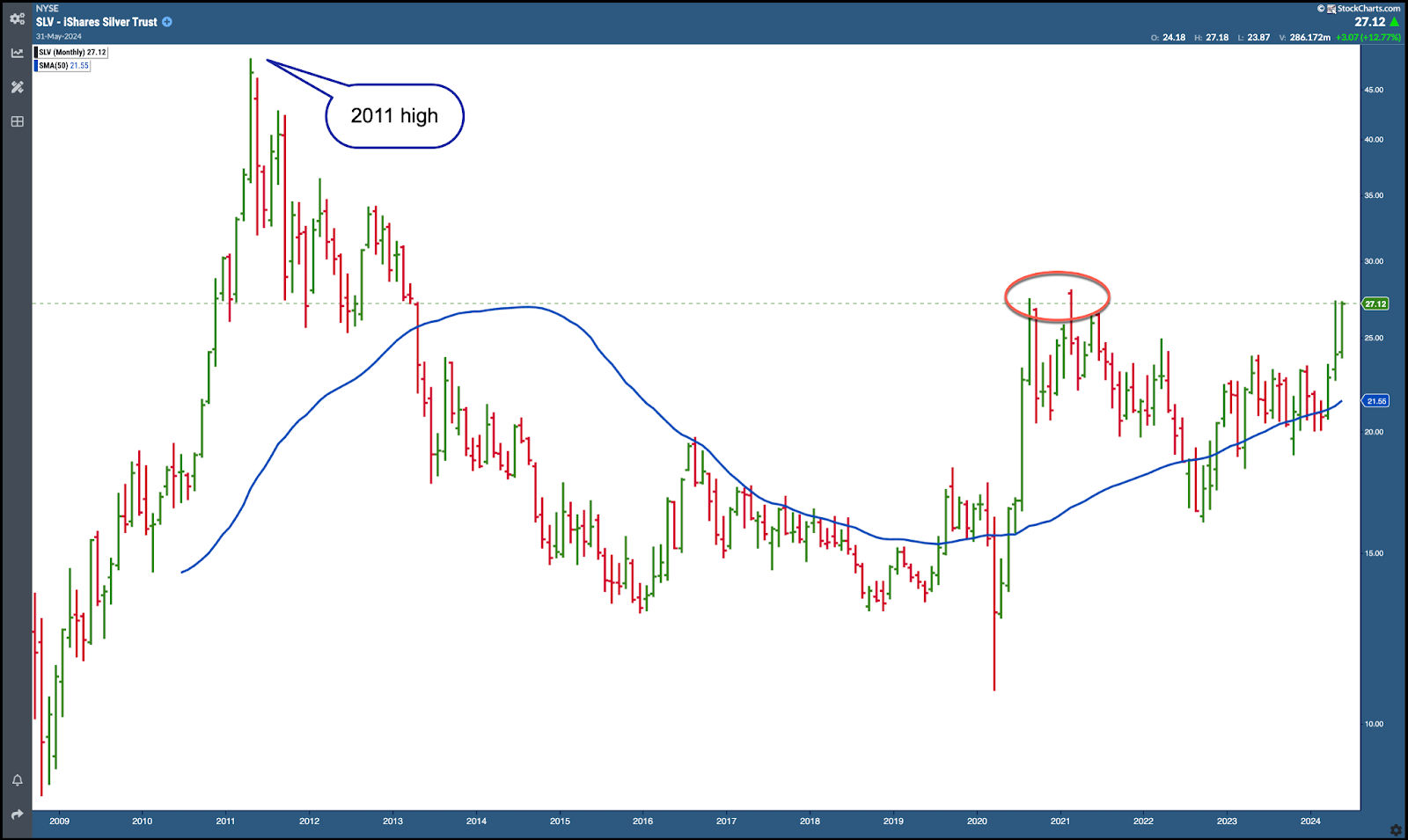
CHART 4. SILVER SOARS. Silver is retesting its previous highs. Will it break through and reach its 2011 high?Chart source: StockChartsACP. For educational purposes.
The Takeaway
Overall, it looks like the waiting paid off. The inflation data injected optimism into the market and sent equities, bonds, precious metals, and Bitcoin higher. The bull market is still here; investors are confident about the stock market, and optimism remains positive.

Disclaimer: This blog is for educational purposes only and should not be construed as financial advice. The ideas and strategies should never be used without first assessing your own personal and financial situation, or without consulting a financial professional.
Happy charting!
