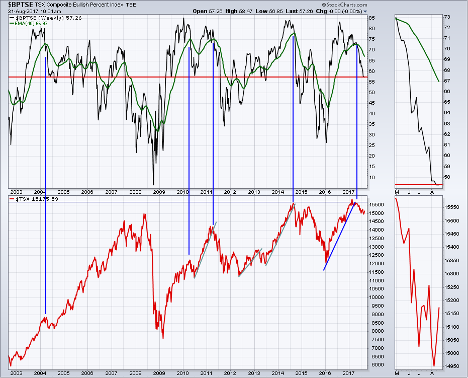
Canada has been lagging behind almost every other nation in the world in terms of stock market performance. The Canadian market peaked on February 21st and we have drifted down and sideways for the last 6 months. The chart for the $TSX has some encouraging signs on it. Let's start with the Bullish Percent Index. The red horizontal line is placed based on the current level. The 2004 pullback as well as the 2010 pullback, both had the same sort of pullback as the Canadian $TSX in the bottom panel. The other two drops in 2011 and 2014, marked by the blue vertical lines, were much more sudden drops and the Bulish Percent dropped past this level. Based on a couple of samples, this could be a level to expect the Canadian to re-engage in the global bull market.
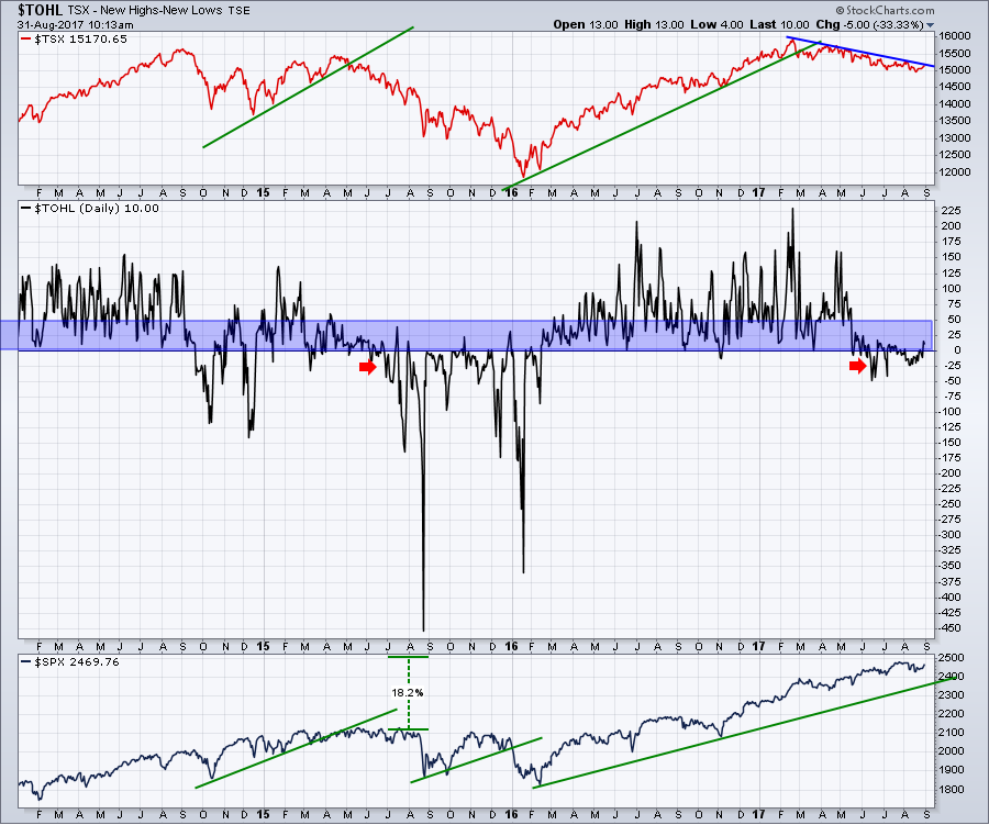
The US market is up 18% from the 2015 highs whereas the Canadian market hasn't gotten out of bed. We are below 2015 highs and even lower relative to 2014 highs. One factor that has been at play is the lack of Net New Highs. Net New Highs is the total number of new 52 week highs minus 52 week lows. I regularly present this chart during my video recordings. It would have to start recording a lot more highs soon to change this chart dramatically, but a second way to change it is to stop recording new lows. In the middle panel, when the Net New Highs moves above 50 (purple shaded area), you are in a big bull market push. The current level is very weak, which is why our Canadian market can't make higher highs. The real question for us: Can we turn this around?
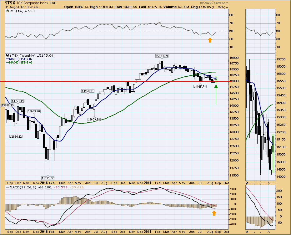
 One positive note this morning as I look through the Canadian market charts, is the $TSX is bouncing off a level of support that was first tested in July and early August. This week's candle shows price moving down after Friday's close, testing the lows of the previous week, then accelerating to the top of the range and making a higher high. That is very bullish price action.
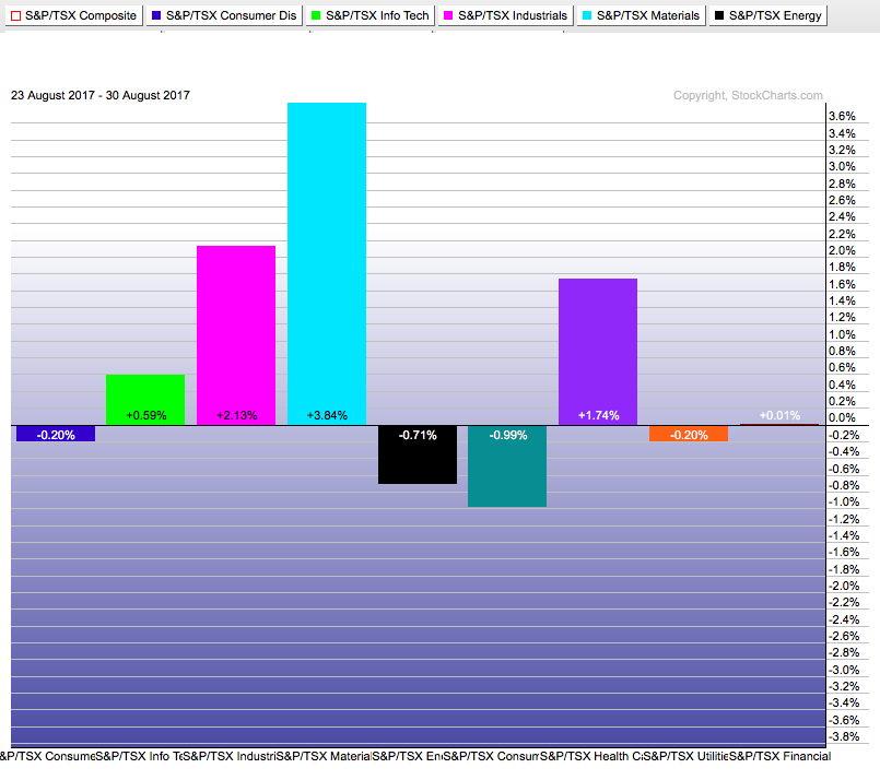
 In terms of sectors, the bounce in Gold helped, but materails have been performing well for months. This PerfChart shows the performance of the Canadian sectors over the last 5 days.
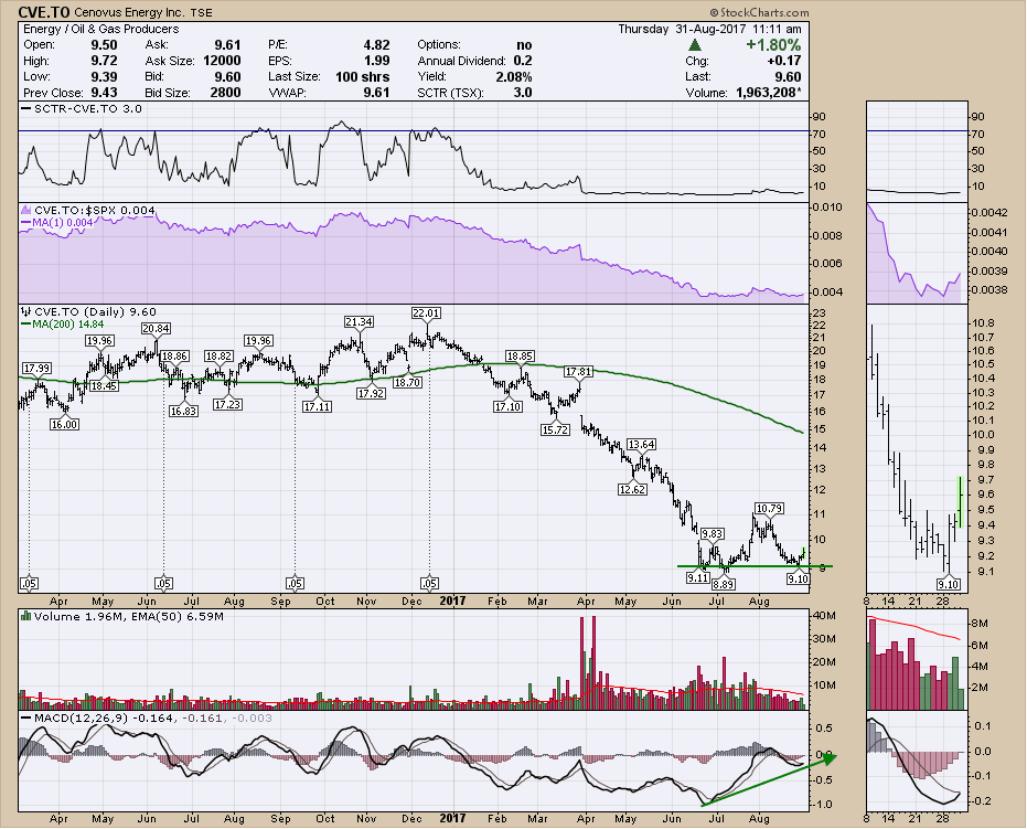
I noticed some positive divergence setting up in Energy, so perhaps that will spark the fire to get this market moving. We have a lot of catching up to do. Looking at Cenovus, the biggest dog in the dog park, there is some nice divergence.
 I also presented a Commodities Countdown Video Recording this more with lots more on Gold and a significant portion on energy.
Have a great long weekend,
Greg Schnell, CMT, MFTA.