- Commodities Countdown
- Oil is extended
- Gold Miners hold up on a bad Gold day
- Junk Bonds - clues?
- Breadth - dismal
- Indexes need to bounce now
To arrive home from a vacation in Bali to an early snowfall in Calgary is quite a shock. Similarly, the market has had some real big changes. Oil is pushing above the prior highs but momentum is extended. Gold down $17 on Monday and the gold miners trade up. Natural Gas continues to extend after the breakout in September in a rare burst. Junk bonds unload which is a big deal. Breadth goes to very weak levels.
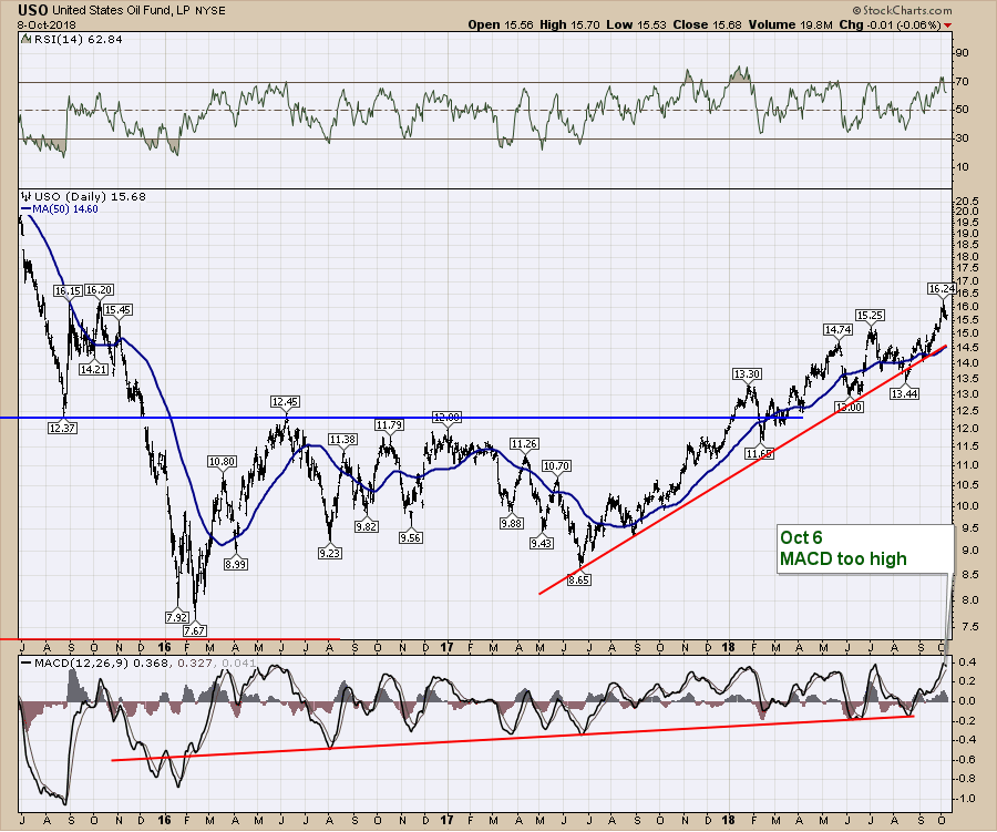
Lets start with oil. This is USO. Notice the MACD on the bottom, up near the typical high for the range. While oil is still in a big uptrend, this might be a better time to wait if looking to invest in the crude related trades.
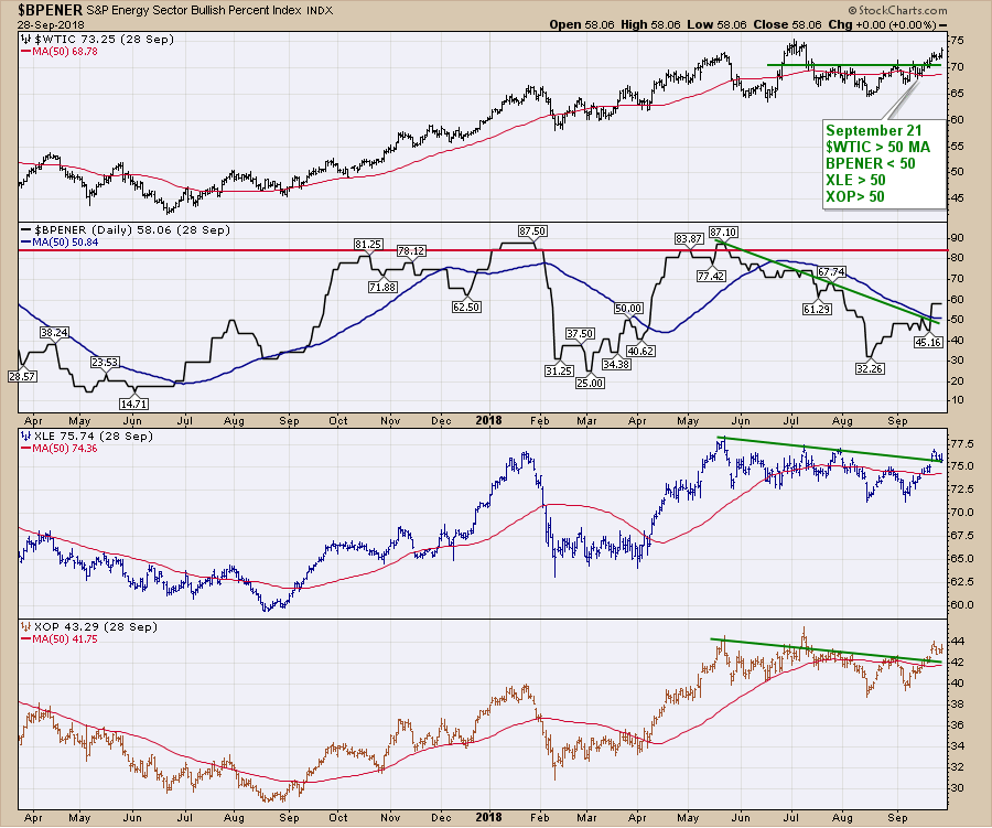
 A snapshot of the industry indicators around oil is displayed on the next chart. All four of these panels are above the 50 DMA which is bullish. When everything is above the 50 DMA, it is a good time to be involved. So it's a better place to hold rather than initiate new positions until the momentum has a chance to reset.
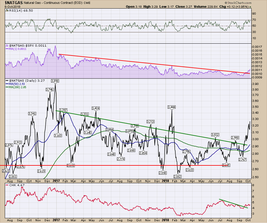
 $NATGAS continues to be working since the breakout a few weeks ago. The hurricane season is upon us and this is a nice setup.
 A large number of the commodities and ETF's have moved above the 50 DMA. But they are also struggling to make any real moves higher. It's a very cautious environment.
The next few charts are on different areas within the fixed income area.
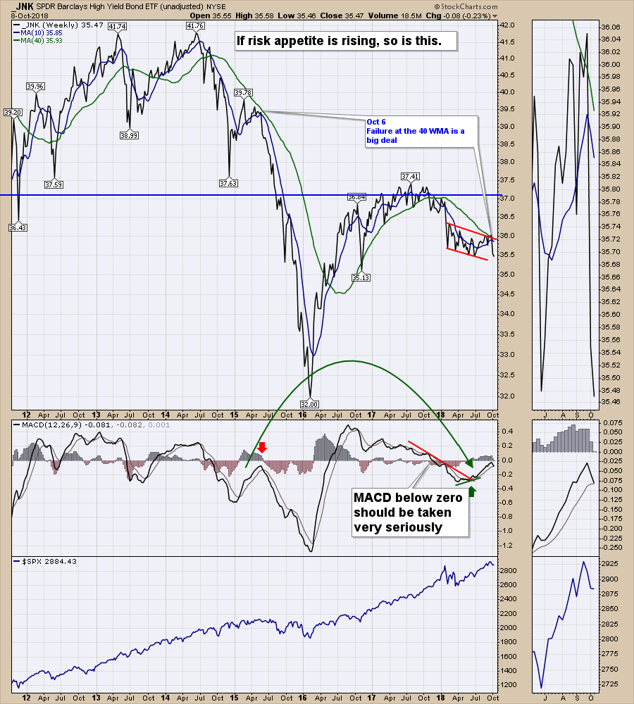
The JNK ETF represents high yield bond prices. The chart below is accelerating the breakdown in price. This chart is 'unadjusted' which means the income from the bonds are removed from the chart as StockCharts.com charts are total return charts. On the attached video I compare the unadjusted chart and show the regular adjusted chart to make the difference clear. JNK is a high yield product that investors like when things are going well. As the note on the top of the chart suggests, the chart can help us see what investors are doing in aggressive risk products. One of the things I noted on the chart was the recent failure to get back above the 40 WMA. Notice that the market top from 2015 occurred when the junk bond market plummeted in May 2015. The second thing to notice is the MACD (momentum) setup is very similar. The MACD is below zero, runs up for a period of time and fails to turn positive. This looks like it is happening again. This is a weekly chart so we'll need to see where the week closes to finalize the reading, but Monday closed below the June low.
As a footnote, the breakdown in 2013 below the 40 week was met with 1.9 trillion in Quantitative Easing.
 To explain the difference between adjusted and unadjusted, below is the same ETF shown both ways. The lower panel has the older prices adjusted by subtracting the monthly dividend or coupon revenue from the preceding prices on the chart. If the monthly income revenue was $0.50, all the preceding prices on the chart would be adjusted by $0.50. So the current price is the same, but the removal of the interest income shows the value of the actual price of the bond portfolio in the top panel.
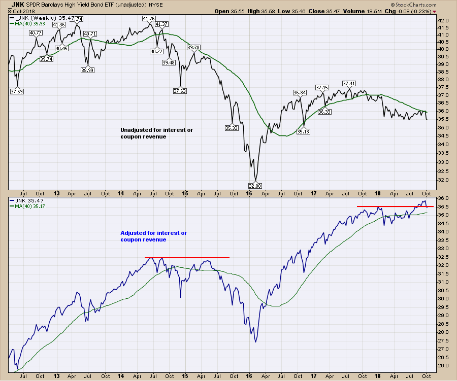 When looking at bonds, it is important to see what the actual price of the bond is without the historical payments being adjusted. In this case we see definite topping structure on the top panel.
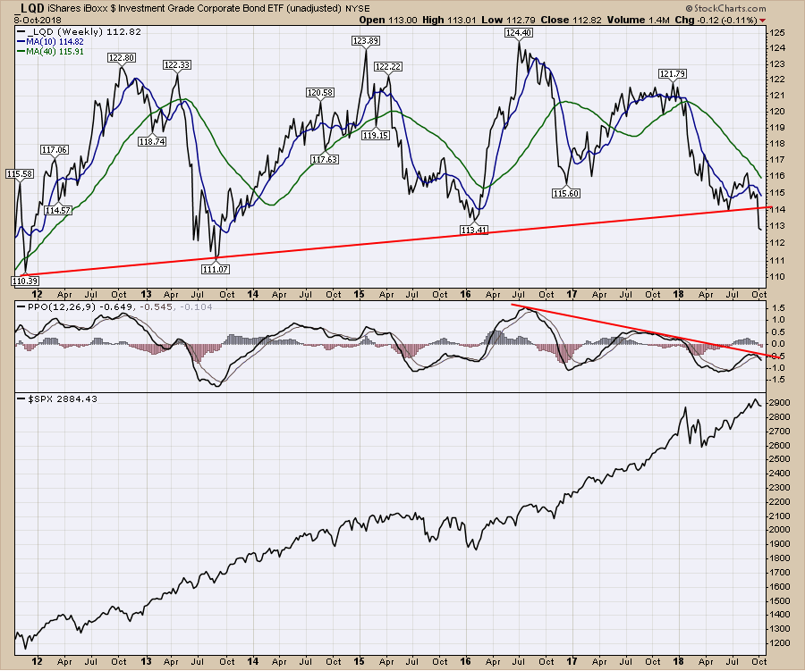
Moving on to the corporate bonds, September ended with a thud as the chart broke an eight year trend line. This shows corporate bond prices dropping to the lowest level in 5 years. It is important to look at the scale on the right hand side of the chart. Top to bottom is $15 showing a roughly 10% trading range of these bonds over 7 years. As this chart is 'unadjusted' there would be yield income as well. The current yield is 3.49%.
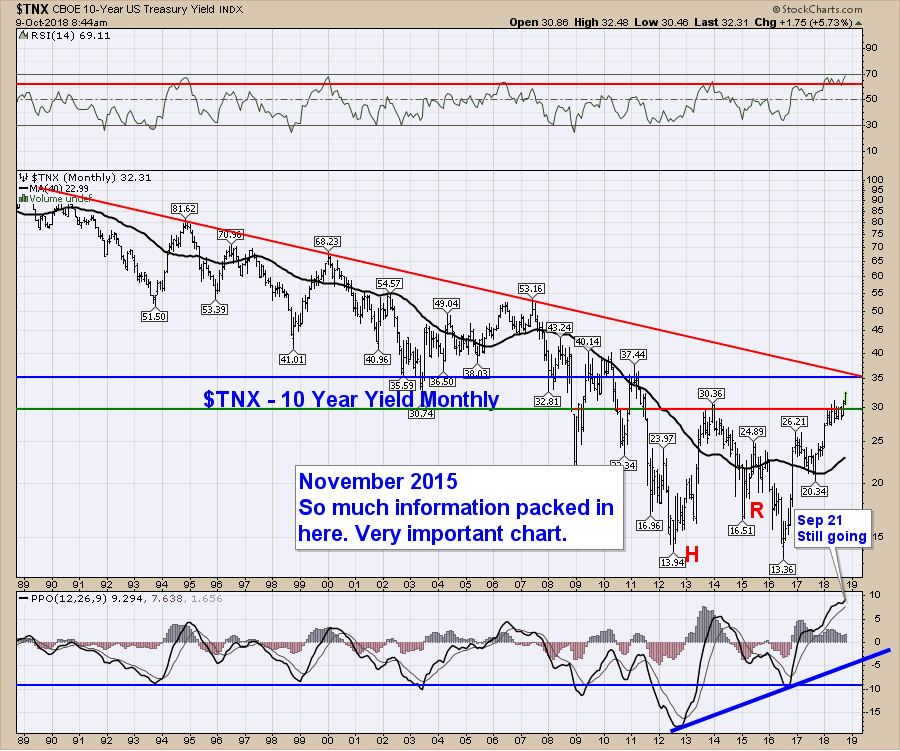
 Below is the monthly chart of yield, not price of the Ten Year Treasury. There is a big zone of resistance around 3.5% on this logarithmic chart. Based on the huge extension on the PPO, that might suggest the 3.5% will be a big area to get through. If that's the case, we could start looking for this to moderate over the fourth quarter.
 On the Chartwatchers newsletter, I shared some Bullish Percent Index charts. Breadth Indicators at 2 year lows should not be ignored. Here is a link to that article.
There is a difficult setup in the current market for breadth. I spent the first few minutes on the video trying to share how vulnerable the markets are here.
All of my articles that would be in the Commodities Countdown blog will now be in the Canadian Technician blog. We will be phasing out the Commodities Countdown blog.
If you are missing intermarket signals in the market, follow me on Twitter and check out my Vimeo Channel often. Bookmark it for easy access!
Good trading,
Greg Schnell, CMT, MFTA
Senior Technical Analyst, StockCharts.com
Author, Stock Charts for Dummies
Want to read more from Greg? Be sure to follow my StockCharts blogs:
The Canadian Technician