One of the things I have focused on when examining the US market as well as other markets around the world is the tops that have been created in the last 20 years.
There are multiple ways to look at tops. Rear view mirrors are great, but more importantly, can you mark significant tops on a timely basis?
- When do you actually get a sell signal?
- What types of indicators help us see tops?
- Is it showboating to call a top? What evidence?
- If the economics are so bullish, can we still top?
The economists create a different vision of the world than technicians do. Most economists see a trend and it's bullish until it kicks down severely. Of course, for people following their portfolio value, that kicking and screaming moment is way too late as vast swaths of profits and capital have been significantly wiped out of their account. Yet if a technician calls a top, and the economists don't see it yet, they blow it off as just some perma-bear who is definitely wrong.
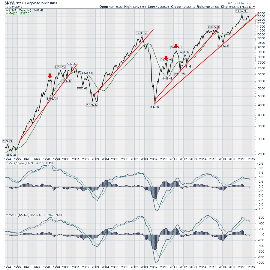
So let's use some chart history to help judge when a top is in. We have had 3 major tops - 2000, 2007, 2015 - and we have a couple of interim tops like 1998, 2010 and 2011. I don't focus on whether the economic conditions are bullish or bearish, I want to focus on whether investors are bullish or bearish. When I sell a share, I sell it to another investor, not an economic conditions chart. That's just me.
When do you actually get a sell signal?
Every technician will have different signals. Some use breaks below horizontal support, others use trend lines, moving average crossovers or price dropping below moving averages.
So first of all, lets look at a multi year chart and identify some tops. Most major tops break some sort of uptrend. Breaking short trend lines of 1, 2 or 3 years rarely qualifies as a major top. Usually a major top needs to break a trend line of 5 or more years. I have drawn 4 major trend lines on the chart. An example of a non-major but still wicked top is the 1998 top of only three years. Hindsight makes it easy to draw these trend lines but on the far right I have drawn a long trend line which is being tested currently. It is not hard to place a 10 year trend line even in real time. So is it the trend line from 2016 or the trend line from 2009?
 PPO vs. MACD
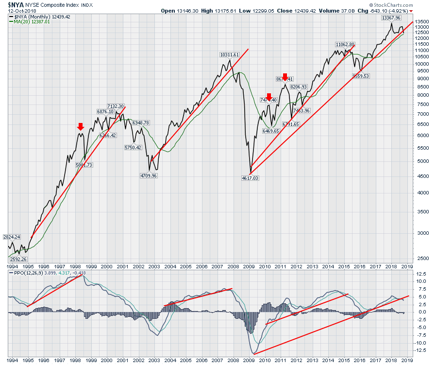
Notice in the bottom two panels, I have placed the PPO indicator and the MACD. The PPO is the percentage price oscillator. It works like the MACD. The height of the MACD oscillator changes based on the price of what is being measured. As the price goes higher the waves go higher potentially making waves at lower prices look less important. The PPO uses change in percentage terms rather than the change in price terms. So the lofty market moves of 1998 were a lot bigger in percentage terms than the current market moves. The MACD makes them look the same in this case. Click on the chart above to see a live shot of the chart and change the ticker to AMZN. You will see the meaningful difference where the later price moves look bigger on the momentum indicators like MACD. So I will use the PPO for this article to compare the moves on percentage terms.
On the chart below, I have added trend lines on the PPO. I have tightened the final trend line on both the price and the PPO. What you can see is these long trend lines are breaking. We are mid month and these are monthly charts. So this line chart will get a final data point at the end of the month but it adds caution.
 So to answer the question of when do we get a sell signal, every technician will have their own tool basket. Some want to be late and wait for the final nail in the market coffin. Other's like myself are looking for clues very close to the top and are aggressive near potential topping and bottoming areas. I would rather be wrong and react to new good news on the chart than waiting for my portfolio to get smoked and then agree that a top is in.
As we watch the price action kick out signals, it suggests to me, the need to go and look for other correlations that have happened in other major tops. October has a history of making lows and bouncing out of them. Other years like 2007, the market topped in October. So seasonality, while usually bullish in the fourth quarter, can also be painful when it doesn't work out.
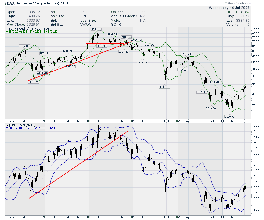
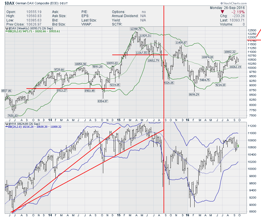
One of the areas I like to look at are the global market conditions. The US is part of a big financial system. It usually rises first and falls last. It might coincide with the rest of the world breaking down or show resilience in the face of global weakness. My main point is if the global conditions are weakening, at some point that will bleed into the US market. So here is an example. Using weekly charts, lets compare the $DAX with the $NYA or $SPX. You can look at them at different times. Each one might cross on different weeks, but I think they are both good early indicators.
One foreign market does not make the case, but I'll wrap that bundle together for you as the reader to consider later in this article. Let me build a case with one market first. The $DAX has been a helpful indicator. When it does not match with the US market highs it can be timely.
In 2000, the SPX coincided a little tighter than the $NYA. On the chart below, the $DAX lost 9 months of support as the trend line on the US market broke. The US market was not even at three month lows.
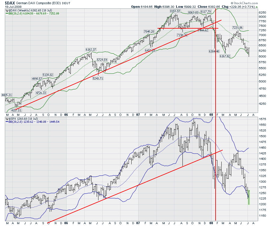
 In 2007, with the US market starting the housing crisis, the trend line broke on the US market. Meanwhile, the $DAX had built a tight sideways consolidation. The $DAX was near the highs only two weeks before it broke the trend line and four weeks before it broke 9 months of horizontal support. The US Market never got a high in December close to the October high. They both broke the trend lines within weeks of each other, but the $DAX also broke horizontal support.
 Fast forward to 2014. 2014 was tricky. The $DAX broke support during the big oil pullback and the $NYA did as well. The $DAX was breaking an uptrend as the US market broke the trend as well. It looked like it was coming apart there. but there was one more rally to marginally higher highs on the $NYA. The $DAX broke support in July and then bounced back up one more time. This bull was a fierce bull. It stalled at the 20 WMA and fell. You can see the $NYA was a smoother road down as it struggled around the 20 WMA whereas the $DAX oscillated way above and below. The bottom line is the $DAX confirmed the breakdown again in a timely manner and six months of pain showed up. Most of the pain was in the final weeks in early 2016 where everything was plummeting.
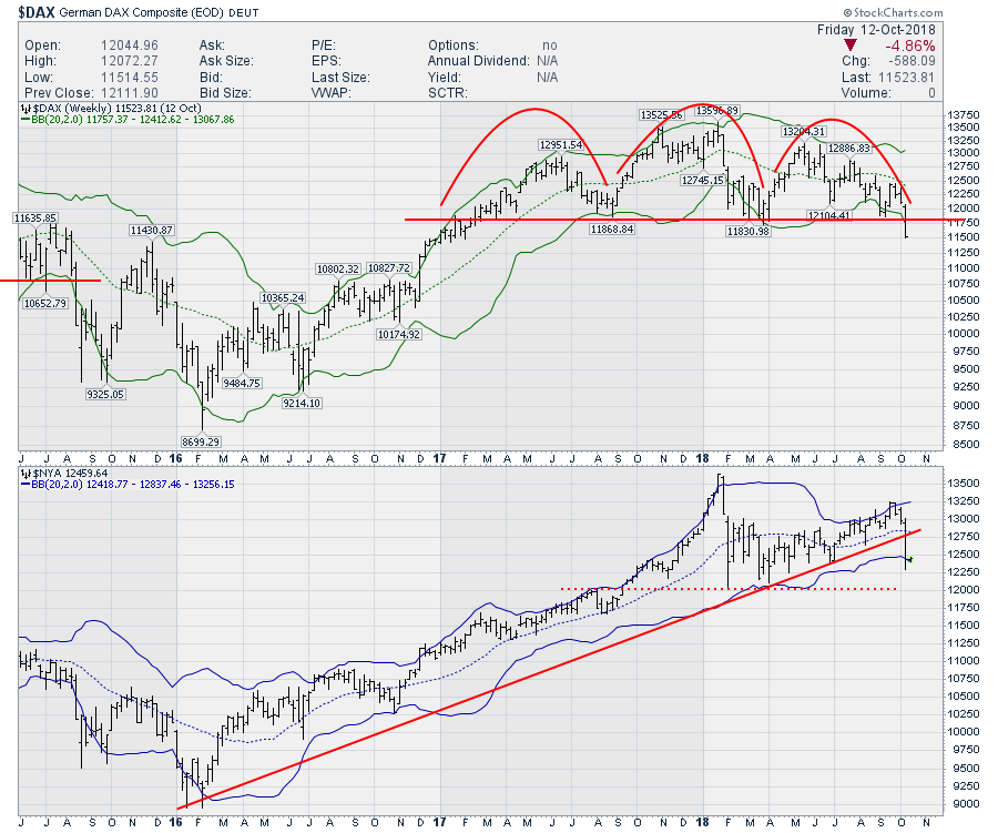
 So now we sit here in the US market, testing some long term trend lines. What is our friend the $DAX doing? Well, the $NYA broke this three year uptrend and the $DAX just broke 18 months of support. So we have this $DAX confirmation that has been a pretty important match. The point I want to make is a broad basket of stocks are breaking down in US markets. The NYSE is not exactly a bad group of stocks to compare to.
 OK, so one market confirms. The PPO lines on the monthly look to be breaking. The lines on the weekly are breaking. What else can we check?
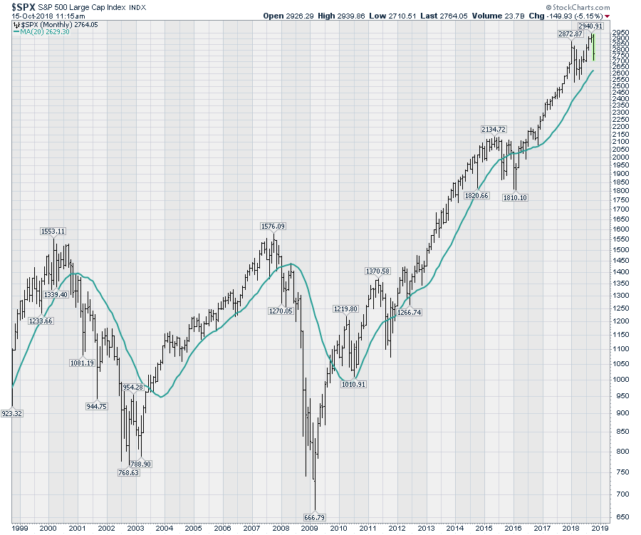
Here is a simple chart of the $SPX with a 20 month moving average. Pretty solid support and resistance. We find ourself well above the level right now.
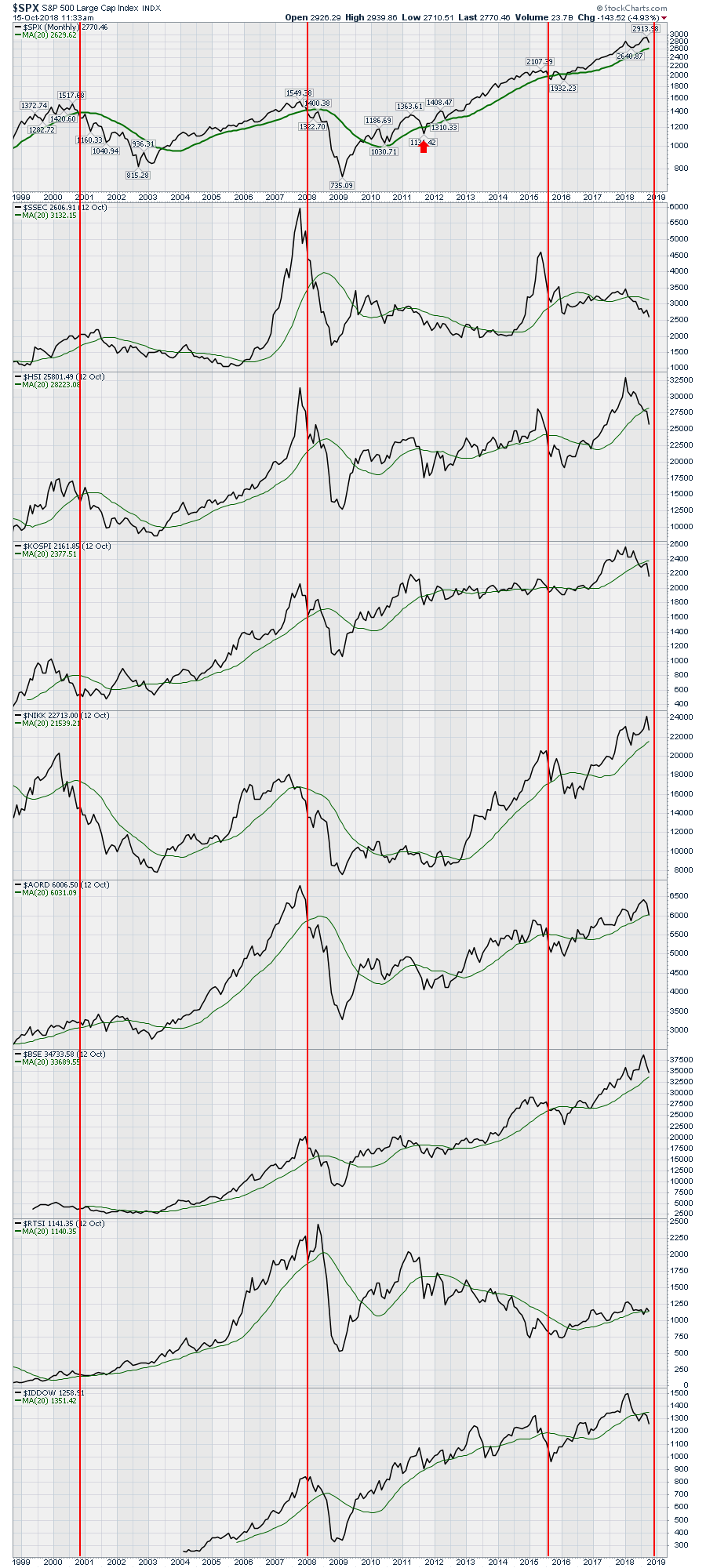
 Going back and looking through the tops, I decided to compare a bunch of markets, one above the other and look at the 20 month moving average on the global indexes. This chart below has Asia and Australia.
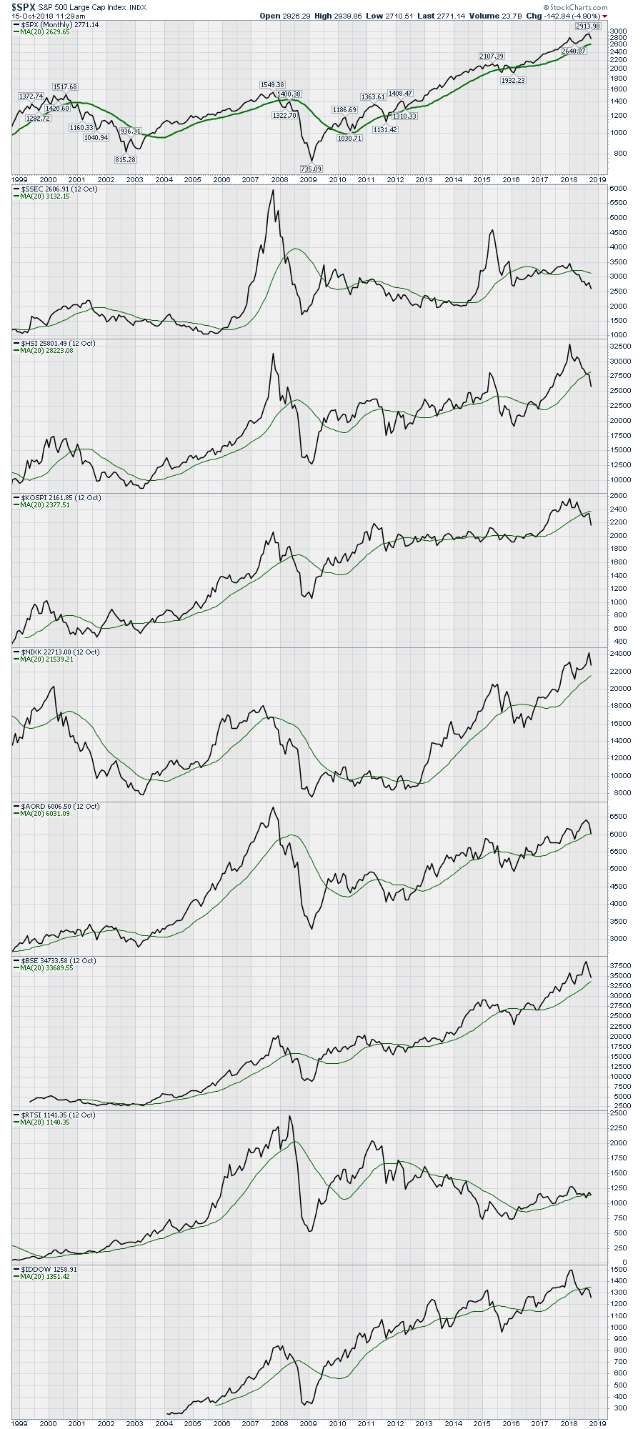 The chart is uncluttered, so you can look at it. Now, I'll install bearish lines when the US Markets go below the 20 MA. Some move before the US, some moved after. Some have periods when they go wobble above and below but the US market is unfazed. Every now and then, they all synchronize below. On this chart 6 of 9 are below the 20 MA. The USA, Japan and India are not below. But some pretty big markets are. You can click on this or any chart in any blog at month end to get a live update. The markets shown below in order are : The $SPX, Shanghai, Hong Kong, South Korea, Japan, Australia, India, Russia, and Indonesia.
 This chart below is the chart of Europe - Germany, France, Spain, Italy, Great Britain, Canada, Brazil and Mexico respectively. 7 of 8 are below the 20 month moving average. The 20 month is a generous level. On a daily chart, the 10 month MA is equal to a 200 day moving average.
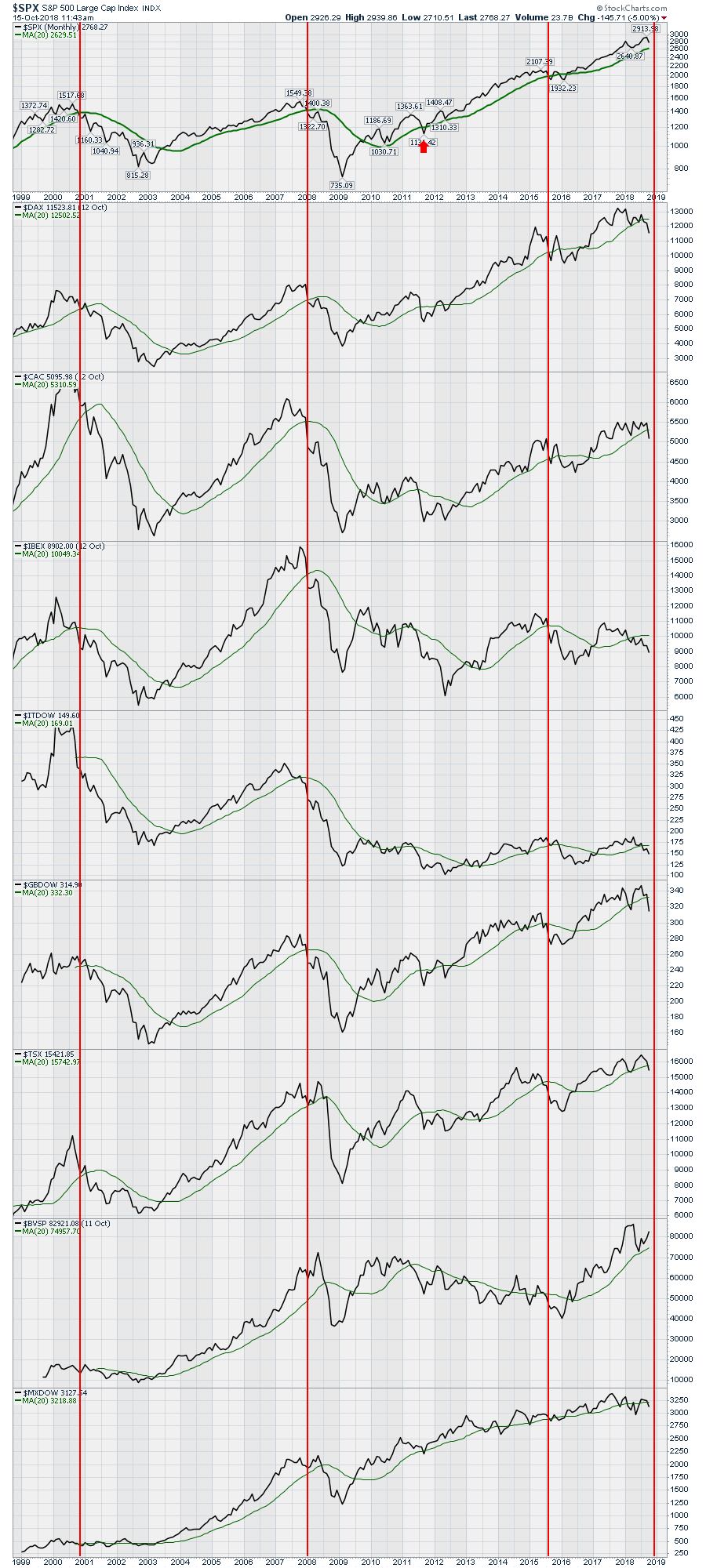 13 of 17 markets are below the 20 month MA.
The optimist will say that its not month end yet. Agreed. Another optimist will say that some are just barely below. Agreed. The picture of global weakness is becoming very obvious especially when we use the 20 month moving average and not the 10 month moving average. I think we can agree on that. So the question becomes: Can the US survive on it's own or will it be dragged down like the other three times?
With the global weakness, I think we can all agree that if the US, Japan and India join the weakness, it is a pretty big deal. Month end becomes very important.
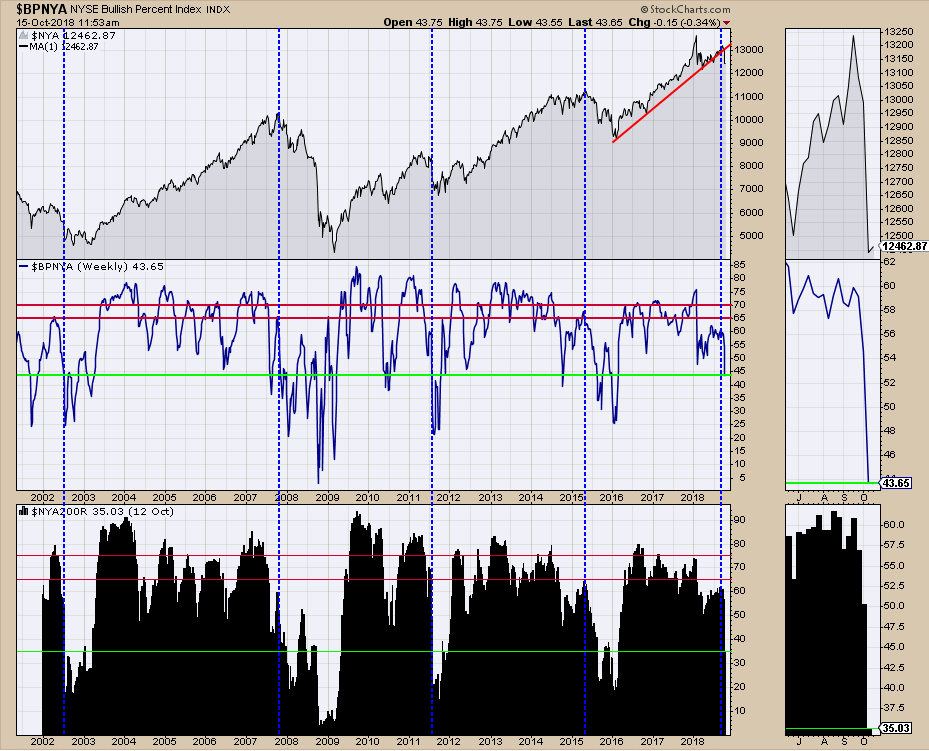
Lastly I want to add some bullish percent index charts into the mix. I'll use the $NYA because it has the clearest message with the percentage of stocks above the 200 MA ($NYA200R). Looking at the bottom of this chart, there have only been four periods where the percentage of stocks dropped down to 35%. You will also notice that in the previous four examples, it stayed down there for a while. Looking at the bullish percent chart in the middle, we can see to the right of these blue dotted lines that the BP readings are at very weak levels for a period of time going forward.
 It all adds up to me to be the start of a big bear market. Others will say we are just barely off the highs.
Is it showboating to call a top? Where is the evidence?
Is a technician showboating to be forecasting a big or small bear market? I hope you will agree there is a lot of information here that makes the market look very suspect with major global weakness setting up. If a person sees this volume of information from internal US Market data, global data and similarities to previous market tops, I think it makes sense to share it with the readers. If it ends up not transpiring, that is probably a good thing.
If the economics are so bullish, can we still top?
No one including the Fed thought the stock market would top out in 2007. They saw no signs of a problem. By the following October they were drowning in negative data after the implosion of Bear Stearns and Lehmann Brothers. I think the question to ask is can the economics get any better in terms of unemployment and low materials costs if there are inflationary pressures coming? The answer to that question might be probably not.
The market looks extremely weak here.
I would encourage you to watch the three videos below this week to see if you agree. We can choose to differ, I would just like more facts suggesting why I am wrong.
The Canadian Technician video shows the massive breakdown on almost every sector chart. This week the Canadian market started what appears to be a major breakdown. Financials also fell outside their channel and below the 40 WMA. For Canadian investors, huge caution here.
Gold is perking up, a few of the agriculture commodities are perking up and Natural Gas has been behaving well. However, the stocks around those areas are still struggling with the overall market sentiment. Lots of information in here on the indexes, currencies, bonds and commodities.
This is a quick look at the market setup and an introduction on why Gold is starting to look good. It has nothing to do with the broad market weakness. It is the charts of gold and gold miners doing the talking.
If you are missing intermarket signals in the market, follow me on Twitter and check out my Vimeo Channel often. Bookmark it for easy access!
Good trading,
Greg Schnell, CMT, MFTA
Senior Technical Analyst, StockCharts.com
Author, Stock Charts for Dummies
Want to read more from Greg? Be sure to follow his StockCharts blog:
The Canadian Technician