Chip Anderson August 26, 2012 at 01:07 PM

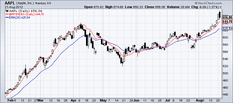
Chip Anderson August 22, 2012 at 12:38 PM
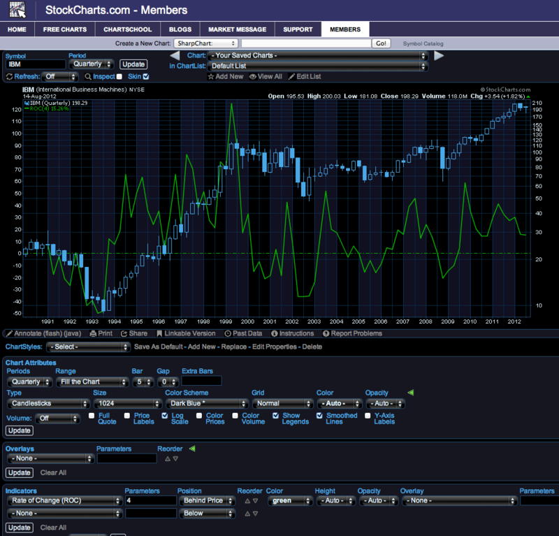
Chip Anderson August 14, 2012 at 08:53 AM
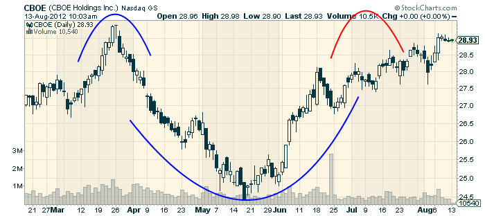
Chip Anderson August 13, 2012 at 01:33 PM
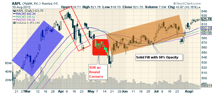
Chip Anderson August 10, 2012 at 09:29 AM
Chip Anderson August 08, 2012 at 09:28 AM
Chip Anderson August 06, 2012 at 04:15 AM
Chip Anderson August 02, 2012 at 04:53 AM