Don't Ignore This Chart! December 31, 2009 at 06:41 AM
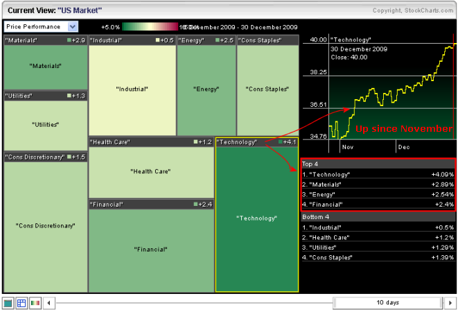
The technology sector has led the market higher over the last 10 days. Using the slider at the bottom, the Sector Market Carpet is set to show price performance over the last 10 days. Technology is the greenest of the nine sectors - followed by materials, energy and financials... Read More
Don't Ignore This Chart! December 30, 2009 at 02:36 PM
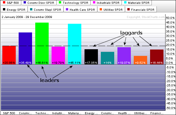
All sectors were up for the year, but some were up more than others. In fact, of the nine sectors, only three outperformed the S&P 500 over the last 12 months: consumer discretionary, technology and materials... Read More
Don't Ignore This Chart! December 29, 2009 at 08:11 AM
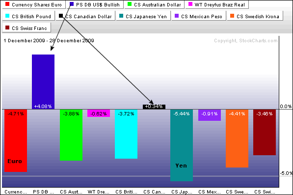
The Perfchart below shows the DB Dollar Bullish ETF (UUP) with nine other currency ETFs. Even though the Dollar is still down for the year, it is up around 4% for December. The Euro and Yen, which represent our two biggest trading partners, are down the most... Read More
Don't Ignore This Chart! December 28, 2009 at 03:09 PM
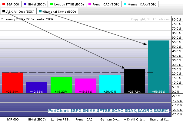
Even though year has a few days left, the Shanghai Composite ($SSEC) is one of the top performing indices in 2009. The Perfchart below compares the performance of this Chinese index against six other major indices... Read More
Don't Ignore This Chart! December 24, 2009 at 10:40 AM
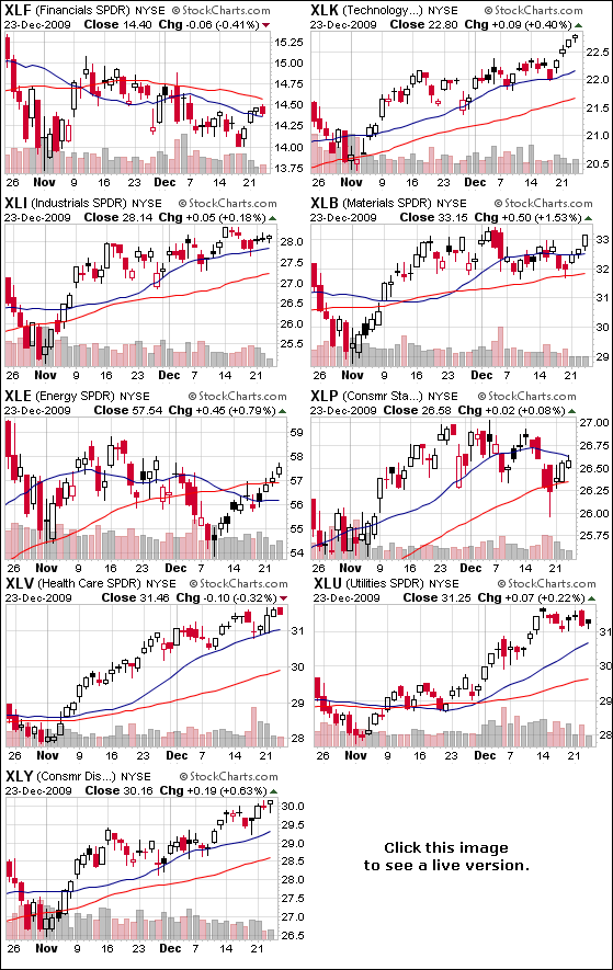
The CandleGlance sector page provides an easy means to see all eight Sector SPDRs on one page. One can identify sectors hitting new highs (leading) and sector trading below their prior highs (lagging). CandleGlance groups are also good candlestick spotting... Read More
Don't Ignore This Chart! December 23, 2009 at 10:52 AM
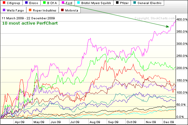
The Free Charting Tools page shows the most active lists on the left side. There is a Perfchart link at the bottom of each list that will show the 10 most actives together. Over the last 200-day days, Ford (F) is the big winner with a gain in excess of 400%... Read More
Don't Ignore This Chart! December 22, 2009 at 12:10 PM
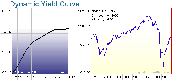
As the dynamic yield curve shows, the Treasury yield curve remains inordinately steep. The 3-month T-Bill Rate ($IRX) is around .50% and the 30-year Treasury Yield ($TYX) is currently around 4.6%. Long-term rates are nine times higher than short-term rates... Read More
Don't Ignore This Chart! December 21, 2009 at 02:47 PM
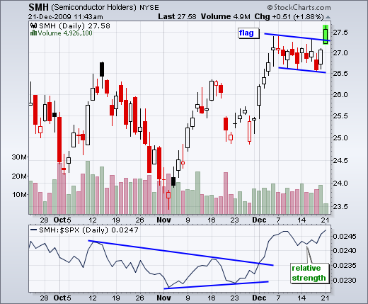
The Santa Claus rally got off to a good start with the Semiconductors HOLDRS (SMH) leading the way higher. SMH broke flag resistance with a surge over the last two days. Also notice that semis are outperforming the broader market as the price relative moved higher in December... Read More
Don't Ignore This Chart! December 18, 2009 at 01:43 PM
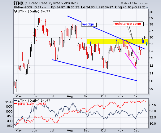
The 10-Year Treasury Yield ($TNX) broke above the August trendline with a surge in December. Because bonds moving opposite of yields, this corresponds to a sharp decline in US Treasury Bonds... Read More
Don't Ignore This Chart! December 17, 2009 at 05:50 PM
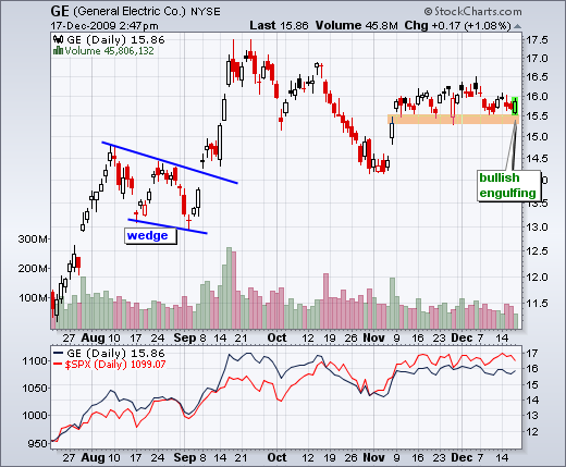
All of the major stock indices were down Thursday afternoon, but General Electric (GE) was bucking the downdraft with a modest gain. The stock opened weak, but rallied above its prior high in the afternoon... Read More
Don't Ignore This Chart! December 16, 2009 at 01:07 PM
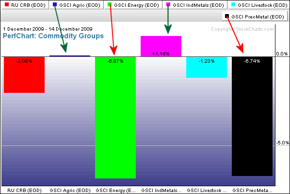
The Commodity Groups Perfchart shows the GS Precious Metals Index ($GPX) and the GS Energy Index ($GJX) are both down over 6% so far this month... Read More
Don't Ignore This Chart! December 15, 2009 at 01:50 PM
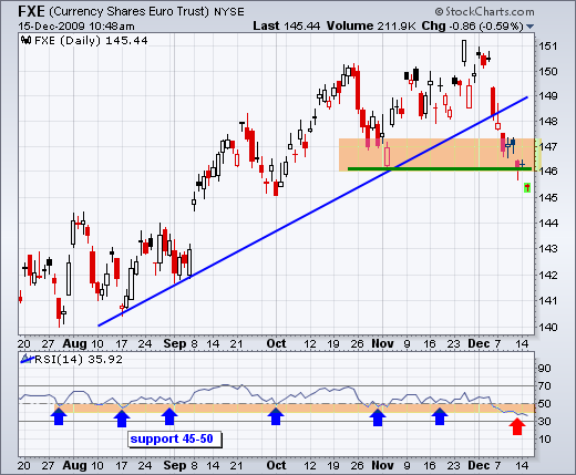
The Euro ETF (FXE) extended its decline this week and broke below its November low. FXE has been under intense selling pressure since the big plunge below 150 two weeks ago. In fact, selling pressure has been so intense that it looks like a medium-term downtrend has started... Read More
Don't Ignore This Chart! December 14, 2009 at 07:49 PM
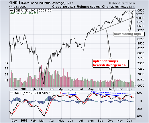
Despite numerous bearish divergences in MACD since August, the Dow continues pushing to new highs. With today's close above 10500, the Dow hit another 52-week closing high today... Read More
Don't Ignore This Chart! December 11, 2009 at 12:49 PM
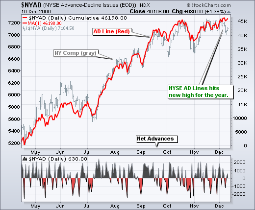
Don't look now, but the NYSE AD Line hit a new 52-week high this week. The AD Line is a cumulative measure of Net Advances (advances less declines). It rises when there are more advances and falls when there are more declines... Read More
Don't Ignore This Chart! December 10, 2009 at 01:45 PM
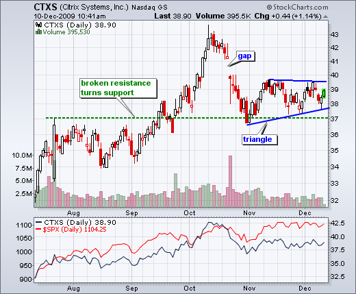
After a gap and sharp decline in October, Citrix (CTXS) found support near its resistance breakout (~37). Bounces in early November and early December confirm support in the 37-38 area... Read More
Don't Ignore This Chart! December 09, 2009 at 08:59 PM
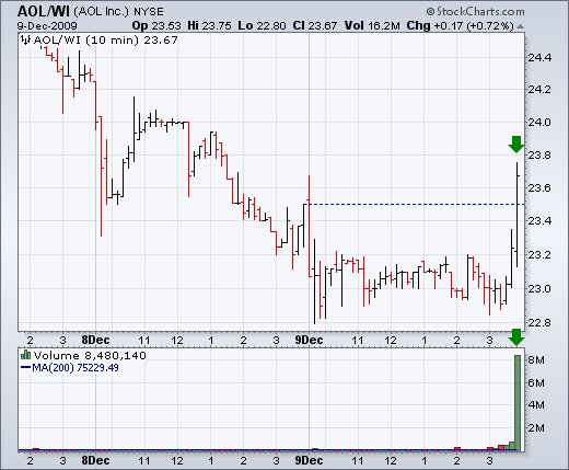
AOL Inc (AOL/WI) returned to the big board after a nine year hiatus. The stock was already trading "when issued" (WI) before today... Read More
Don't Ignore This Chart! December 08, 2009 at 02:01 PM
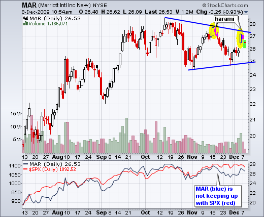
For the second time in four weeks, Marriott (MAR) formed a bearish harami. The first harami marked a reaction high just below 28. This second harami formed around 27 for a possible lower high... Read More
Don't Ignore This Chart! December 07, 2009 at 01:49 PM
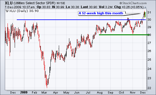
Seven of the nine sector SPDRs recorded new 52-week highs in November or December. Among those, the Utilities SPDR (XLU) broke resistance from its 2009 highs with a surge above 31 this month... Read More
Don't Ignore This Chart! December 04, 2009 at 11:42 AM
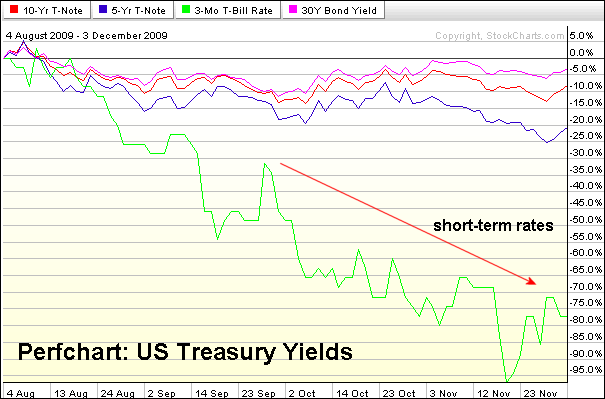
The US Treasury Yield Perfchart shows yields falling since early August. In particular, short-term rates (green line) have fallen sharply in the last three months. Treasuries rise when rates fall so these declines suggest money moving into Treasuries... Read More
Don't Ignore This Chart! December 03, 2009 at 10:02 AM
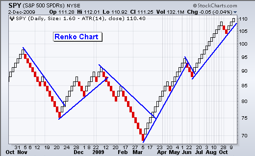
The chart below shows a Renko chart for the S&P 500 ETF (SPY). Like Point & Figure, these charts focus on price action, independent of time. Notice that the first half of the chart extends from late October 2008 to early March 2009... Read More
Don't Ignore This Chart! December 02, 2009 at 01:53 PM
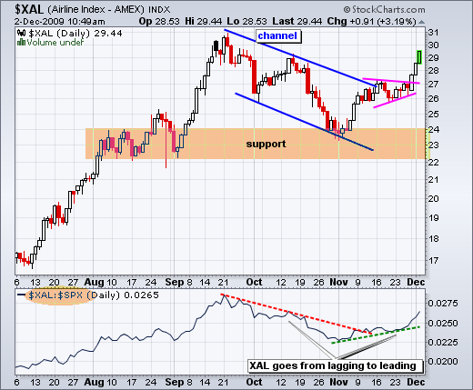
After underperforming the S&P 500 in October, the Amex Airline Index ($XAL) reversed course to become a leader in November. This leadership role picked up steam the last three days as XAL broke above consolidation resistance... Read More
Don't Ignore This Chart! December 01, 2009 at 12:37 PM
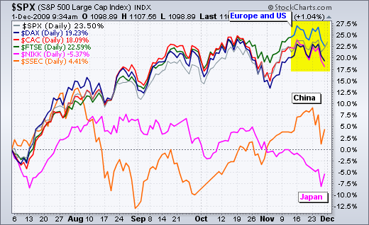
The US and European markets bottomed in early July and have been moving higher the last five months. These indices are up 18-23% since early July. The Shanghai Composite ($SSEC) is also up, but less than 5% and lagging the US and Europe... Read More