RRG Charts January 30, 2015 at 05:46 AM
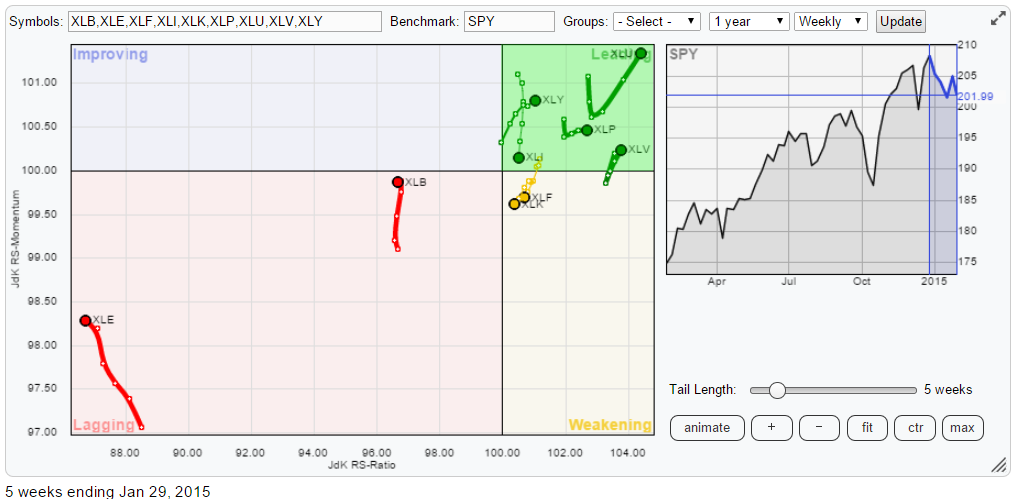
The Relative Rotation Graph below holds the nine S&P sector ETFs showing the weekly relative trends against the S&P 500 (SPY) and against each other. As you can see it is pretty crowded in the top-right, leading quadrant and a lot less so in the opposite lagging quadrant... Read More
RRG Charts January 28, 2015 at 05:17 AM
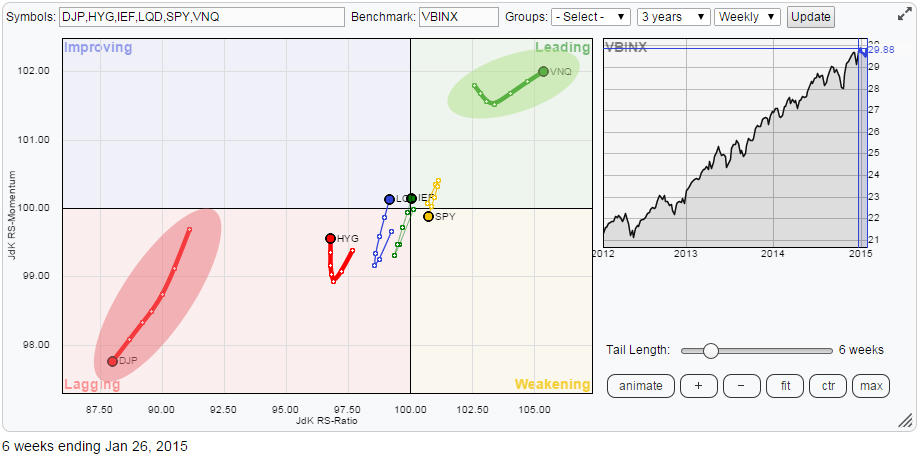
The relative rotation of various asset classes continues to tell the same story as it has been doing for quite a while now... Read More
RRG Charts January 20, 2015 at 12:42 PM
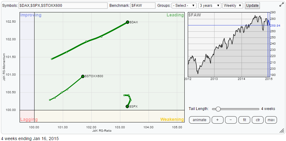
In my first article of this year I talked about more developed markets improving versus Emerging Markets... Read More
RRG Charts January 17, 2015 at 08:51 AM
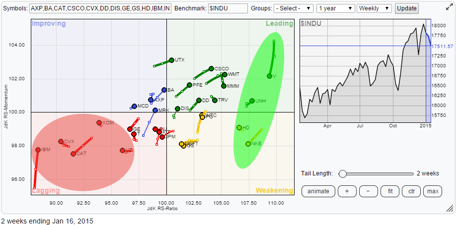
Below is the Relative Rotation Graph holding the 30 stocks that make up the Dow Jones Industrials index. When I start analysing a universe like this I always start to look at what's going on on the outskirts of the RRG. In this case they are the names inside the shaded areas... Read More
RRG Charts January 08, 2015 at 08:43 AM
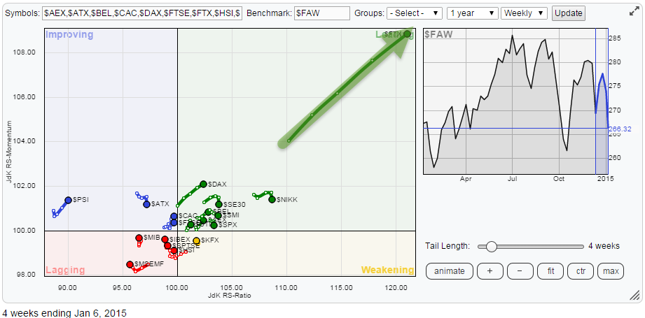
It's time to check the world again. The Relative Rotation Graph below shows the relative positions and movement of international equity markets against the FTSE All World index... Read More