RRG Charts February 26, 2015 at 05:45 AM
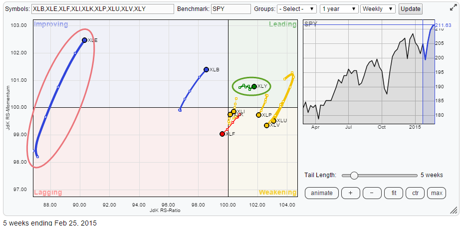
On the Relative Rotation Graph showing the sector rotation in the nine S&P sector ETFs there is one that really stands out. But is it good or is it bad? XLE, the Energy select sector SPDR is showing up in the top-left 'improving' quadrant with a long, almost vertical, trail... Read More
RRG Charts February 18, 2015 at 10:37 AM
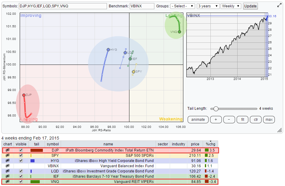
The rotation of relative trends close to "home" over the past 3-4 weeks. HOME in this context is VBINX (Vanguard Balanced Index Fund) which represents a balanced investment portfolio holding approximately 60% in Equities and 40% in bonds... Read More
RRG Charts February 11, 2015 at 06:21 PM
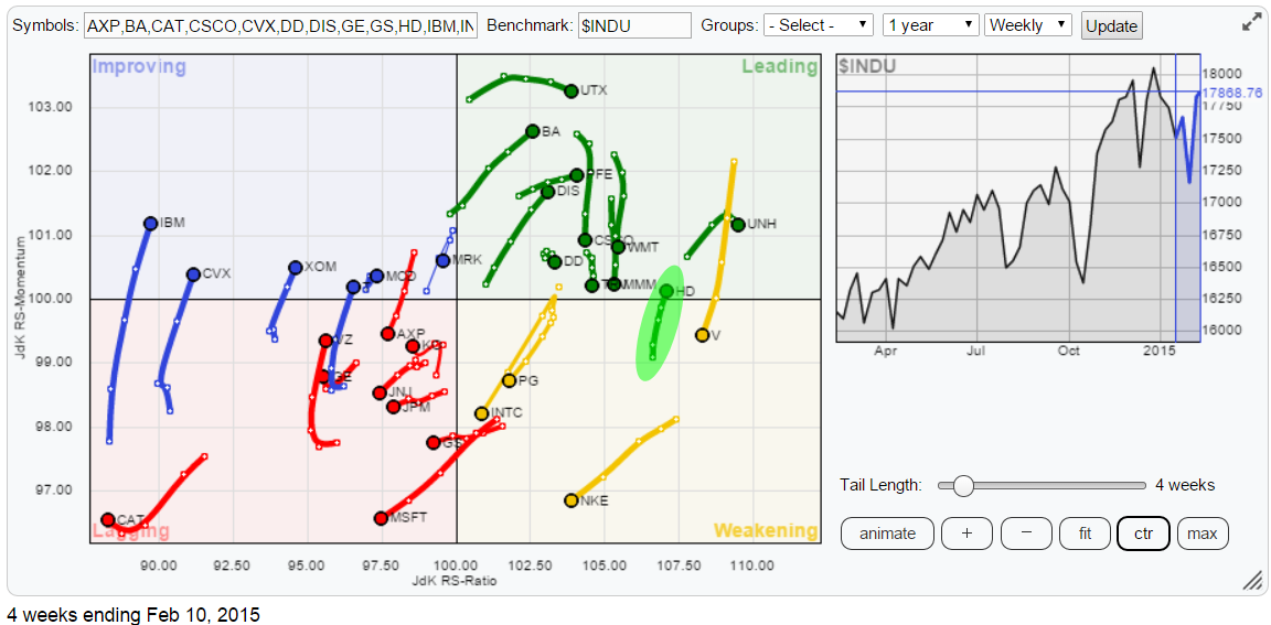
The Relative Rotation Graph of the 30 Dow stocks shows nicely balanced rotations. All 30 names are more or less evenly spread around on the RRG chart... Read More
RRG Charts February 05, 2015 at 06:23 AM
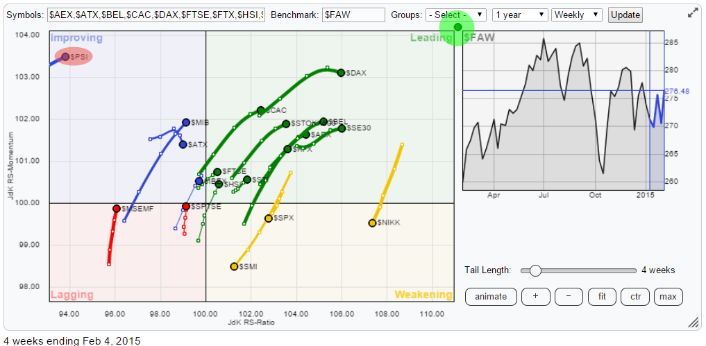
The Relative Rotation Graph below holds a number of international, country and regional, stock indices. In order to get a bit more clarity I have zoomed in to the central area that holds the most observations... Read More