RRG Charts May 27, 2015 at 03:19 AM
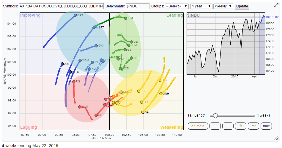
The 30 stocks that make up the Dow Jones Industrials index are more or less evenly spread out over the Relative Rotation Graph below... Read More
RRG Charts May 17, 2015 at 09:25 AM
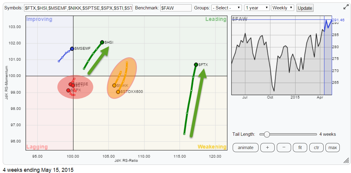
The Relative Rotation Graph below holds a number of world equity indices and shows their relative rotation versus the FTSE all world index ($FAW)... Read More
RRG Charts May 07, 2015 at 07:34 AM
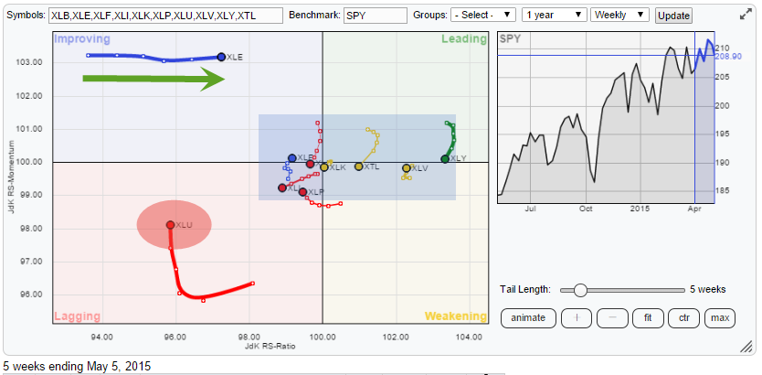
Sector time! With the general market picture being a bit 'un-clear' and showing pretty wide swings from week to week, the Relative Rotation Graph holding the ten (I added XTL - Telecom) sector ETFs will shine some light on the sector rotation that is going on within the S&P 500 i... Read More