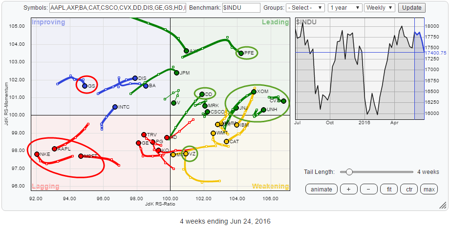
When you look at the Relative Rotation Graph (below) holding the members of the Dow Jones Industrials index without knowing what date the snapshot was taken you would not be able to tell that a major historical event had just happened....
Obviously, I am talking about the surprising outcome of the Brexit referendum last Thursday and the market's response to that result on Friday. Thousands of words have been typed, scores of analysis reports have been published about the "as if and when" of both possible outcomes. And the markets.... they just continue their rotational behavior. Clearly, they are affected by the outcome, but the rotation continues. Let's see if this event managed to break some trends or create new ones.
Summary
- NKE weakest stock in $INDU at the moment
- Watch $ 48 support in MSFT, more weakness expected
- A break below $ 90 will send AAPL further South
- GS still working its way lower after H&S reversal, weak relative rotation ahead
- VZ breaking to new highs, supported by strong relative rotation offers potential
- PFE and DD running into resistance, short-term setback expected
- CVX stable outperformer, expected to continue rotation deeper into leading quadrant
Quick scan
A first glance at the RRG above reveals two clusters of stocks showing similar rotational patterns and a few individual moves that seem interesting enough to take a closer look at.
The first cluster that stands out is in the bottom left, lagging, quadrant where NKE, AAPL and MSFT are close to each other and all moving further down on the JdK RS-Ratio axes. Only NKE shows some improvement on the JdK RS-Momentum axis. However, being the weakest stock on the chart (lowest RS-Ratio value), that is judged to be only a small recovery in the relative downtrend that is in play.
The second cluster is on the opposite side in the leading quadrant where XOM, CVX, UNH, and JNJ are all moving right on the RS-Ratio scale, keeping their relative uptrends in this universe (vis-a-vis $INDU) intact.
These two clusters aside, my eye fell on a few individual trails that I would like to inspect further. The first one is VZ inside the weakening quadrant which has turned back up and is now heading towards the leading quadrant again. Usually, this means that a corrective move has completed, and the persisting (relative) uptrend is about to continue upward.
Secondly, GS inside the improving quadrant needs some attention as its tail has already started to rotate down again.
And finally, inside the leading quadrant, DD and PFE caught my attention. PFE because it is in an isolated position on the RRG at high RS-Ratio and RS-Momentum levels but started to lose some momentum recently. DD looks interesting because of its straight move (back) into the leading quadrant at an almost 45-degree angle which means a strong improvement on both scales at the same time.
Inside the weakening quadrant
NKE - NIKE Inc.
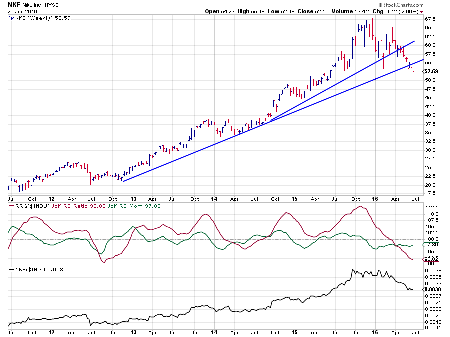 NKE has been one of the star performers inside $INDU for a very long period of time. The most recent relative uptrend which was picked up by the JdK RS-Ratio line (crossing above 100) sometime in August 2014 and carried on until the relative strength line started to move sideways in October 2015.
During that sideways movement in the RS-Line, relative momentum dropped below 100 indicating that the existing trend began to weaken, and RS-Ratio started to fall. This weakening progressed until March of this year when the JdK RS-Ratio dropped below 100, putting NKE inside the lagging quadrant, shortly thereafter followed by a break down from the consolidation in the RS-Line.
The relative downtrend is now fully in play with relative momentum stable around 98. This means that the trend is stable and not accelerating lower. The RS-Ratio line is therefore almost straight.
On the price chart, NKE is now resting at a horizontal support level near $ 52 while on the verge of breaking below a long-term rising support line. A drop below $ 52 will very likely cause an acceleration lower.
Given the fact that the JdK RS-Ratio is now close to pretty extreme levels seen in 2012, the odds are increasing for a recovery in relative strength but as NKE has the lowest RS-Ratio value in this universe a turnaround of the relative downtrend is not expected at short notice.
MSFT - Microsoft Corp.
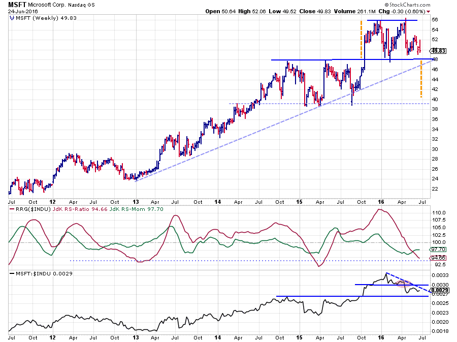 On the price chart of MSFT, there are two distinct levels to watch at the moment. The first one is $ 56 at the top which will act as resistance on the way up. And maybe even more important $ 48 which is expected to provide support on the downside.
This $ 48 support level almost coincides with the level of the rising support line (dashed) . A break of these support levels completes a big double-top formation, based on which we can peg a price target near $ 40 in case of such a break.
On the relative charts, MSFT is already in a downtrend. With the JdK RS-Ratio and the JdK RS-Momentum lines both below 100, the stock is positioned inside the lagging quadrant. The raw RS-Line has recently dropped below a support level and has started to put in lower highs and lower lows.
Given the low level of the RS-Ratio line and the raw RS-Line just above a horizontal support level, a (small) recovery in the relative move is possible. But, just like for NKE, such a move will, for now, be judged as a recovery within the existing downtrend.
AAPL - Apple Inc.
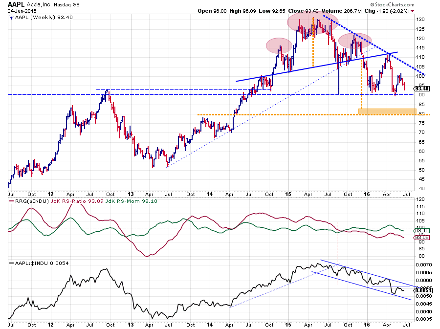 AAPL is probably one of the most watched stocks in the world and consistently shows up on the StockCharts.com homepage as Currently popular with StockCharts.com users. No surprise that AAPL came up in a few of my blog posts as well. Most recently in the post of 3 September 2015 and again in the post dated 23 December 2015. In both cases, it was not in a favorable way.
Looking at the chart above, things have not improved for the better yet. "Au contraire" as the French would say. On the price chart, AAPL continues to set lower highs, which indicates that selling pressure is still present overhead. For the time being the horizontal support level near $ 90 was able to prevent a further drop but the question is for how much longer?
The massive H&S formation that characterized the AAPL chart in 2015 is still weighing on its performance, and the minimum price target coming off that H&S formation has not been met yet. Using the rule of thumb that it can take as much time to reach a price target as it took to form the pattern, leaves another six months (roughly) for AAPL to reach levels near $ 80.
A break below $ 90 will very likely be a trigger for a move to lower levels.
The relative trend for AAPL against $INDU turned negative around August 2015 when the RS-Line broke a rising trendline, and JdK RS-Ratio dropped below 100. After a recent recovery rally that brought relative momentum briefly above 100, and AAPL inside the improving quadrant, things turned negative again, and the rotational pattern continued lower and back into the lagging quadrant again. A turnaround for either the price or the relative trend seems unlikely in coming weeks.
Inside the improving quadrant
GS - Goldman Sachs Group Inc.
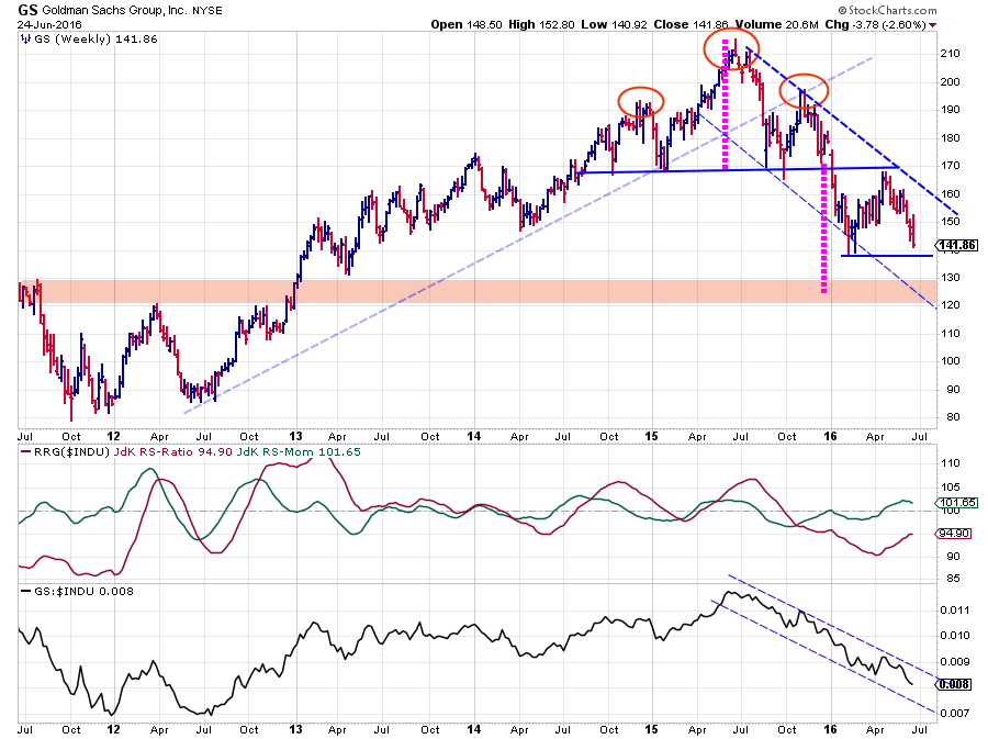 GS is another stock that is still working its way lower after completing a big H&S formation that took all of 2015 to form. The initial break of the horizontal, neckline occurred at the beginning of this year and triggered the initial decline to $ 140 where a new low was set. Out of the low a recovery rally, pull-back, towards the neckline started and completed in April with a new lower high near $ 170.
During the past few months, GS dropped from $ 170 back again to current levels around $ 140. A break of this support level will accelerate the decline towards the price target, coming off the H&S formation, around $ 125.
From a relative point of view, a clear channel is visible in the raw RS-line. This downtrend was picked up by the JdK RS-Ratio line late September 2015 when it crossed below 100.
The recovery back to the neckline and the slowdown of the relative trend (although barely visible in the rs-line itself) caused GS to rotate into the improving quadrant. The current loss of relative momentum in combination with the low reading on the RS-Ratio scale suggest that the rotation will turn GS back down and into the lagging quadrant again in coming weeks.
Inside the weakening quadrant
VZ - Verizon Communications
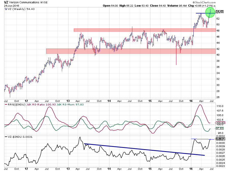 Inside the weakening quadrant, the rotational pattern of VZ looks interesting especially when combining it with the pattern on the price chart.
From a relative point of view, VZ trended down from mid-2013 until the beginning of this year. During this period the RS-Ratio peeked above the 100 level a few times in an attempt to turn this relative weakness around, but none was successful. The price chart, during the same period, kept VZ contained between roughly $ 42 and $ 48.
This changed at the beginning of 2016 when VZ broke out of its trading range to the upside and rallied towards a new high at $ 54. The rally in price caused the relative strength line to break powerfully above its down sloping resistance line and almost at the same time pushing RS-Ratio above 100. As the JdK RS-Momentum line had already moved above 100 a few weeks prior, this caused VZ to rotate into the leading quadrant on the Relative Rotation Graph.
The setback after the initial rally got caught at the breakout level that started to act as support and out of which the current rally emerged that is now breaking the $ 54 level and again pushing VZ to new highs. Especially given the current market conditions a very strong move.
The correction on the price chart, caused relative strength to drop back as well and drag VZ into the weakening quadrant. But the RS-Line put in a first higher low after the breakout and is now close to breaking its previous relative high which will improve the relative outlook even more.
The combination of improvement on both the price and the RS graphs looks to be causing a rotation back-up towards the leading quadrant again which probably makes VZ one of the better stocks in the universe at the moment. There is no overhead resistance and the downside is well protected at the old breakout levels.
Inside the leading quadrant
PFE - Pfizer Inc.
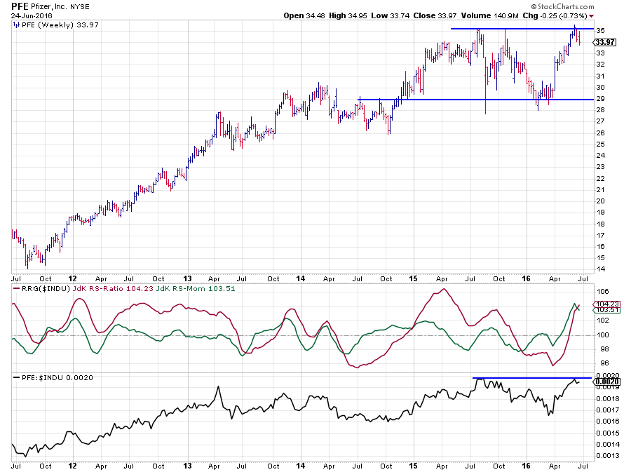 PFE is positioned deep inside the leading quadrant following a strong and steep rise on both the RS-Ratio and the RS-Momentum axes.
However, a look at the price and relative graphs above raises some doubt as to whether PFE will be able to maintain this position in the near future. The problem is that the stock is pushing against overhead resistance on the price chart as well as on the RS chart. A lot of price- and relative momentum is needed to push higher.
With a trading range visible between $ 29 and $ 35 this means that upside potential, at least for the short term is capped around $ 35 while downside risk is all open towards $ 29. Although the improvement over the past few weeks is clearly there, it looks as if a correction is needed to refuel for a new attempt to break higher. Because of the high RS-Ratio reading, this can very well mean a rotation on the right-hand side of the RRG. I will be monitoring the rotational pattern of PFE and look for opportunities when the tail starts t turn upwards again once inside the weakening quadrant.
DD - DuPont Co
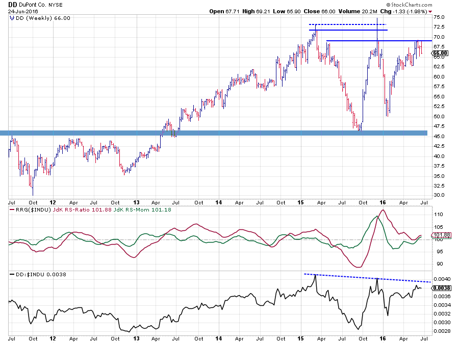 The difference between the rotational pattern of DD vs. PFE is that PFE rotated into the leading quadrant from improving while DD rotated through the weakening quadrant since the beginning of this year and just recently came back into the leading quadrant.
This different rotational path aside both stocks are facing a similar problem. Just like PFE, DD is also pushing against resistance on both the price- and the relative charts which will put a drag on the rotation going forward unless price or relative strength will be able to convincingly break higher in the near future.
CVX - Chevron Corp.
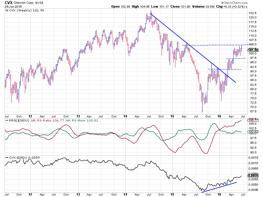 Out of the cluster of stocks, deep inside the leading quadrant but just above 100 on the RS-Momentum scale I have picked CVX to display above, but quite frankly the other names (XOM, JNJ, and UNH) are equally strong and definitely candidates to be included in defensively positioned portfolios.
Following a very volatile period in the second half of 2015 with very wide price swings, things seem to have settled down now.
The RS-Ratio line already crossed above 100 at the end of 2015, picking up the early stages of the new uptrend in relative strength that started to develop. The volatile price pattern at that time prevented the RS-Line to push seriously higher and made the RS-Momentum line drop to just above 100. Any RS-Momentum above 100 level still means that the RS-Ratio line is rising which is what we see in the graph above.
On the price chart, the rhythm of higher lows and higher highs is still intact and $ 105 is the next resistance level to watch for a break higher and continue the rally. Such a break will very likely add some extra fuel to the relative improvement as well and make the RS-MMomentum line move to higher levels, pushing CVX deeper into the leading quadrant again.
Julius de Kempenaer | RRG Research
RRG, Relative Rotation Graphs, JdK RS-Ratio and JdK RS-Momentum are registered TradeMarks by RRG Research
Follow RRG Research on social media:
LinkedIn Facebook Twitter