To surrender or not to surrender? That's the question!
After a nice run up in the S&P 500, I started to worry about its ability to push higher when resistance levels coming off previous highs started to act up. At, more or less, the same time, sector rotation of US sectors began to show a pattern favoring more defensive sectors in the lead. Usually not a very good sign for the general market.
This started back in April-May, and the pattern of sectors labeled as defensive leading the market from a relative perspective is still in play.
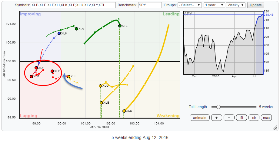 The Relative Rotation Graph above shows the sector rotation for the S&P 500 sector ETFs (Telecom, XTL added as well). In this article, I will look into the relative positioning of the various sectors in relation to sector rotation models and what that means for the general market direction.
Summary
- XLF, XLY, and XLP all in relative downtrends
- XTL, XLU, XLB and XLEproviding balance on far right of the RRG
- XLF remains a troubled child but is sending mixed signals now
- Negatives outweigh positives on SPY chart for the moment, remaining cautious
- Strong sector rotation for Technology (XLK)
Quick scan
The first and most important thing that stands out looking at the RRG above is the high concentration of sectors on the right-hand side of the graph in leading and weakening and only three sectors on the left-hand side in lagging and one on the border of improving and leading.
As this Relative Rotation Graph represents a closed universe, it means that the three sectors on the left, Financials, Consumer Discretionary and Consumer Staples together are much weaker than the other sectors together are strong. There is a positive balance for the sectors on the right, especially XTL, XLU, XLB, and XLE. Even despite the fact that the last three sectors are inside the weakening quadrant and heading lower in NW direction, their high readings on the JdK RS-Ratio put them in relative uptrends against SPY.
The one single sector that is seriously weak versus the S&P is still Financials, and it remains a troubled child. Consumer Discretionary has been moving slightly higher recently but is still the second-weakest sector measured by RS-Ratio.
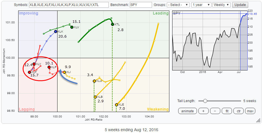
The Relative Rotation Graph below has the sector weights (%) added which shows how the large-cap sectors are all relatively close to 100 on the RS-Ratio scale, and therefore the smaller ones need to move way out to compensate for that. As you can see, the three sectors inside the lagging quadrant are almost 40% of the S&P 500. With XLK (20%) and XLI (10%) more or less neutral, the remaining sectors (30%) need to be way right on the graph to balance things out. This is why smaller weight sectors often show wider rotations and move further away from the benchmark.
Financial Select Sector SPDR - XLF
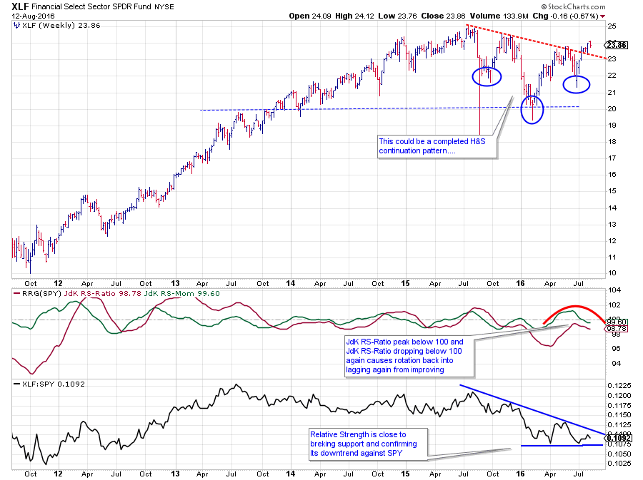
The Financials sector probably holds the key to broader market developments, but the chart above is sending mixed signals at the moment.
From a relative point of view, things are not looking too well. The raw relative strength line in the lowest pane of the graph above is still showing a sequence of lower highs which indicates downward pressure. Only the last two lows are roughly at the same level which means some support has was found in that area. A break below this freshly formed support will trigger a continuation and likely acceleration in the decline of relative strength.
This pressure in the relative strength line causes the RRG lines to position XLF well inside the lagging quadrant and making it the weakest sector in this universe at this moment. Measured by the JdK RS-Ratio, XLF is already in a relative downtrend since October last year when the line dropped below 100. The recent rise of JdK RS-Momentum above 100 and then dropping below that level again caused the Financials sector to rotate through the improving quadrant briefly but dropping back into lagging again a few weeks ago. Usually, this type of rotation pushes a sector deeper into the lagging quadrant.
The confusion comes from the pattern on the price chart. The formation that has developed since Q4-2015 can be seen as a large Head & Shoulders continuation formation which just broke above its neckline which has to be considered as a (very) strong signal sending prices higher. Despite the fact that there is still some overhead resistance that needs to be cleared the improvement on the chart is undeniable.
The two scenarios that can unfold from here:
- XLF prices manage to hold up above the neckline, clear the overhead resistance levels coming off the previous highs, push higher and drag relative strength higher as well. Such a move will trigger a rotation towards improving on the RRG and eventually into the leading quadrant. It will not happen overnight, but if it does work out, this sort of scenario would be a huge positive for the market as a whole.
- XLF prices drop back below the neckline, thus failing the H&S pattern. A failed chart formation usually sends prices the other way, in this case downward again, which will then very quickly lead to a break of relative strength below its recent two lows sending relative strength even lower on the back of falling prices in XLF itself.
I'd rather not choose and let Mr. Market decide but reading the RRG and the price chart(s) including the chart of SPY itself I tend to lean to the second scenario. The mean reason for that bias comes from the (daily) SPY chart.
SPDR S&P 500 ETF - SPY
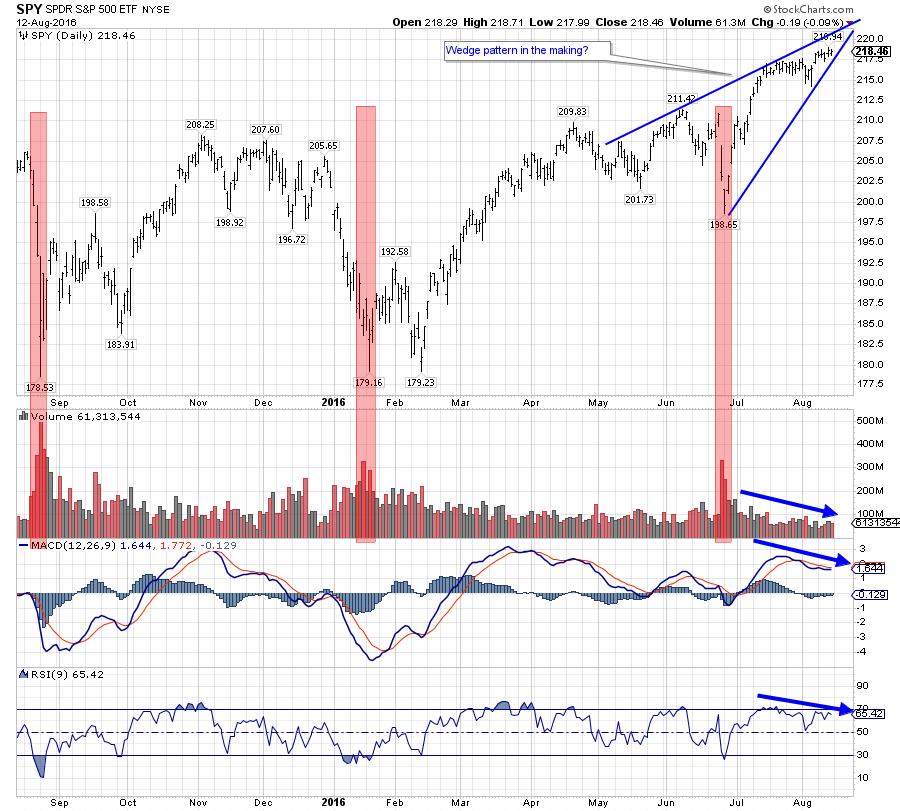
The daily chart of SPY is showing some things that make me reluctant to embrace the recent break fully and jump on the train.
Let's start with the positive(s) on this chart. First of all, SPY has broken to new highs by taking out the peak near 211 and after that break, we have seen a small setback that managed to put in a, small, higher low above the breakout level.
The doubt is coming from the following observations:
- After a break out of such a long and broad range, 30 points (180-210) over more than a year, I expect a strong follow through rally, immediately pushing prices up and steering away from the breakout level. That did not happen yet. The market only moved marginally higher.
- Important, and reliable, breaks are accompanied by a jump in volume and the subsequent rally after the break should be backed by rising volumes. That also did not happen yet, as a matter of fact, SPY is currently trading at the lowest average monthly volume over the past five years. In essence, the market is lacking fuel to propel itself higher at the moment.
- The pattern that developed over the past 3-4 months on the price chart can be seen as a rising wedge. A pattern that most often triggers a sharp decline when broken downward. A target, equal to the base of the formation in this case around 200, can be attached to the move. This would take SPY clearly back below its breakout level.
- Finally, both the MACD and the RSI indicators are showing a negative divergence with price which usually also is not a very strong sign.
All in all, for me at least, there is enough doubt as to whether SPY will be able to continue this rally. I will monitor the issues, which keep me sidelined, for now to improve. I am not ready to surrender yet...
Technology Select Sector SPDR - XLK
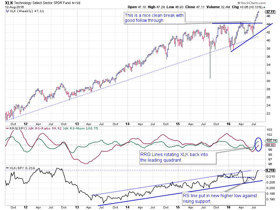
On the RRG, XLK is on the edge between improving and leading and ready to crossover after a small negative rotation through weakening since the beginning of the year, via lagging since May and back into improving since early July.
On the RS chart, the rising support line has been tested twice, and relative strength has now moved away from this lower boundary again and is challenging its previous peaks. A break beyond these levels will certainly help RS to move higher and push XLK deeper into the leading quadrant on the Relative Rotation Graph.
In my previous post, covering the components of the Dow Jones Industrials index, I already highlighted the improvement of the technology stocks in that universe.
Technology is certainly one of the sectors to keep an eye on at the moment.
Julius de Kempenaer | RRG Research
RRG, Relative Rotation Graphs, JdK RS-Ratio and JdK RS-Momentum are registered TradeMarks by RRG Research
Follow RRG Research on social media: