Summary
- Opposite rotations for Equities and Bonds on both weekly and daily RRGs
- Rapid weakening of commodities over past six weeks
- Current positioning of SPY suggests some short-term weakness before resuming trend
- IEF in consolidation pattern after breaking long-term uptrend
- Double divergence in SPY:IEF ratio points to potential corrective move ahead
- Commodities need to complete another full rotation before getting back in favor as an asset class again.
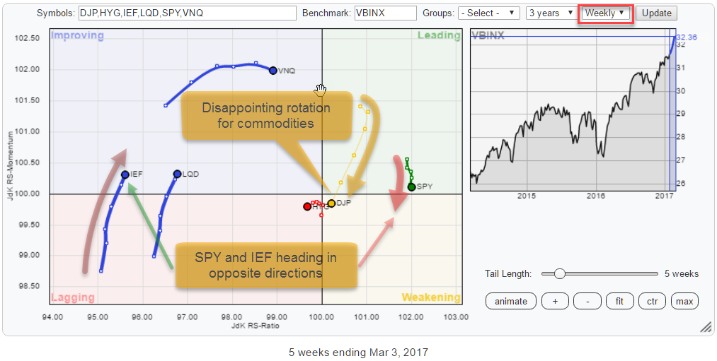
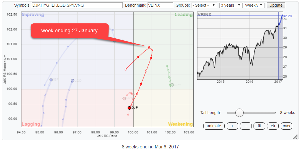
The Relative Rotation Graph above holds a set of ETFs that represent various asset classes. Using RRG to get a handle on the rotation around a balanced benchmark (VBINX) helps investors to get a handle on the relative strength of various asset classes vis-a-vis each other.
The first thing that I am looking at on the RRG above is the opposite directions for the rotations of SPY and IEF.
Although the fact that equities (SPY) are still the strongest asset class and Government bonds (IEF) the weakest, measured by JdK RS-Ratio, their contrary rotational patterns require attention.
A second observation is the rapid weakening of Commodities (DJP) after entering the leading quadrant, six weeks ago.
the daily picture
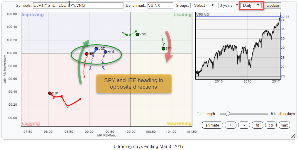 When I bring up the daily version of the Relative Rotation Graph for asset classes, we can see that the opposite rotation for Equities and Bonds is also visible on this shorter time-frame. So the two time-frames are confirming each other concerning the weakening of Equities against Government Bonds at the moment.
I will first investigate the charts of SPY and IEF independently and then look at the SPY:IEF ratio to assess the current state of Equity/Bond rotation.
Equities - SPY
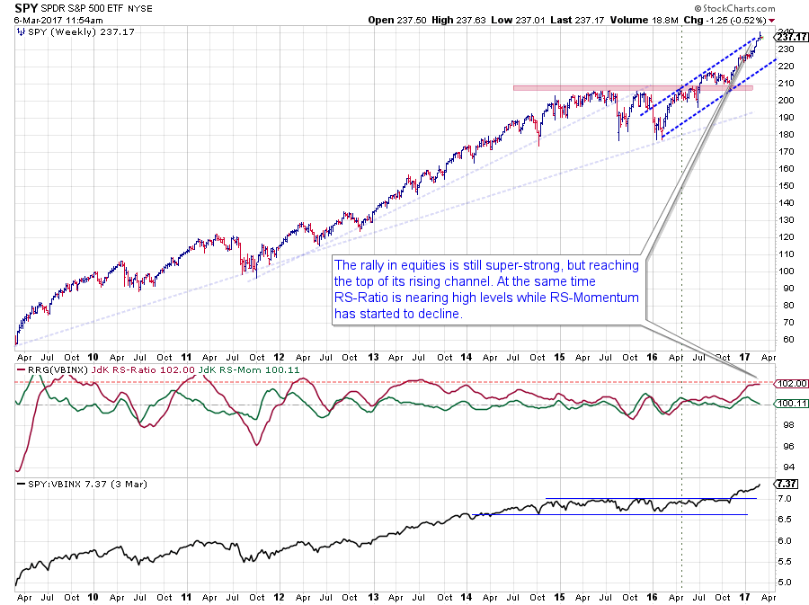
The long-term chart of SPY, as a proxy for the asset class equities, is still in good health.
Just by eye-balling the price chart we can see that it is getting a bit over-stretched as SPY is touching the upper boundary of its rising channel, but this chart is nowhere near a down-trend.
Looking at the relative charts, we can see that the JdK RS-Ratio line picked up a relative uptrend (against VBINX) at the beginning of 2016 but that new uptrend lacked acceleration until late 2016 when the raw RS-Line broke out of its two-year range and started accelerating.
This recent rally in relative strength has pushed the RS-Ratio line to very high levels, increasing the likelihood of a corrective move. The JdK RS-Momentum line has already started to show some signs of weakness as it is heading towards the 100-mark.
In both cases, price and relative, there is plenty of room for a corrective move without harming either of the uptrends.
With SPY positioned far to the right of the Relative Rotation Graph, there is a good chance that we will see a rotation through weakening and then back towards leading again.
The current positioning of SPY suggests some upcoming weakness but for the time being such a corrective move is judged as temporary before the longer-term rally will continue higher.
Government Bonds - IEF
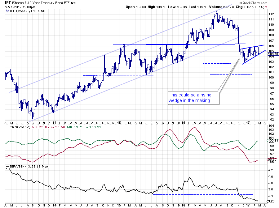
In my previous blog on asset class rotation, I showed a long-term chart for Government Bonds (IEF) and highlighted the fact that the recent price decline has broken and seriously harmed the long-term uptrend which characterized it for many years.
The chart above is a shorter version that shows a bit more detail. After the initial acceleration down, IEF came to rest around $ 103 which was/is an intermediate support level.
Off of that level, a consolidation pattern, in the form of a rising wedge, seems to be forming since late last year. Rising wedges are generally patterns with negative implications. The final trigger will be a break of the lower boundary of the pattern.
As IEF is currently resting at that short-term support line, there is a fair chance for another minor up-leg within the formation in case a downward break does not materialize immediately.
Such a short term move within the boundaries of the wedge formation would perfectly fit the current rotation of IEF on the Relative Rotation Graph.
IEF is currently positioned on the (far) left side of the weekly as well as the daily RRG heading higher primarily on the RS-Momentum scale.
Just like SPY, based on its position on the right-hand side of the graph, has a good chance for rotation through weakening and then back towards leading. IEF has a good chance for rotation through improving, where it now is, and then back towards lagging without hitting the leading quadrant.
Equity / Bond ratio - SPY:IEF
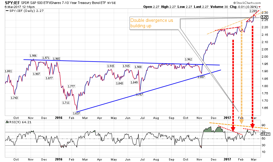
With the equity and bond markets in the state as described above, the SPY:IEF ratio should make an interesting chart to study. And it does.
Above is the short-term, daily chart of SPY:IEF in combination with the RSI indicator. What we see here is a strong rally after breaking out of the consolidation in November last year when equities clearly took the lead again.
The rally was strongest in the last part of 2016 and stalled a bit at the beginning of 2017 while a lot of negative divergence between price and RSI was building up. The above chart is a perfectly good of example of why it is a bad idea to ONLY trade off divergences. It shows that the strongest rallies occur while markets are "overbought" or rather "at high RSI levels."
Divergences can send (strong) warning signals, but they should only be acted upon by confirmation, preferably from a pattern completing on the price chart or a break of support or resistance.
Back to the chart above, we see two smaller divergences, in red, and a bigger divergence combining the two smaller ones. It is clear that a lot of (negative) pressure is building up here, but there is no trigger yet.
The answer may come from the rotational patterns on the RRG chart where we see improvement for IEF and weakness for SPY on both time frames (daily and weekly). For this rotational pattern to continue a decline in the SPY:IEF ratio is needed. I see no trigger yet but it looks like the rotation on RRG is picking up an underlying shift in power which is not visible on the regular charts yet.
Putting things back into, the longer-term, perspective again I want to point to the long-term version of this SPY:IEF ratio below.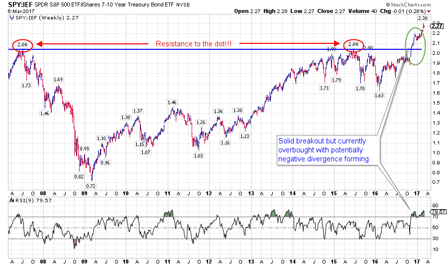
This chart shows the break to all-time highs and the ensuing rally in combination with very high readings on the RSI. As you can see, the RSI jumped to these "high" levels right at/after the upward break and is still there. The fact that the recent highs in the ratio chart are not confirmed by the RSI is called (negative) divergence and is sending us a warning signal for underlying weakness building up.
That early warning signal from negative divergences on both the daily and weekly SPY:IEF ratio charts in combination with the opposite rotational patterns on the Relative Rotation Graphs make me very alert for:
- a short-term bearish signal for SPY:IEF causing a temporary lead for Bonds over Equities
- followed by a re-entry opportunity to overweight/switch back to equities as the preferred asset class over bonds
Commodities - DJP
 Late January, everything looked healthy for Commodities with DJP pushing into the leading quadrant backed by strong relative momentum. Unfortunately, very shortly after that DJP started to rotate down and to accelerate lower on the JdK RS-Momentum scale.
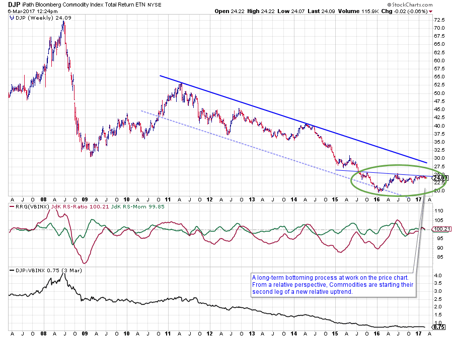 I have previously highlighted the long-term bottoming process that is currently ongoing in the chart above.
Since late January, the overhead resistance has proven to be strong for the moment, and DJP has not been able to work its way beyond this barrier. So we have to conclude that there is still too much supply for commodity bulls to absorb at this point.
Not overly dramatic as the decline, off the $ 25 resistance area, is "only" around 8% and not breaking any major support levels (yet) keeping the bottoming process alive.
However, from an asset allocation perspective, it means that another rotation (see RRG above) through the lagging quadrant is now underway and needs to be completed before commodities will be able to really take off and challenge their resistance again.
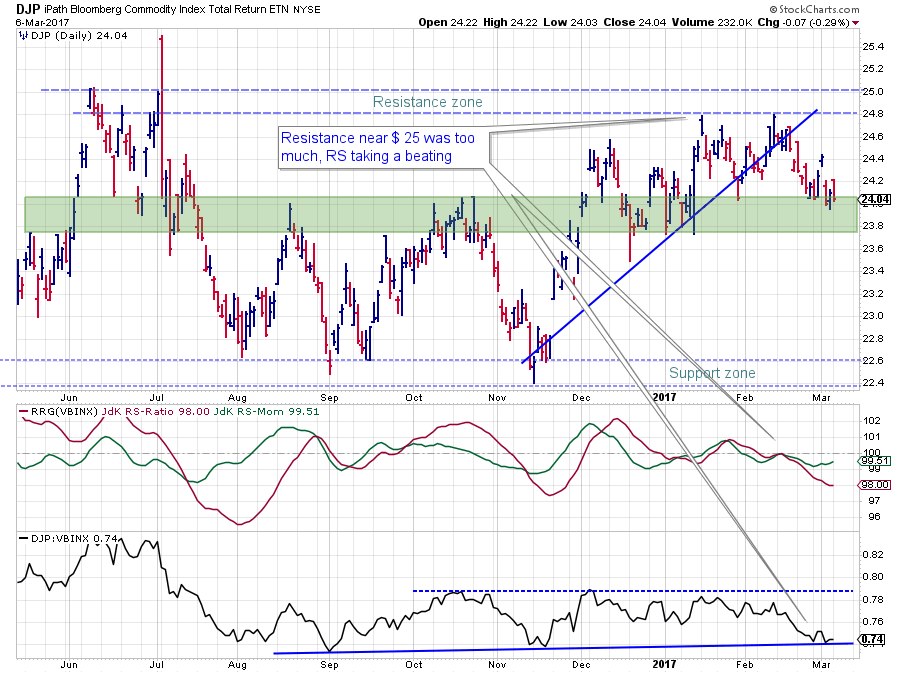
The shorter-term version of the DJP chart above shows the bounce off its resistance area in more detail as well as the support levels to be expected on the price chart. The relative charts show that relative strength is resting at a support level on the raw RS-Line while the tail of DJP on the daily RRG is starting to turn up again.
I will continue to monitor the rotation of DJP on both the daily and the weekly RRGs to see if this will be a quick and clean rotation bringing commodities rapidly back as one of the preferred asset classes.
You can do the same by clicking on the charts in this article and bookmark them in your browser to quickly check how the current rotation works out going forward.
Julius de Kempenaer | RRG Research
RRG, Relative Rotation Graphs, JdK RS-Ratio and JdK RS-Momentum, are registered TradeMarks by RRG Research
Follow RRG Research on social media: