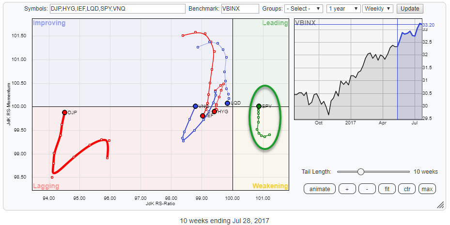
 The above Relative Rotation Graph holds some ETFs representing various asset classes and compares the against VBINX, a balanced index fund that holds 60% equities and 40% bonds.
The most striking observation is the fact that there is only one asset class on the right-hand side of the plot AND it is returning into the leading quadrant after rotating through weakening...
Despite all the talk about an over stretched market, a bull market on its last legs, etc. etc. the winner is ..... <drum roll> SPY!
Summary
- SPY returning to leading quadrant.
- VNQ improving and turning back into improving.
- Short term outlook for DJP improving but remains far away from the center of the RRG.
- IEF set for a renewed period of underperformance.
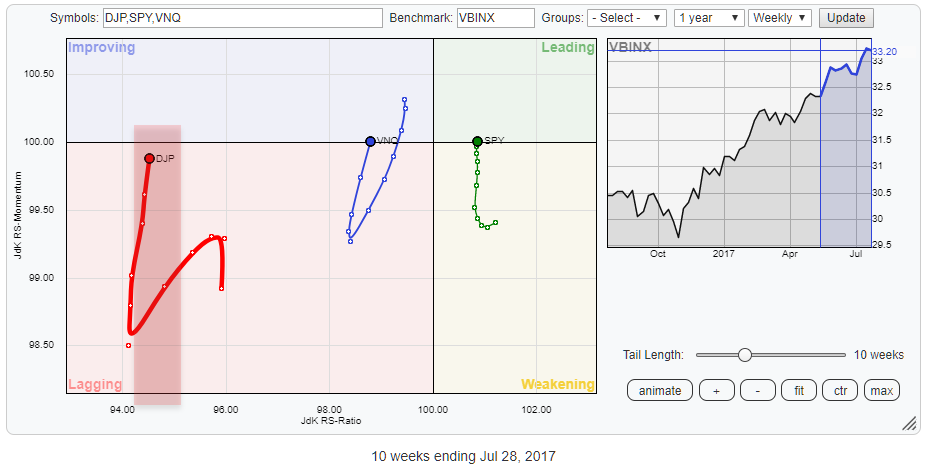
Risk on
The positive rotation for SPY on the RRG is crystal clear. Equities are the strongest sector measured on the JdK RS-Ratio scale at the moment and the fact that they are returning into the leading quadrant after a rotation through weakening suggests that a renewed period of relative strength is imminent for stocks.
VNQ (Real Estate) is another sector which usually performs well in a risk-on environment. Over the past ten weeks, VNQ is showing a similar rotational pattern as SPY but on the left-hand side of the plot from improving through lagging back into improving.
The RRG-Heading for VNQ is stronger than for SPY. VNQ is gaining on both axes while SPY is mainly picking up relative momentum but not yet on relative strength (JdK RS-Ratio). That improvement on the RS-Ratio axes is needed for SPY in coming weeks to maintain this positive rotation.
The third asset class on the RRG above is Commodities. The recent improvement, primarily on the JdK RS-Momentum axis is well visible, but the position on the RS-Ratio axis still makes this an asset class to be approached with caution.
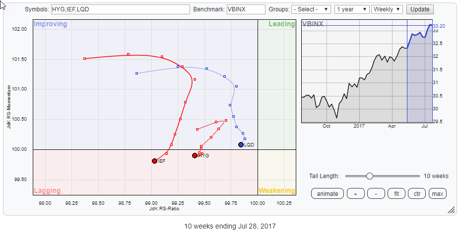
The above RRG zooms in on the fixed income related asset categories in this universe, and these usually perform well in a risk-off environment.
With all three of them moving lower on the RS-Momentum scale and two already inside the lagging quadrant and the third rapidly following the conclusion, based on the rotational pattern for the asset classes in this universe should be that we are still in a risk ON market which should be favorable for equities.
Commodities - DJP
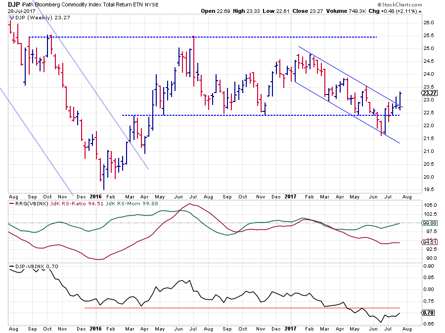
In my previous blog on asset class rotation, I mentioned commodities as being "completely detached from other asset classes," and they still are.
However, over the past few weeks, things started to change a bit for commodities. At the time of writing, that previous article DJP had just broken down below horizontal support around $ 22.50. Since then they reversed back up above that former support level and managed to push higher and out of a short term falling channel.
Although it is not a major long-term break or trend reversal, it is surely an improvement from the weak trend we have had since the beginning of this year. From a relative point of view, DJP's relative strength against VBINX is still below support.
The last few weeks of rising relative strength have caused the RS-Momentum line to approach the 100 level and RS-Ratio to start moving flat, but it is clear that this sector needs more improvement from both a price and a relative perspective to turn around.
For the time being it seems that a tradable break is taking place that could bring the price to the upper boundary of the horizontal range $25.00-25.50. Other than that, especially from a relative perspective, I still keep a cautious stance.
Government bonds - IEF
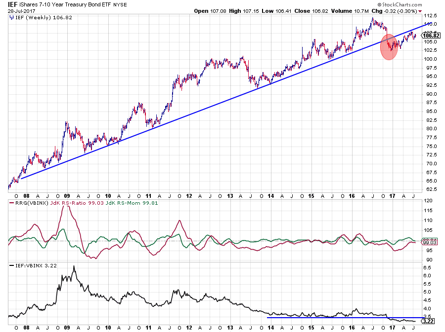
The primary uptrend in Government bonds was already broken at the end of 2016 when IEF fell below its rising support line. At the same time, the RS-line against VBINX dropped below horizontal support after a long period of more or less horizontal movement while the JdK RS-Ratio line was moving below 100 for quite some time already.
The rising price in IEF after dipping to $ 102.50 has not been able to cause an improvement in relative strength which is still below its prior horizontal support level, now resistance. The recent rise in RS-Momentum pulled RS-Ratio up to almost 100 but has started to turn around again causing the rotation on the RRG to move from improving back down into lagging, suggesting that a new period of underperformance for Government bonds is underway.
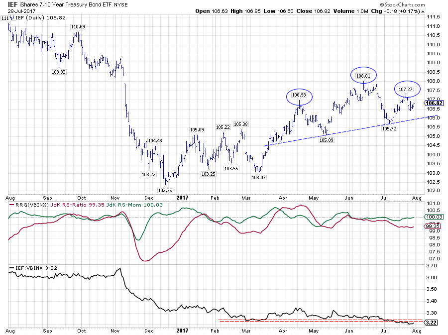
The above chart zooms, daily bars, in on the last part of the graph showing that IEF has not managed to push convincingly higher since April and recently a lower high seems to be put into place. Although it is not the right position on the chart to look for or call Head and Shoulders patterns the analogy is visible, and a break below the slightly rising trend line will very likely have weak implications.
The relative strength against VBINX is well below its previous horizontal support level which is expected to offer resistance on the way up.
Combining this short term picture with the long-term break and the weak rotation on the Relative Rotation Graph makes me believe that the odds for (gov) bonds are more in favor of renewed weakness.
Equities - SPY
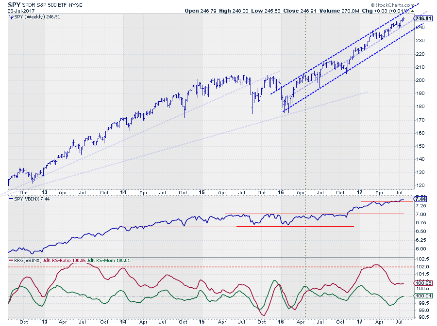
Ok, here's the deal; Look at the chart above and ask yourself the following questions:
- Does this look like a bull market?
- Does it look like this market is ready to turn around?
- Do you see ANY signs of weakness?
and be honest ;)
I guess your answers are the same as mine.
The uptrend and the channel that emerged out of the early 2016 lows are still intact. SPY continues to set higher highs followed by higher lows within the boundaries of the channel, and since late 2016 it is even doing that inside the upper half of that channel.
Three weeks ago the market managed to, once again, break above its previous peak confirming the current uptrend.
From a relative perspective, we have seen a period of flat movement, but the recent break of the RS-line above its previous peak triggered the continuation of the uptrend in RS as well. And it is causing the RS-Momentum line to push back above 100 again pulling SPY back into the leading quadrant on the Relative Rotation Graph.
For now, the move is primarily momentum driven which causes an almost vertical tail. A further improvement in RS and RS-Ratio will turn the RRG-Heading more into a North-Eastern direction providing, even more, strength to the rotation.
For the time being it is tough to see any signs of weakness for equities and with the developments on the IEF chart, it is clear that from an asset allocation perspective we should, still, prefer equities over (gov) bonds.
@Guy Nonplussed and @JackK, I was too late responding to your DISQUS comments on my previous article, my apologies.
@Guy, thank you for the heads up. If you have a big enough screen or maybe two screens you can do what I usually do. Put two browser windows next to each other. One holding the RRG and the other one holding a normal chart. If you create a chart-list and use that list as the input for both windows (the RRG and the regular chart) you can very easily watch both without having to switch screens or browser windows.
@Jack, Your assumption that the RRG-Lines are not range-bound is correct. Having said that you can take the level of RS-Ratio / RS-Momentum into consideration with only one caveat. The level of overbought-oversold, if you want to call it like that, differs from universe to universe and changes with different benchmarks. The range in which RS-Ratio moves in the S&P sector universe is very different (much tighter) than the ranges that are seen in individual equities within sectors for example.
As long as you are aware of that and put the OBOS levels for the RRG-Lines into their proper perspective it surely makes sense. You will see me using such comparisons every now and then in my articles.
With regard to your question on changing the value of the indicator to reflect the same ratio from a weekly to a daily chart, I am not sure what you mean. You can change the time frame from weekly to daily and vice versa on the RRG chart in the upper right corner. And the time frame on a sharp chart with RRG-Lines can be changed as usual. Further to this here is the chart school article on the difference between daily and weekly RRGs.
Julius de Kempenaer | RRG Research
RRG, Relative Rotation Graphs, JdK RS-Ratio, and JdK RS-Momentum are registered TradeMarks by RRG Research
Follow RRG Research on social media:
If you want to discuss RRG with me on SCAN, please use my handle Julius_RRG so that I will get a notification