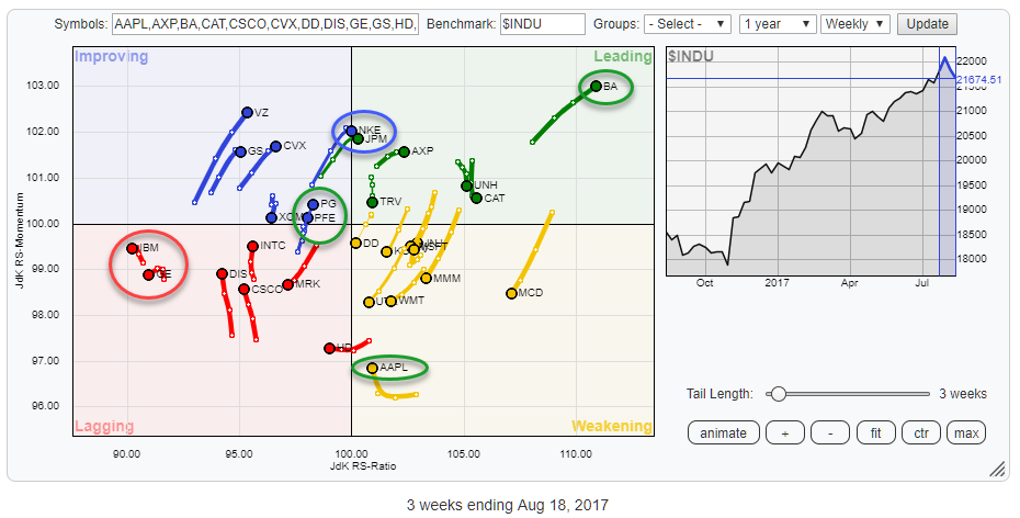
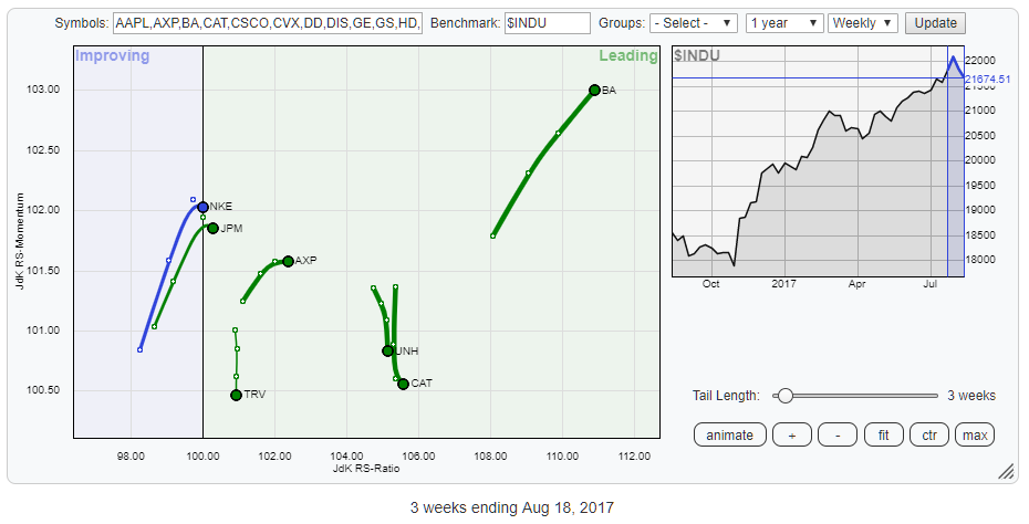
The Relative Rotation Graph above holds the 30 stocks that make up the Dow Jones Industrials Index and compares their relative rotation to $INDU.
From the first observation of this chart, a few tails/stocks catch the eye. First, there is BA in the top-right, leading, quadrant still powering further on both axes. Also inside or just entering the leading quadrant are NKE and JPM. Both seem to have a strong RRG-Heading but last week's price action does not look very supportive. I prefer a wait and see approach in such cases.
Inside the Weakening quadrant, AAPL attracts attention as it has stopped moving lower on the JdK RS-Momentum axis and started turning back up. This could be the start of another relative leg higher and deserves a closer look.
Within the boundaries of the lagging quadrant, IBM and GE are to the far left of the spectrum, and after a move higher on the JdK RS-Momentum axis they started heading further left again which is not a strong sign.
Crossing into the improving quadrant from lagging we find PG and PFE close together; I am interested to look at the charts of those two stocks and see if we can find a preference for one or the other.
Summary
- BA powering higher inside leading quadrant
- MCD inside weakening quadrant but still has enough room to turn back up again
- UTX heading for new relative downtrend
- AAPL lining up for a new leg up in relative strength?
- Despite (almost) crossing into leading quadrant, prefer "wait and see" for NKE and JPM
- PFE and PG at the same location on RRG, but PG is the one to prefer.
Weakening Quadrant
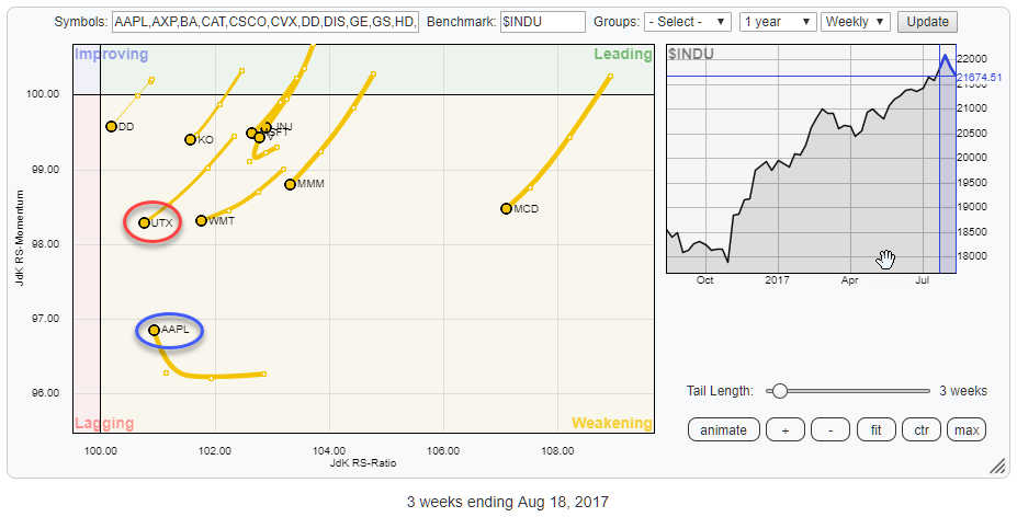
The RRG above zooms in on the stocks moving inside the weakening quadrant.
Pretty much all of these stocks are on a negative RRG-Heading (South-West, or between 180-270 degrees) which makes them weak(er) from a relative perspective, at least for the time being.
A stock like MCD which is furthest to the right still has a lot of room to maneuver and turn back up before crossing into the lagging quadrant a rotational pattern that is very often seen in very strong uptrends. A rotational sequence from leading to weakening and then back to leading is then a high-low rotation of the relative strength line within a longer-term uptrend.
So despite being inside the weakening quadrant and on a negative RRG-Heading MCD is not on my "negative" radar yet because of its high reading on the RS-Ratio scale.
United Technologies Corp. - UTX
I have marked UTX as one of the weaker stocks in this group as the tail is rapidly nearing the 100-level on RS-Ratio with very little room left to turn back towards the leading quadrant.
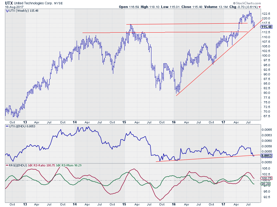
The price chart of UTX above, in combination with the RRG-lines, shows that the stock did not manage to hold above its former breakout level near $ 117.50 and fell back below and is now testing the rising support line.
On the relative strength chart (middle pane) UTX is currently challenging its rising support line and just like on the price chart, here also it looks as if a downward break is around the corner.
With the RS-Ratio line very close to the 100-level, not much is needed to push UTX into a relative downtrend and the lagging quadrant on the Relative Rotation Graph.
Apple Inc. - AAPL
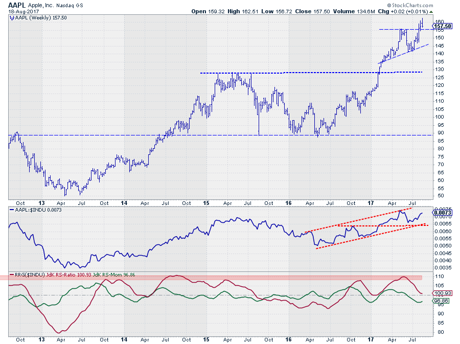
Despite AAPL being at almost the same RS-Ratio level as UTX the rotational pattern over the past weeks is quite different.
AAPL came from very high RS-Ratio levels, around 110, down into the weakening quadrant, started to level off on the RS-Momentum scale about 3/4 weeks ago. The tail has now begun to move higher again, suggesting that there is a good opportunity for AAPL to rotate back up towards the leading quadrant, and remain in its longer term relative uptrend.
On the price chart, AAPL has recently broken above a previous peak, once again, and is still holding up above that level. And although I do not particularly like last weeks price action (bar) it is still above its previous high which is good.
The RS-Line is still well within the boundaries of a rising channel. Although the RS-Line did not manage to break its previous high, yet, the positive trend is still clearly visible. The recent drop in RS has caused the rotation through weakening for AAPL, but as you can see on the RRG-Lines, RS-Momentum has leveled off and is starting to move higher, stopping RS-Ratio from dropping further just above the 100-level.
As always, things can change (rapidly) in financial markets, but when AAPL can hold up above support ($ 155) on the price chart and push higher, above its previous peak, on the RS-chart, AAPL seems to be lining up for another leg higher in its relative uptrend.
Leading Quadrant
Until last week both NKE and JPM were pushing higher on both axes of the Relative Rotation Graph, heading for the leading quadrant at strong RRG-Headings.
At last Friday's close things have started to shift. For both stocks, the RS-Momentum has stalled, and on the price charts some "not so nice" reversals showed up, especially for NKE.
Given the weak moves on the price charts and the stalling of the tails on the RRG, I prefer a "wait and see" approach in these cases.
Nike Inc. - NKE
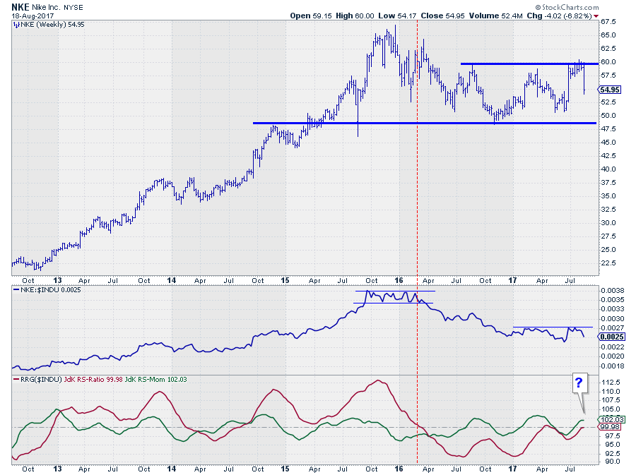
The bounce off of overhead resistance near $ 60 last week was very nasty and will very likely send NKE back to the lower boundary of this year's trading range.
With a similar move on the RS-chart and the RRG-Lines close to 100, it is now doubtful that NKE will be able to continue its relative rise and turn it into a solid uptrend against the Dow Industrials index.
J.P. Morgan Chase & Co. - JPM
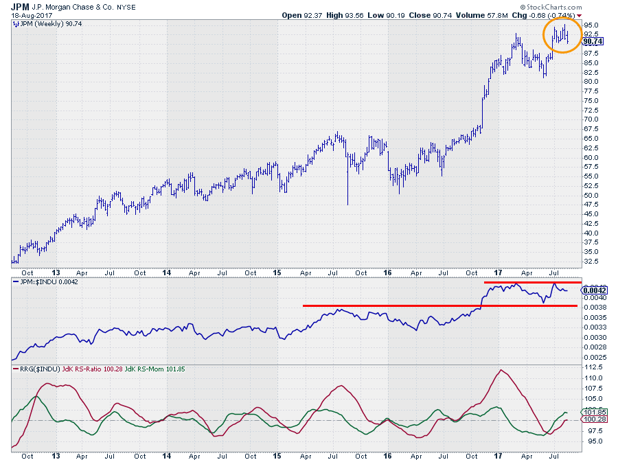
Last weeks reversal on the price chart of JPM could be the final bar before completing a small double top pattern. I am watching $ 90 for support. If that breaks, more downside is likely.
From a relative perspective, JPM failed to break resistance and started coming down over the past weeks. This is causing RS-Momentum to level off with RS-Ratio at the 100-level.
Based on the above observations it is unlikely that JPM will be able to continue its positive rotation in coming weeks.
Improving Quadrant
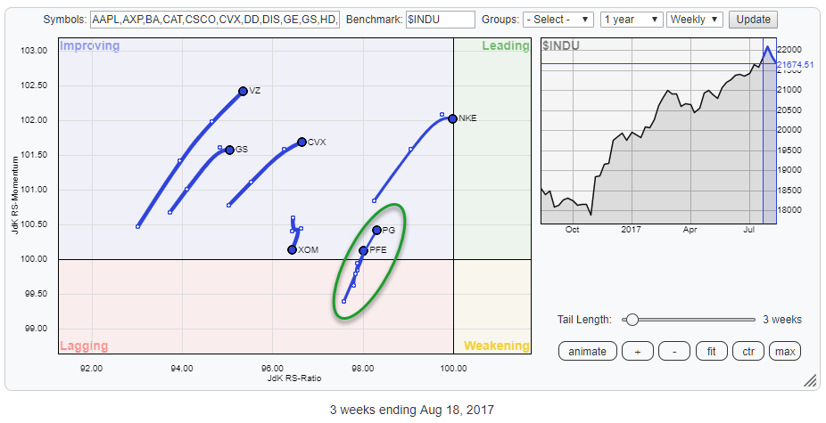
The above Relative Rotation Graph zooms in on the stocks that are inside the improving quadrant.
We have looked a bit closer at NKE above already. On this chart, I am intrigued by the rotations of PG and PFE. Both are almost at the same location on the RRG at a positive RRG-Heading and relatively close to the 100-level which makes them valid picks for a potential relative trend reversal.
Pfizer Inc. - PFE
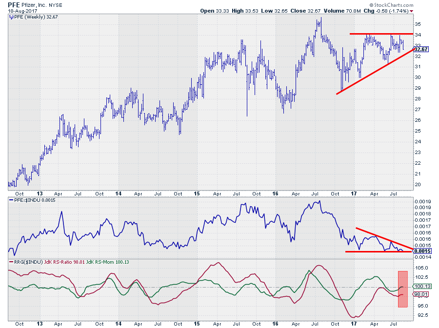
The combination of price- and relative charts above sends mixed signals for PFE.
In the price chart, an ascending triangle formation can be seen with overhead resistance around $ 34 and a rising support line connecting the most recent low. Although last week's bar was not very pretty, the pattern is still intact and a break above $ 34 in coming weeks should be taken as a positive sign.
The relative chart, on the other hand, is sending an almost opposite signal as a descending triangle can be seen with the RS-Line very close to crossing below that horizontal support level.
The RRG-Lines, finally, are responding to the moves in the RS-Line and the RS-Momentum line can be seen stalling at the 100-level. As RS-Momentum is leading RS-Ratio a further rise for the latter will be difficult. This increases the odds for PFE to start losing relative momentum again and return to the lagging quadrant and resume its relative downtrend against $INDU.
Based on the above observations my judgment call is to be careful with PFE as a break lower on the Relative Strength chart will send RS-Ratio lower and signal a new leg down in the relative trend.
PG Procter & Gamble Co. - PG
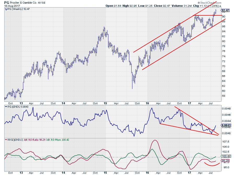
Despite the similar position on the RRG. The price- and relative-charts for PG are sending a different message.
First of all, on the price chart, PG recently broke to new highs signaling a continuation of the uptrend that is in play since late 2015 and good support now at the former resistance level (now support) around $ 90.
Secondly, on the RS-chart a big falling wedge can be seen that has just been broken to the upside. Working off the premise that relative strength charts can be analyzed like regular price charts this should be seen as a positive sign as it means that a period of relative weakness has come to an end and PG has started to pick up relative strength against the Dow Industrials.
The resulting RRG-Lines are picking up on this message, especially the RS-Momentum line which crossed above 100 and seems to be keeping a good pace. The RS-Ratio line is putting in a low and is starting to follow the RS-Momentum line higher.
Comparing the rotation for PFE and PG on the Relative Rotation Graph for the Dow Industrials components the evidence is pointing to an outperformance for PG over PFE in coming weeks.
If you like to receive a notification anytime a new article is posted in this RRG blog please subscribe below this article.
Julius de Kempenaer | RRG Research
RRG, Relative Rotation Graphs, JdK RS-Ratio, and JdK RS-Momentum are registered TradeMarks by RRG Research
Follow RRG Research on social media:
If you want to discuss RRG with me on SCAN, please use my handle Julius_RRG so that I will get a notification