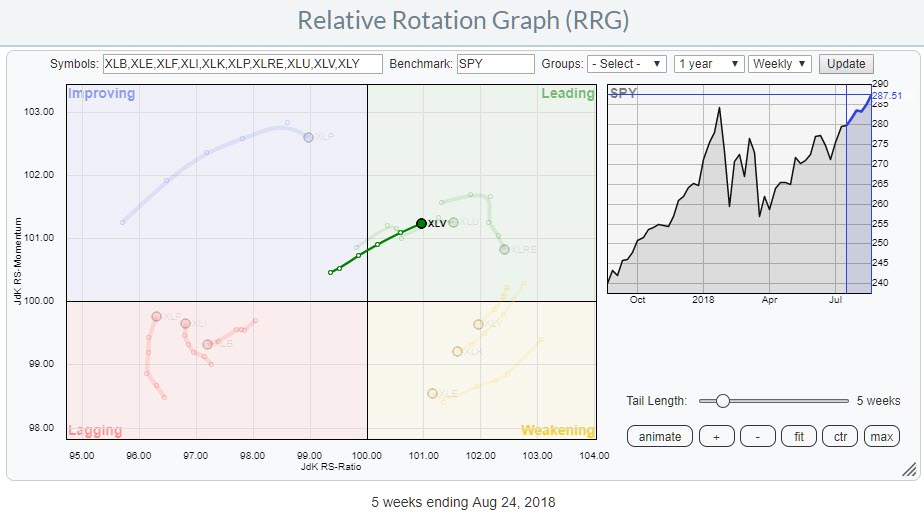
 The Relative Rotation Graph shows the rotation of the Health Care sector over the last five weeks against SPY. The dimmed trails are the other US sectors.
The strong rotation from improving into leading at a steady positive RRG-Heading (0-90 degrees) suggests that further improvement against SPY is likely.
In this blog, I will take a closer look at the individual members of the Health Care sector and identify some stocks to watch more closely for out- and under-performance.
Summary
- Healthcare sector pushing further into leading quadrant
- ABMD rapidly weakening and heading towards lagging quadrant
- ALGN losing relative momentum but still has opportunity to rotate back towards leading
- IQV breaking out of flag formation
- PFE leading the sector higher
From a sector perspective
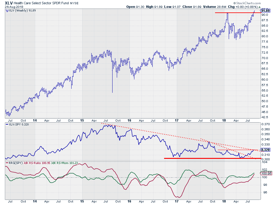 Starting off with a view from the, higher level, sector perspective, we see a price chart that is breaking to new highs as the market is taking out the high that was put into place earlier this year. Undeniably a strong sign.
The relative strength for XLV against SPY has been weak for a long time. The relative weakness for the sector started back in 2015 when relative strength started to roll over and form lower highs and lower lows.
After printing relative lows at the end of 2016 and 2017 the picture against SPY improved somewhat during the first half of 2017 but weakened again in the second half and continuing that weakness into the first months of 2018 as well.
In May of this year, XLV's relative strength against SPY tested the previous lows and managed to hold up at those levels.
A first positive was the upward break of the short-term (dotted) falling trendline. At the moment relative strength is testing the longer-term (dotted) falling trendline which coincides with a horizontal resistance level at current levels.
The RRG-Lines are picking up on the improvement and have now both turned above the 100-level while JdK RS-Momentum is rising, which indicates that the relative trend is still getting stronger. In combination with the upward break in the price chart, this makes for a positive outlook for Health Care at the sector level.
Zooming in
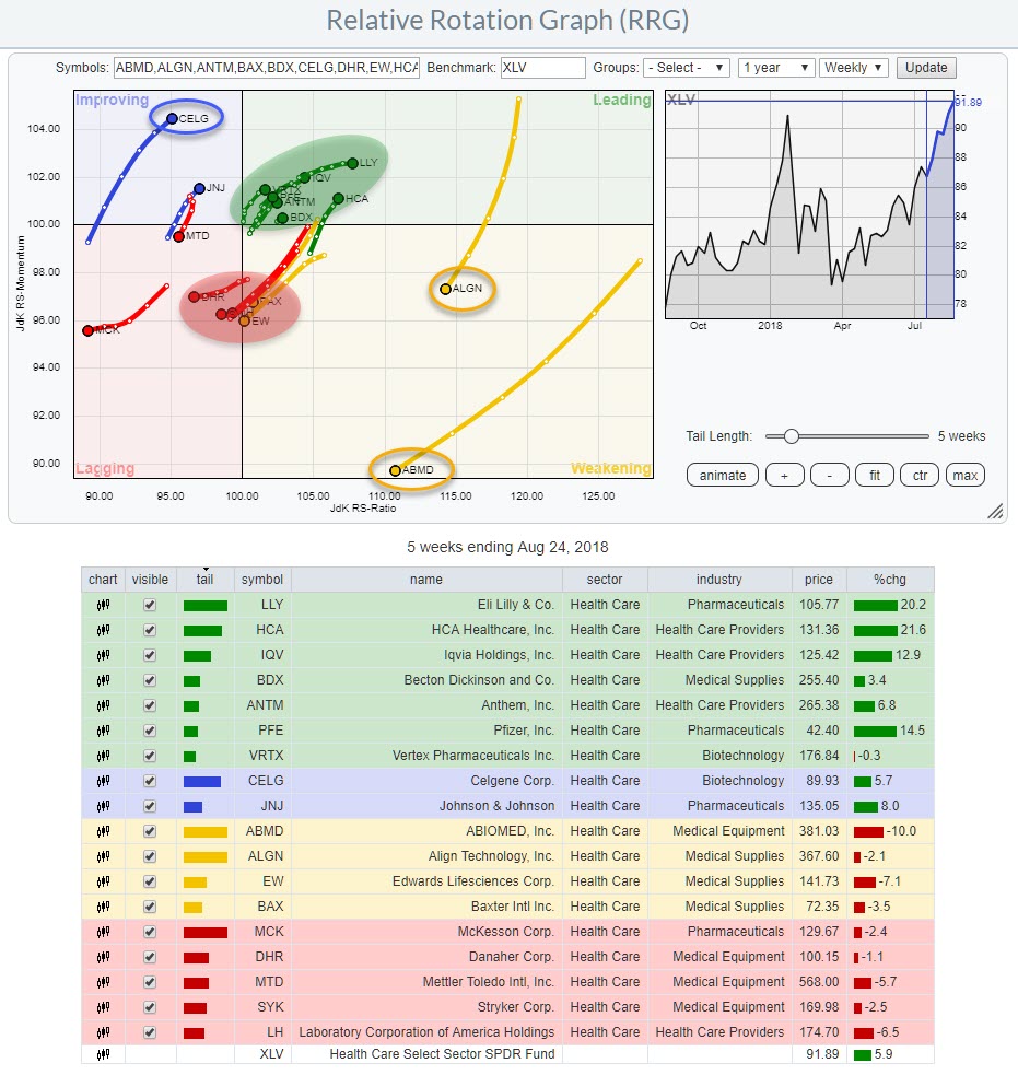 The RRG above zooms in on the individual members of the Healthcare sector. As this a sector with a lot of stocks in it (> 50) I have truncated the list a little bit and only selected the names that are showing interesting rotational patterns and/or tail directions. You can load all members (capped at 50) for this sector through the drop-down selection on the RRG chart.
Glancing over the RRG the long tails and, negative, direction for ALGN and ABMD catch the eye. Both are at high JdK RS-Ratio levels but rapidly losing relative momentum and heading towards the lagging quadrant. This type of rotation makes me curious to see how they look on their individual price charts.
At the opposite side, CELG shows an opposite rotation as it is heading towards the leading quadrant.
The red and green shaded areas on the RRG hold clusters of stocks heading in a similar direction. If you click the chart and then open the live version you will be able to toggle through the list and see them in more detail.
Worth mentioning inside leading are HCA and LLY. Both are showing strong charts and rotations but they already went through a strong upward move recently which makes them less interesting to pick up NOW, a bit further to the left, lower on the RS-Ratio scale, there are a few stocks that probably have better potential. One of these stocks is PFE, a heavyweight in this index. The other stock I would like to highlight is IQV.
Abiomed Inc. - ABMD
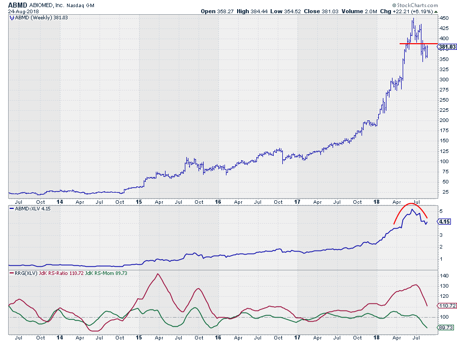
ABMD was a strong performer in both price- and relative terms for the better part of the last five years. That stint seems to be coming to an end now.
On the price chart, a topping pattern has completed and a new series of lower highs and lower lows seems to have started. This was confirmed upon the break below the recent low around $ 390.
That $390 level needs to be watched in coming weeks as a resistance level and a limit to the upward potential for ABMD for now. The downside, on the other hand, is wide open with first support coming in at the level of the most recent low near $ 350.
From a relative perspective, the RS-line against XLV seems to be topping as well and that recent weakness is now being picked up by the RRG-Lines which are both pointing down. The RS-ratio line is still above 100 but declining rapidly as it is pulled lower by the declining RS-Momentum which is already well below 100.
This positions ABMD inside the weakening quadrant with an RRG-heading pointing to lagging and a long tail which indicates power behind the move.
Align Technology - ALGN
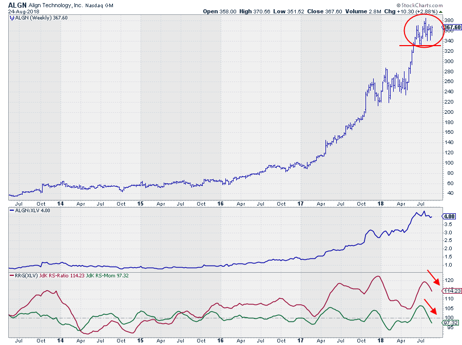
A somewhat similar situation as in ABMD is seen in ALGN albeit with some subtle differences.
The rotation on the RRG is on the outside and clearly visible with a long tail. The heading of the tail for ALGN, however, is much more South than for ABMD which means that relative strength for ALGN is managing to keep up for now where ABMD is rapidly losing strength on both axes.
This matches with the observation that the decline from its high in the RS-line is less pronounced than for ABMD and this then results in a significant higher RS-Ratio reading for ALGN, keeping the option for a rotation through weakening and then back into leading open.
For this to happen we need to see an improvement in relative momentum soon to start turning the tail around. This will be crucial for a return to the strong relative uptrend that is visible since mid-2015.
ALGN goes on the watch list for now as a candidate for a possible re-entry when RRG-heading turns back to 0-90 degrees or as a stock to avoid when the deterioration continues and ALGN starts to lose, stronger, on the RS-Ratio scale as well.
Shorter week-to-week distances between observations on the tail are an early warning for a potential rotation back up while longer week-to-week distances indicate a stronger deterioration in the current direction (towards lagging).
Iqvia Holdings Inc. - IQV
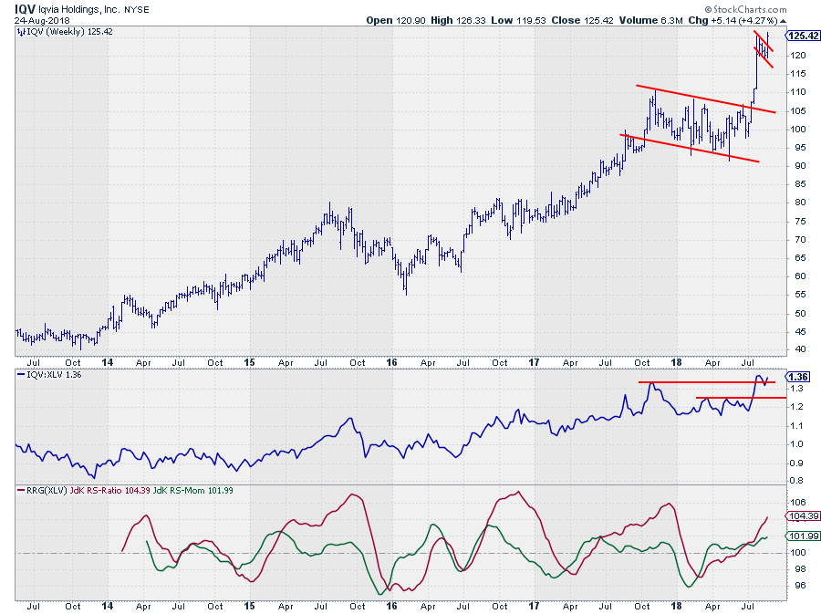
Inside the cluster of stocks in the green shaded area is IQV. From a relative perspective it has not done much over the past year, maybe two. But the price chart, IMHO, is showing some interesting developments.
Clearly, the break out of the large consolidation formation from late 2017 to mid-2018 was a strong signal followed by a rapid $ 20 rise. What interests me most is the small "flag" formation that developed after the rapid rise and the recent break out of this pattern and more particularly the current break out of that formation. This suggests that another $ 15 - $ 20 rise is possible. Confirmation when the most recent high is taken out on the weekly close.
The relative improvement over the past months has caused the RRG-Lines to both rise above 100, positioning IQV well inside the leading quadrant with RS-Ratio rising sharply at a steady RS-Momentum. Currently, relative strength is challenging the levels of the previous major high that was set late last year.
A continued rise in price as anticipated by the break from the flag pattern will very likely act as the catalyst for relative strength to pull away from current levels and push IQV further into the leading quadrant.
Pfizer Inc - PFE
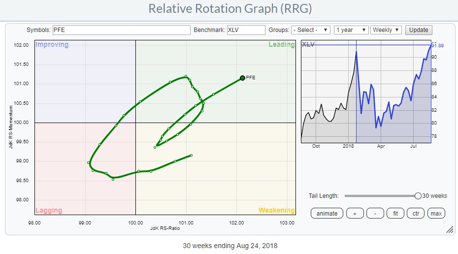
PFE attracted special attention while I was browsing through the symbols on the RRG.
In the first place because of its current heading and position in, the lower left corner of, the leading quadrant. But most definitely when I started to scroll back and forth through history which showed that the improvement for PFE already started back in April when the stock entered the leading quadrant and recently rotated back into leading after a short rotation through weakening.
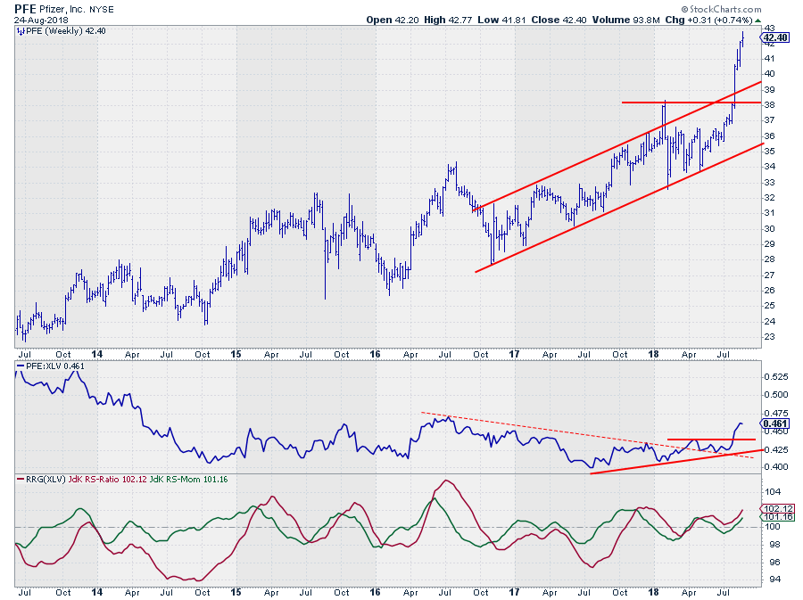
From the price chart, we can learn that the improvement and the rotation into leading coincided with the relative strength line breaking the falling trendline (dashed). The consolidation of RS that followed after the break managed to hold above the former resistance line and very recently rapidly push higher following the break above the previous high in price and upward out of the rising channel.
The rapid rise increases the risk of a short-term corrective move but the longer term picture remains solid.
This means that PFE is now improving rapidly on two fronts. As this is the third largest stock in the Healthcare sector this is an important observation which will definitely help to push the sector as a whole against the other S&P sectors.
Let me know what you think of this usage of RRG in the comments below. If you would like to receive a notification when a new RRG blog article is published, simply "Subscribe" with your email address using the form below.
Julius de Kempenaer | RRG Research
RRG, Relative Rotation Graphs, JdK RS-Ratio, and JdK RS-Momentum are registered Trademarks ®; of RRG Research
Follow RRG Research on social media:
If you want to discuss RRG with me on SCAN, please use my handle Julius_RRG so that I will get a notification.