 In my contribution to last week's Chartwatchers newsletter, I mentioned my current experiment on using breadth indicators on a Relative Rotation Graph.
In this article, I want to take a look at a few of these setups side by side and see if there is indeed a leading tendency for breadth to lead price on the RRG as it tends to do on regular charts as well.
I remember sitting in on a presentation by Greg Morris at the CMTA symposium a few years ago when he was talking on breadth indicators. In that talk Greg used the quote: "Breadth arrives at a party on time, but always leaves early". I actually made a note of the quote as it made some much sense to me. Only when re-reading his recent blog on the "advantages and disadvantages of using breadth" I noticed that the phrase actually came from Tom McCllelan.
Following that statement, it means that for my current project the assumed leading tendency for the breadth indicators should be more defined or better visible around market tops than at market bottoms.
What are we actually looking at?
Over the past few days, I have been watching and studying a lot of RRG chart setups filled with breadth indicators for sectors. I was using the data-sets based on the Bullish Percent indexes ($BP###) and the indicators looking at the percentage of stocks above an n-period Exponential Moving Average (!GTnn###).
After a while and viewing a lot of RRGs I was still or started, to ask myself "What am I actually looking at?"
Every time that question pops up while working on (new) research subjects I have learned to step back and go back to the basics. In this case that meant taking a look at the individual indicators and indexes BEFORE throwing them at a Relative Rotation Graph.
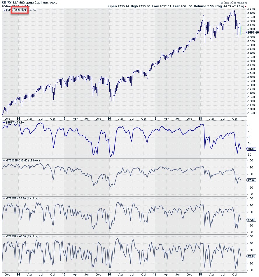
To do this I set up a chart template that would plot the price of a ticker and in the panels below the Bullish percent index for that ticker as well as all three above EMA indicators. I also wanted to see the difference in behavior for these values on a broad index like the S&P 500 and the sector indexes.
I started out using a weekly time frame as that is the time-frame I use most of the time. The first chart shows the setup for the S&P 500 index.
 The second chart shows the same picture for XLK, the Technology sector.
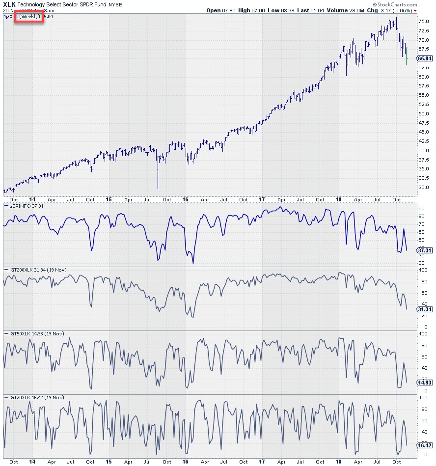 What I noticed is the highly oscillating behavior of the breadth indicators especially in the lower two panels. The transitions from up to down are very sharp and sudden which makes it hard to determine trends and trend transitions. One could argue that it could help to plot some form of a moving average on top of these values to take away the spikes.
Two issues made me ditch that plan:
- All these indicators are percentages which means that they have hard upper (100%) and lower (0%) boundaries. Plotting a moving average will certainly smooth the values but in a strong market when the majority or all of the members of a universe are above their moving average the moving average of that percentage will start to move flat because there simply is no more upside potential for the indicator to rise or fall.
- From a more pragmatic perspective, I can load any ticker-symbol into an RRG but I cannot load an indicator value like a moving average of a ticker symbol into an RRG.
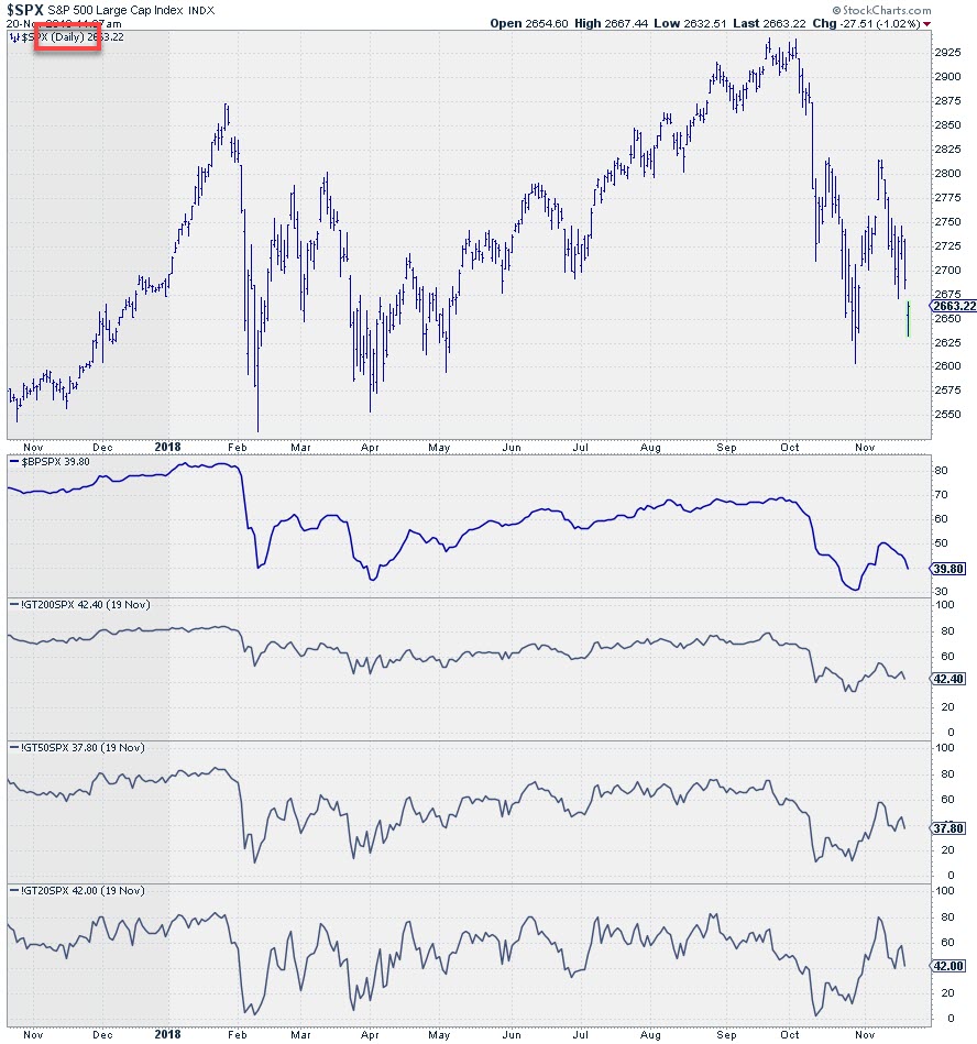
Moving from weekly to daily observations
After staring at a number of these pictures and re-reading the definitions in the symbol catalog I realized that these values are calculated on a DAILY basis using DAILY price or exponential moving averages. So when breadth starts to move, up or down, and stocks start to break below a moving average that value (percentage of stocks above EMA) changes from day-to-day. It is unlikely that they will all or in big numbers all break on the same day. So the change in percentage is expected to be gradually.
When we plot a weekly value of those daily numbers it is very well possible that we see big jumps up or down. I.e. if 5 stocks per day break below their 20 day EMA that shows a gradual decline in !GT20### of 5 (in % value) per day. Plotted on a week-week basis that 5 per day becomes a 25 jump in one period which explains the jagged patterns, especially in the lower two panes.
When I moved to a daily time frame the pictures looked like this.
 And for the technology sector.
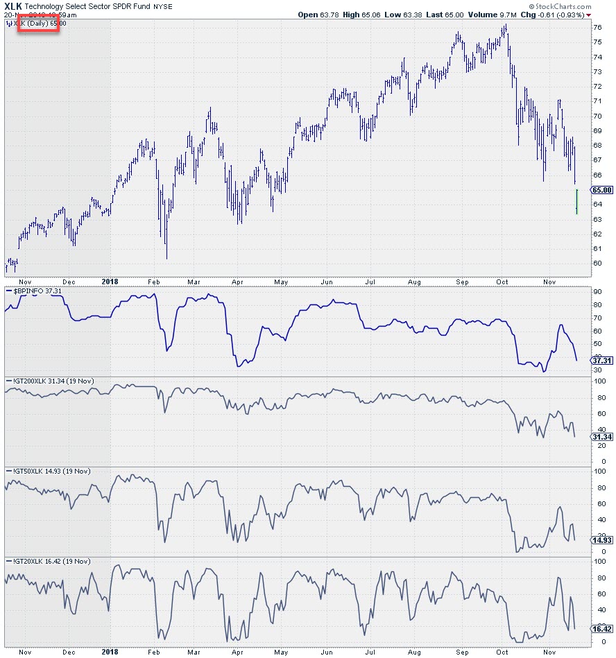 Still pretty jumpy but a lot better than the weekly version especially in the lower two panels with the shorter EMA-periods.
This leads me to the conclusion/assumption that using these breadth indicators makes more sense on a daily chart than on a weekly chart. The BP and the percentage of stocks above the 200-day EMA seem to best suited as they show more gradual changes from up to down and vice versa.
If you want to take a longer-term approach, like me usually, it is probably wise to limit yourself to the Bullish percent indexes and the percentage of stocks above their 200-day EMA.
From basic breadth numbers to their relative strength
In order to get a handle on the suitability for use on a Relative Rotation Graph I needed to investigate their behavior in a relative strength setting. To do that I used the same template as used above for the XLP:$SPX and XLK:$SPX ratios and switched the breadth indicators to compare them with their S&P 500 equivalents.
The chart below shows the results for both sectors side-by-side
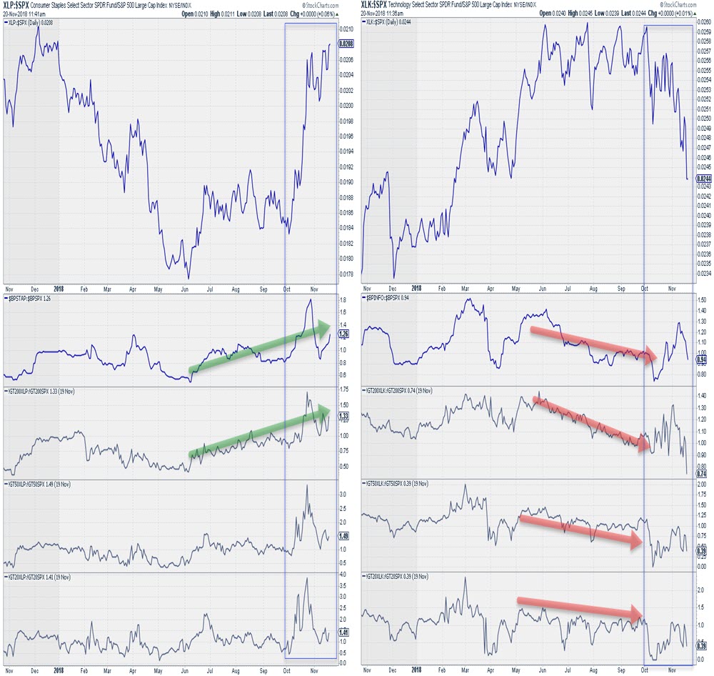 I have to admit that the results are not as smooth as I had expected/hoped.
Nevertheless, there seems to be a tendency for the breadth comparisons to lead the ratios albeit in a rather irregular fashion. Especially the wild swings that show up during the last six weeks are surprising me.
In the next article, I will run these numbers on Relative Rotation Graphs again and investigate whether RRG calculations can pick up those trends in range bound indexes/indicators in a meaningful way.
Let me know what you think of this usage of RRG in the comments below. If you would like to receive a notification when a new RRG blog article is published, simply "Subscribe" with your email address using the form below.
Julius de Kempenaer | RRG Research
RRG, Relative Rotation Graphs, JdK RS-Ratio, and JdK RS-Momentum are registered TradeMarks ®; of RRG Research
Follow RRG Research on social media:
If you want to discuss RRG with me on SCAN, please use my handle Julius_RRG so that I will get a notification.