"The average long-term experience in investing is never surprising, but the short-term experience is always surprising." -Charles Ellis
I have spent much of my career working with long-term investors to generate ideas and manage risk using technical analysis. Parts of the technical toolkit actually seem much better suited for short-term trading. However, from a tactical perspective, tools like candle patterns can be a good gauge of short-term sentiment and risk/reward parameters. This can help long-term investors to identify better entry and exit points as they build or trim positions.
Dissecting a recent example
I recently tweeted about the S&P 500 index displaying a rare candle pattern called the “stick sandwich” which consists of three candles. Basically, you have two solid candles with no lower stem (meaning the day’s close was the low) surrounding an open candle (close above the open). The ideal pattern looks like this:
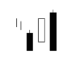 I noticed the chart of the S&P 500 looked exactly like the first two candles in the pattern, which put this on my radar.
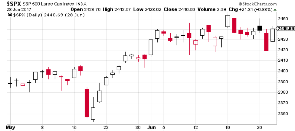
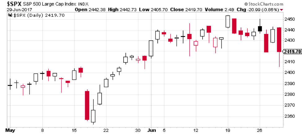
The next day, however, the index traded below the low of day one, essentially negating the pattern. You’ll see on the next chart that the third candle has a long lower shadow, meaning at some point in the day the index went much lower before rising to the close at 2419.70.
So why pay attention to patterns with esoteric names like “stick sandwich”? To be honest, the names don’t mean much to me. What is important is what the candle pattern can tell you about the short-term dynamics for the stock in question.
A window into short-term sentiment
What does this specific candle pattern tell us about the short-term sentiment, and why would it be a bullish indication?
The key here is the first and third candle in the stick sandwich pattern, which should have the same closing price. The similar closes serve as a support level, or a level at which buyers will likely enter the market to push the price higher.
After one day of closing at the lows, the second day we see some buying as the price closes higher. Then on day three, we once again close at the same level as day one, confirming the importance of that price level.
The beauty of candlestick analysis is that it is essentially an early form of data visualization. Once you get familiar with some of the common candle patterns, you’ll find they almost jump off the chart when you see them.
Remember that candle patterns along with point & figure charts were created well before computers allowed us to aggregate data. They were the “quantitative analysis” of the time, and even with computing power at your disposal they still have a place in your toolkit.
Incorporating candle patterns into your analysis
When I’m evaluating a chart, short-term indicators like candle patterns come in at the end of the process. Once I’ve understood the long-term price trend, support and resistance levels, price patterns and relative strength configuration, I check for any short-term movements that may help me get a sense of what the next couple days may hold. I also note if candle patterns are occurring at a significant support or resistance level or a moving average.
I also use screening tools to find stocks that are displaying candle patterns that I’ve found helpful in the past. It’s important to note that when I go through the charts, I still use the same checklist that I outlined above. This helps me to not be too skewed by the short-term picture.
Finally, I like to use candle patterns as a breadth indicator. How many stocks and ETFs are showing bullish or bearish candle patterns? Without even looking at the broad market indexes, you’ll quickly have a sense of when the tide is shifting.
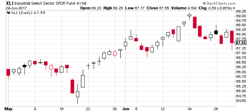
As I run the scan after the close on June 29th, I count 193 NYSE securities with a bearish engulfing pattern, including the Industrials Sector SPDR:
How many bullish engulfing patterns? Only ten.
Does this mean the market will definitely head lower? No.
Will I keep an eye on these charts to see what happens next? Absolutely.
David Keller, CMT
marketmisbehavior.com
David Keller, CMT is passionate about viewing the markets through the lenses of behavioral psychology and technical analysis. He is a Past President of the Market Technicians Association and currently serves as a Subject Matter Expert for Behavioral Finance. David was formerly a Managing Director of Research at Fidelity Investments in Boston as well as a technical analysis specialist for Bloomberg in New York. You can follow his thinking at marketmisbehavior.com.
Disclaimer: This blog is for educational purposes only, and should not be construed as financial advice. The ideas and strategies should never be used without first assessing your own personal and financial situation, or without consulting a financial professional.