When the market enters a corrective pattern, I like to compare the current move to previous corrections. I’ve written before about how corrections can make you feel, but in this case let’s remove the emotion and simply review the facts. Here we’ll consider cap tier performance as well as breadth analysis to put this correction into proper context.
Back on May 10th, I wrote about the divergence between large cap stocks and mid and small cap indexes, and included this chart to illustrate the point.
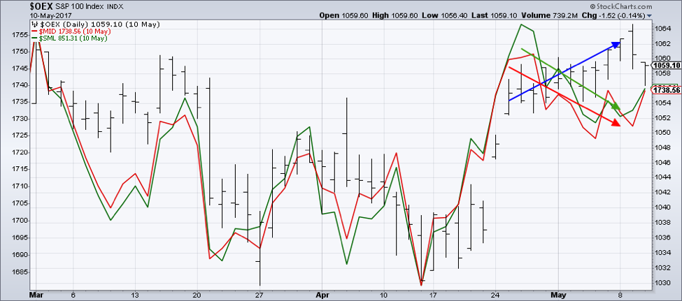 Why is this important? Toward the end of a bull phase, larger stocks tend to continue higher while smaller names can begin to correct.
The OEX did indeed correct soon after, then resumed its uptrend. Now in the last couple weeks, we see a very similar pattern of divergence.
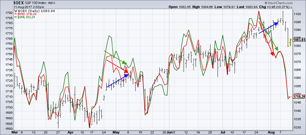
The S&P 100 index is only down 2% off the highs, and remains well above its June low. As a contrast, the mid cap and small cap indexes are already down over 5% and have broken down through support from previous lows.
One of my favorite market breadth indicators is the percent of NYSE stocks trading above their 200-day moving averages.
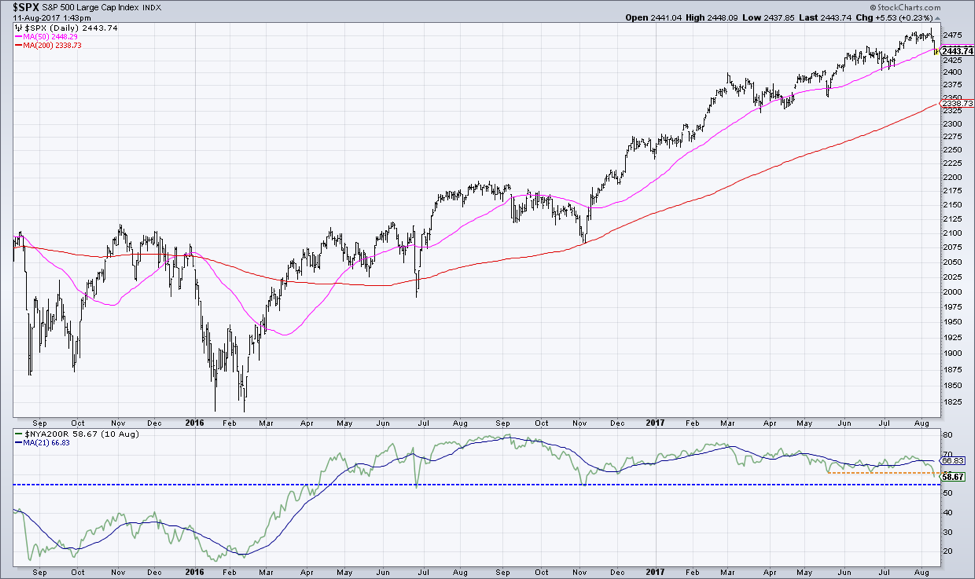
The last couple brief corrections saw the S&P 500 pull back to its 50-day moving average. In both cases, the percent of stocks above their 200-day moving average came down to 60%. This week, the indicator came down to just below 59%.
You’ll also see that in larger corrections in June 2016 and November 2016, the indicator came down to around 55%.
Taking a longer look back, we can see how this breadth indicator looks in bull vs. bear phases.
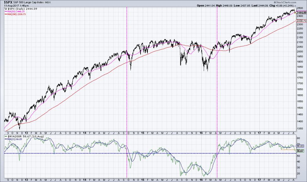 Through 2013 and early 2014, the indicator remained above 50%, with 55% coinciding with a number of corrective periods. When the indicator finally broke down through 50% (first dashed pink line), the S&P entered an 18-month holding pattern. See how the current bull phase appears very similar to the previous bull phase?
So, what does that mean for right now? I will be watching this chart to see where this breadth indicator finds support. That will tell me whether we should expect a shallow correction (indicator does not go any lower), a larger correction (indicator bottoms out around 55), or a more significant “holding pattern” similar to 2015 (indicator breaks below 50).
David Keller, CMT
marketmisbehavior.com
David Keller, CMT is passionate about viewing the markets through the lenses of behavioral psychology and technical analysis. He is a Past President of the Market Technicians Association and currently serves as a Subject Matter Expert for Behavioral Finance. David was formerly a Managing Director of Research at Fidelity Investments in Boston as well as a technical analysis specialist for Bloomberg in New York. You can follow his thinking at marketmisbehavior.com.