
Earlier this month, the technical analysis community mourned the passing of Richard Arms, the creator of the eponymous Arms Index. You can read an obituary by Jonathan Arter here. I met him a few years ago and had corresponded with him, and I can tell you that he was not only a brilliant chartist, he was also a really nice guy. He was happy to share his insights with others.
The Arms Index is sometimes referred to as “TRIN”, short for TRading INdex. TRIN was the old Reuters screen code, and it is the symbol many quote systems use to this day. But professional technical analysts like to give credit where it is due, and so we call it the Arms Index.
Dick Arms created it back in the 1960s, when he wondered what it meant if the stocks going up (or down) traded a greater share of the total volume than the other side. So he created a ratio which now bears his name, the Arms Index, which looks at the A/D ratio versus the Up/Down Volume ratio. The raw formula is as follows:
Advancing Issues / Declining Issues
-----------------------------------------
Up Volume / Down Volume
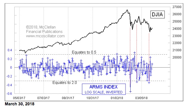
It is neutral at 1.0, which is a way of saying that the A/D Ratio and the UV/DV Ratio are the same. Readings below about 0.5 or above 2.0 show an overbought or oversold condition, respectively. This creates the slightly unusual problem for chart interpretation that a high indicator means a price low, and a low indicator means a price high. So I like to adjust for that using the math described in the chart above.
First, I calculate the Arms Index as normal, and then I calculate the logarithm of that number. Since the Arms Index is neutral at 1.0, and since the logarithm of 1.0 is zero, this has the nice outcome of adjusting the neutral level to zero. It also helps to balance out the vertical scaling for degrees of overbought and oversold conditions. Then I invert the log of the Arms Index, so that up and down match the price action, making what I consider a better chart. It still works the same as the unadjusted Arms Index; it just allows us to see better what it has to tell us.
The original thresholds of oversold (2.0) and overbought (0.5) are thus converted to roughly -0.3 and +0.3. You may notice in the chart that we did not have many extreme readings during 2017, when the stock market was in a fairly linear uptrend. But it is perking up now, and giving us its characteristic overbought and oversold readings. They do not come along often enough to form the basis of a trading system by themselves, but when they do appear they are good indications of a short term reversal.
Dick Arms’ original intent was to understand what it might mean when either the advancing or the declining stocks were trading more than their fair share of the volume. But this is not the entirety of the magic of why the Arms Index works as an indicator. To get to that, I need to digress a bit to talk about the nature of the “stocks” that trade on the NYSE.
“Common stocks” are only part of the broad list of issues trading there. Here are the percentages, according to our categorizations:
Common 59.7%
Preferred 17.8%
Bond CEF 7.7%
Other CEF 6.9%
Specialty 7.8%
So common stocks make up only about 60% of the listed issues on the NYSE. All of the other ones still get an equal vote in the Advance-Decline statistics, even though they are considered by many to not be “real” stocks. The Bond Closed End Funds (CEFs) are often maligned for contaminating the “real” data as interest-sensitive issues, although that criticism is actually misplaced. The “specialty” category contains items like warrants, rights, “when issued”, structured products, and other odds and ends.
But common stocks interestingly account for around 95% of the trading volume each day. The others trade “thinly”, meaning that they have relatively small amounts of daily volume. So what the Arms Index is really telling us at extreme readings is that there is not so much a case of the advancing or declining stocks trading more than their fair share. It is instead more a case of there being a big difference between the behaviors of the stocks which trade most of the volume, and those that don’t.
Here is a chart to help illustrate this point. This is an Arms Index for just the common stocks, again with my log-scaled inverted modification.
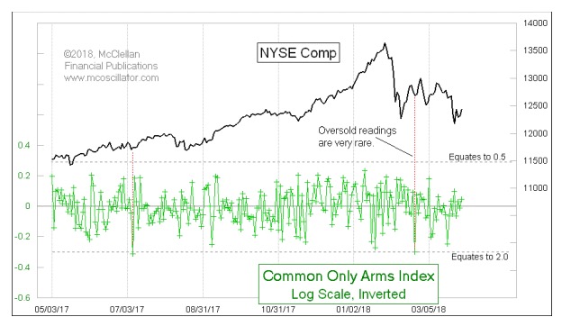
The difference we see versus the one above that uses the composite NYSE A/D and UV/DV numbers is that the amplitudes are much smaller for the common only version. In other words, the A/D and UV/DV ratios for the common stocks by themselves are much more similar. In the past year, the Common Only Arms Index has never once shown us an overbought reading, and only gave a couple of oversold ones. And those oversold ones were not necessarily at the great price bottoms where you would really like to see such an indication.
In other words, “purifying” the data to look at just the common stocks ends up stripping away the useful information that makes the Arms Index work. It is the presence of the supposed “contaminants” in the NYSE data which makes for the great indications when their behavior is different from the common stocks.
This does not take away anything from the indicator which Dick Arms developed. He both envisioned a great indicator and recognized its utility when he saw what it does. And then he shared it with all of us.
Tom McClellan
Editor
The McClellan Market Report
www.mcoscillator.com