Hello Fellow ChartWatchers!
Markets are pulling back from their highs on increasing volume. You can see the weekly and daily charts with my annotations by clicking here. But even in this declining market environment, there are always possibilities. My "Strengthening Strength" scan (included at the bottom of the page I just linked to) found several promising gems including the Biotech Products ETF (BBP), Glaukos (GKOS), Clovis Oncology (CLVS), Activision/Blizzard (ATVI) and several others. (Read this article if you aren't familiar with my stock picking approach.)

How ChartCon 2016 Will Help You Make Better Investing Decisions
As you (hopefully) know, ChartCon 2016 - our online conference for all StockCharts users - starts this coming Friday! The theme for this year's ChartCon is "Building your own customized technical trading system" and I wanted to take a moment to expand on that so you know what to expect.
Many people dive head-first into Technical Analysis and charting without understanding the context it should be used in. I did that myself 25 years ago when I got my first copy of (DOS-based) MetaStock.
"Wow! These charts look great! All the lines seem useful! And all this new terminology sounds really promising! The Ultimate Oscillator?! How can I lose?!?!"
Sound familiar?
Every day our Customer Support team hears from someone else in that same mental state. They are thrilled with all the tools and options that StockCharts provides, but they have no idea (or worse a very wrong idea) about where to start.
Past ChartCons - and our webinars and our seminars - have focused mainly on how to use the tools at StockCharts effectively. And while that is definitely important, this time we are going to focus on the bigger picture. How can you use Technical Analysis to actually TRADE. It turns out there is a lot more to it than what those commercials for on-line brokers show you!
Every experienced investor will tell you that success in the market is as much about your mental approach as it is about your stock picking prowess. You need several other "puzzle pieces" in place before you will be able to successfully profit from the trading ideas and setups that StockCharts.com gives you. Those puzzle pieces are what this ChartCon will focus on. By the end, I guarantee you'll have a much better idea of what you need to focus on to improve your trading results.
Q: But Chip, I already have a successful trading system. What's in it for me?
A: That's terrific! I hope our tools play a part in your success. As an experienced investor, I'm sure you know that you can never stop learning and improving your trading. ChartCon 2016 will include tons of tips, tricks and ideas for "tweaking" an existing system and making it even better. And, of course, you'll hear directly from our expert Technical Titans - John Murphy and Martin Pring - about where they think things are headed. I'm confident that every presentation will have something for everyone regardless of how experienced (or "experience-challenged") they are.
Q: This sounds great Chip. When is it again?
A: ChartCon 2016 starts on Friday, September 23rd and runs thru the end of the day on Saturday, September 24th. It's an on-line conference. All you need to watch it is a computer and an Internet connection.
Q: Crud - I have to work on Friday. Will it be recorded?
A: Absolutely! However - and this is very important - in order to see the recording, you need to register for the conference before Friday. Only people that register before Friday will have access to the recordings.
Q: OK, good. But my Internet connection isn't the best. Will I be able to watch the conference?
A: We'd be very surprised if you couldn't. We are using one of the best streaming services out there - Livestream - to send the broadcast to your computer. Livestream automatically provides the stream in several different bandwidths at the same time. So if the Hi-res broadcast isn't working for you, you can switch to a less taxing setting and see if that works better.
Another nice thing is that Livestream allows you to "rewind" the live broadcast and review anything you missed the first time.
To help you test Livestream ahead of the conference, we have recorded a short test video for you to check out. Here's the link: https://livestream.com/stockcharts/cc-video-test
Please click on that link to test Livestream and see a short message from Grayson and myself!
Notes on this test:
- If you have any technical problems with the Livestream viewer, please consult this page for help.
- If you have Norton Security and it tells you "Livestream is a dangerous website", please just ignore that message. Norton is referring to a completely different broadcast from ours.
- This test video was very hastily put together using my laptop camera. The acutally conference will be MUCH more professional we promise!
- Just before the conference begins, we will send out the official video link and password to all registered participants. It will be different from this test link and you will need a password to access it.
To see the complete speaker line-up, the conference agenda, and to register for ChartCon 2016, please click here!
See you on Friday!
- Chip
ADVERTISEMENT

I've been writing about the upturn in global bond yields, which has boosted Treasury bond yields. Chart 1 shows the 10-Year Treasury Yield trading above 1.70% in today's trading. Foreign yields are bouncing as well. One of the side-effects of rising bond yields is the recent rotation out of bond proxies like staples, telecom, telecom, and REITs and into financials like banks, brokers, and life insurers. My main focus has been on bank stocks that usually benefit from higher bond yields. Over the last month, however, the two strongest financial groups have been life insurers and investment service stocks. And both are doing very well today.
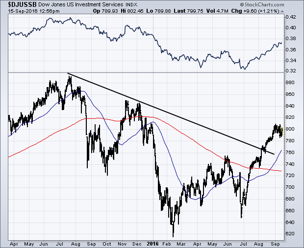
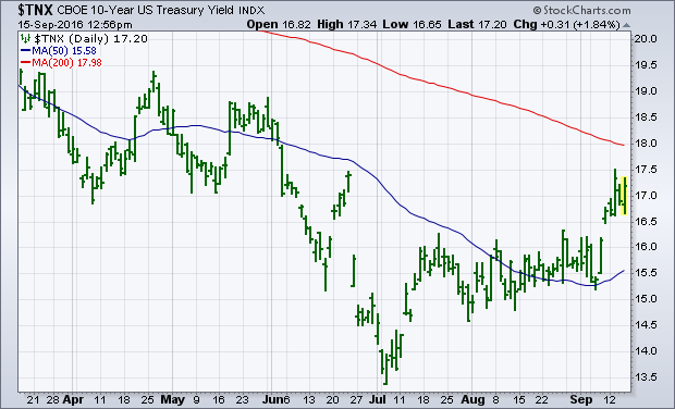 Financial stocks have been market underperformers throughout the seven year bull market in stocks. That's most likely due to the fact the Treasury yields have fallen throughout that period. Since the start of the third quarter, however, financial stocks have started to come alive -- both on an absolute and relative basis. That new interest in financials has also coincided with rising bond yields. The main financial groups are banks, brokers, and insurers. All three have turned up since July and are showing rising relative strength ratios. Along with stronger chart patterns. Chart 2 shows the Dow Jones Investment Services Index ($DJUSSB) trading at the highest level this year. Its price trend shows a bullish pattern of "rising peaks and rising troughs" since February, as well as having cleared a major resistance line extending back to last July. Its 50-day average has also climbed above its 200-day. And its relative strength ratio (top of chart) is rising. Investment service stocks have been the strongest part of the financial sector since midyear. That could be interpreted as a new sign of optimism in the stock market. I'm more inclined to view it as a sign that bond yields have probably bottomed.
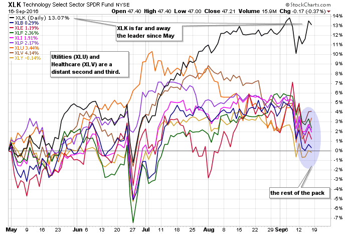
There is the tech sector, and then there is the rest of the stock market. It is not that bad, but the tech sector is clearly head and shoulders above the other sectors. This is true with the Technology SPDR (XLK) and the EW Technology ETF (RYT). The first SharpChart shows the nine sector SPDRs in performance mode. Since May, XLK is up the most, by far. XLK accounts for around 21% of the S&P 500 and this is clearly helping the broader market.
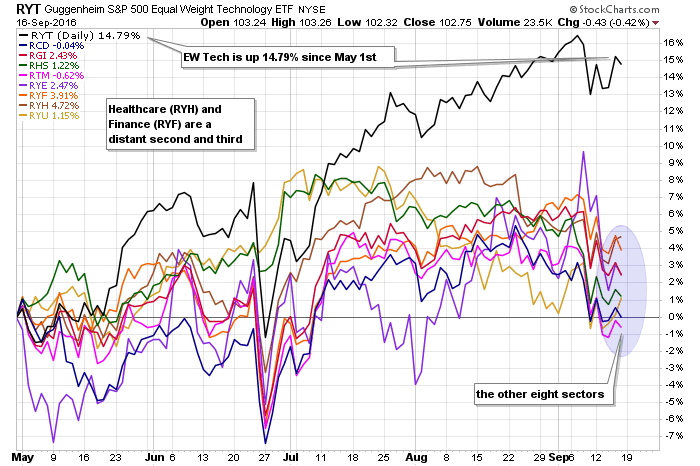
The second chart shows the nine equal-weight sectors to prove that this is not just a large-cap affair. The EW Technology ETF (RYT) is up a whopping 14.79% since May and this is around triple the second place sector, which is the EW Healthcare ETF (RYH). Despite second place, RYH is still up a respectable 4.72% the last four and a half months. Note that the technology sector accounts for around 14% of the EW S&P 500 ETF (RSP).
 Programming note: ChartCon is just around the corner - like next week.
****************************************
Thanks for tuning in and have a good weekend!
--Arthur Hill CMT
Plan your Trade and Trade your Plan
*****************************************
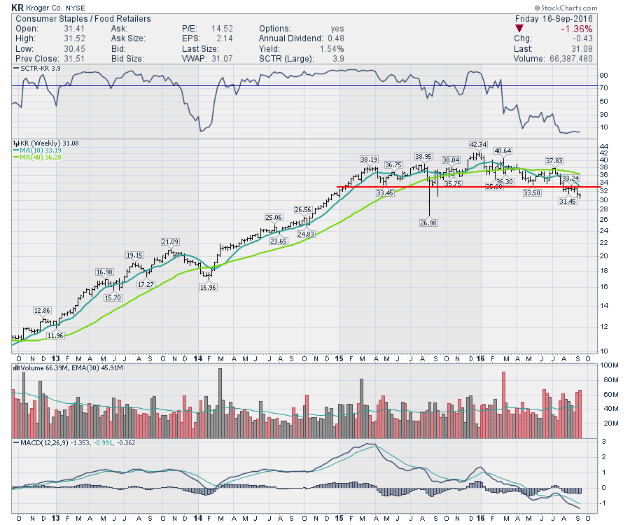
The Grocery chains are usually a free cash flow machine and are in the Consumer Staples Group. Walmart is an exception sitting in the Consumer Cyclicals group. Walmart started as a Broadline Retailer and added groceries.
However, the grocers are not having a good year and major support levels are in play. Kroger (KR) is an example. After being in a fabulous uptrend through 2013-2014, Kroger went sideways in 2015 and is breaking support in September 2016. One could argue they broke support in August, but they are now surging away from that level. Either way, the chart looks broken. With an SCTR of 3.9%, this looks dismal. The fact that the SCTR has been weakening since the beginning of the year may just reflect the bounce in all the other sectors. My main concern with this chart is that the lower commodity prices are starting to filter into the grocers are their revenues are declining as eggs, beef and milk get cheaper.
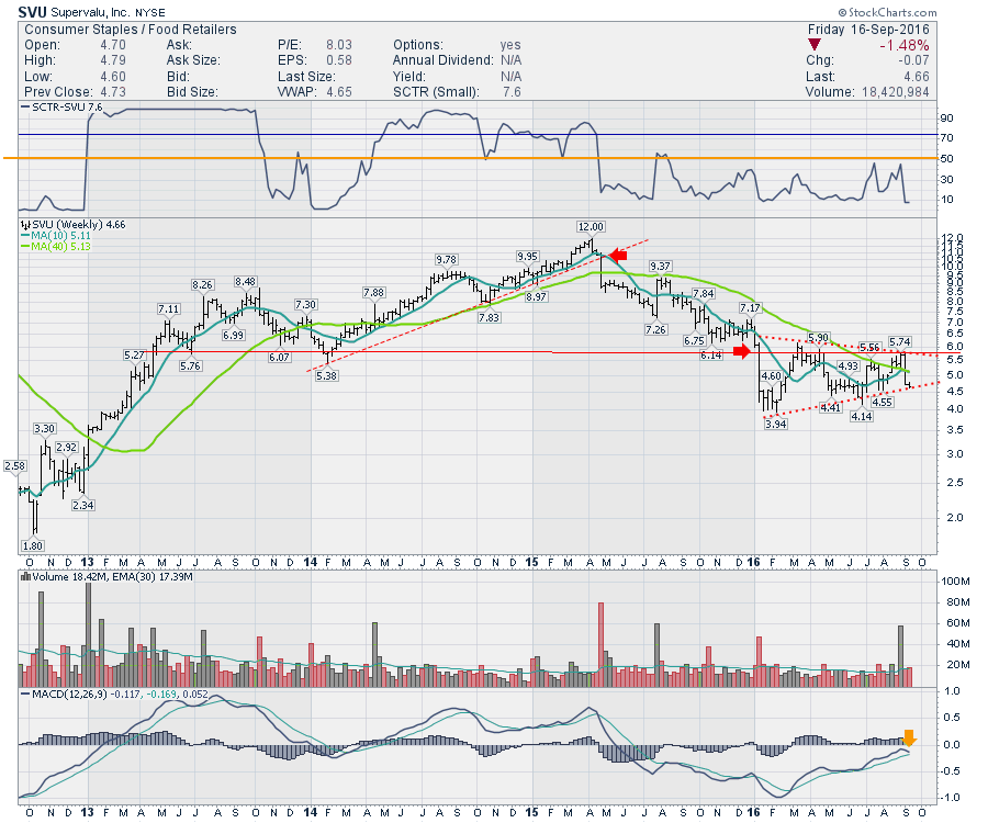
Looking at SuperValu (SVU), the trend has been broken for a long time. The most recent 2016 pennant is threatening to the downside as it back tested the support level of $5.75 and failed recently. Since the $12 highs, this stock has fallen 65 % and continues to underperform with a series of lower highs through 2015-2016.
 Walmart (WMT) looks a little better with their broad diversification. But the chart is piling up the technical points of review for Walmart's price action. First of all, I expanded this chart to 10 years. This shows Walmart since the StockCharts SCTR was started. The SCTR on Walmart has an interesting history. In both of the 2007 and 2011 broader market downtrends, the SCTR soared above 50 and stayed there during the downturns. This would reflect Walmart as a safe place during market downturns. In 2014, Walmart broke out to meaningful highs with the broad market which is shown in the lowest panel. When they announced their minimum wage increase, the stock fell hard. What is interesting now, is Walmart's SCTR has stayed above 50 for most of 2016. So I am watching to see if it renews the status of safe harbour in a storm (2007,2011) or will it continue to rise with the market in general (2014, 2016). The recent thrust with the market pullback makes me wonder.
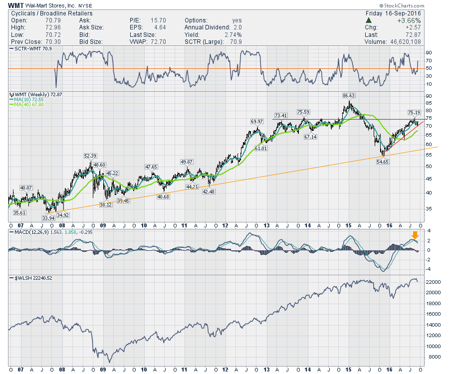 Looking at Walmart's price action, it is up against the major resistance of 2013-2014. It is also testing the 2016 up sloping trend line which just so happens to coincide with the 2013-2014 resistance level. Call it $70-$75 for an important battleground. For technicians, this is an important place on the chart. Looking at the MACD, when WMT gets up to this high level it is usually a meaningful top. If Walmart rolls over here, that would be an important long-term trend resistance and the orange uptrend would become important.
The other grocers are already struggling. Will Walmart follow suit? Will the defensive stocks start to rise up again? All three charts above need to get going to the upside or this group could experience a lot of selling pressure. Whole Foods (WFM) is barely holding at support. Investors in this sector should be aware of the knife-edge they sit on currently.
Good trading,
Greg Schnell, CMT, MFTA.
A comment on a recent DecisionPoint Alert blog article prompted me to review the Thrust/Trend Model indicator chart. During Friday's webinar I brushed over it as time was quickly disappearing. I promised to go over it in more detail in my ChartWatchers article. So here we go!
First, here's a quick refresher on the signal generation of the Thrust/Trend Model. When Sell or Neutral signals are generated by the trend component (basically the Intermediate-Term Trend Model) of the Thrust/Trend Model , the next buy signal is dependent on the "thrust" component--dual positive crossovers by Price Momentum Oscillator (PMO) and Percent Buy Index (PBI) (green lines). After that original signal, the trend component needs to confirm it by having a positive 20/50-EMA crossover (blue lines). Once the Trend Model confirms, the BUY signal will remain intact until a negative 20/50-EMA crossover (red lines). After the negative crossover, the PMO and PBI are in charge again.
As you can see on the chart, we are currently on a Thrust/Trend Model BUY signal that first generated in February. In the meantime, the PMO and PBI have been having crossovers of their own. Those I've highlighted in purple. Although we have a BUY signal right now, we can see how using the dual PMO/PBI crossovers do add an extra screen. The PBI had its negative crossover on Friday, so it would've missed the correction, but it implies their is more downside approaching. Most importantly, note that the 20-EMA is approaching a negative crossover the 50-EMA. That would generate a Neutral signal on both the Intermediate-Term Trend Model and the Thrust/Trend Model. Once that happens, we'll be watching the PMO and PBI closely for positive crossovers to generate the next Thrust/Trend Model BUY signal.
Conclusion: Although we're still on Intermediate-Term Trend Model and Thrust/Trend Model BUY signals, they are closing. The PBI likely gave us serious warning of an impending intermediate-term decline.
Come check out the DecisionPoint Report with Erin Heim on Wednesdays and Fridays at 7:00p EST, a fast-paced 30-minute review of the current markets mid-week and week-end. The archives and registration links are on the Homepage under “Webinars”.
Technical Analysis is a windsock, not a crystal ball.
Happy Charting!
- Erin
This is the final ChartWatchers newsletter before all of us here at StockCharts.com descend upon Northern California to produce what I believe will be one of the most educational online financial conferences of our time. Leading technical experts will be divulging their best kept secrets to hopefully add weapons to your arsenal as you trade and invest for higher profits. You still have time to register, but that window is closing FAST! A small investment in education can go a long way toward higher profits, so please be sure to check out our information page. That page lists the speakers - and the time(s) they'll present - and the agenda, along with REGISTRATION information. I've been to a large number of financial conferences and believe this one will BY FAR exceed the educational content of all of my prior conferences combined.
I am a true historian and have witnessed historical trends repeat themselves over and over and over again. In April, I posted a ChartWatchers article, "Where Should We Look For May Strength?". I promptly pointed out that the Dow Jones U.S. Tobacco Index ($DJUSTB) produced its second largest gains during the month of May (October is its best), where it's averaged gaining 3.9% over the prior 17 years. In May 2016, the DJUSTB rose just 1.0%, but the trade setup was appropriately identified on its weekly chart. Here's how the DJUSTB looked at the time of that article (April 16th):
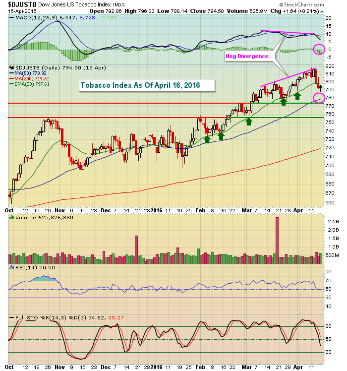 Technically, tobacco stocks were losing upward momentum in early April. As long as the MACD climbed in prior months, note that the rising 20 day EMA (green arrows) provided solid support. But that changed in April and a negative divergence emerged. Following that negative divergence and at the time of that ChartWatchers article, the rising 20 day EMA was lost, increasing the likelihood that we'd see a 50 day SMA test and potentially a MACD centerline reset (pink circles). Also keep in mind that we knew that tobacco performed well in May so we're trying to get the best reward to risk entry point into this group. In addition to the 50 day SMA, two price support lines are provided above. This is a solid explanation on how to plan a trade in advance on weakness, rather than chasing prices higher.
Now check out how tobacco performed once it bottomed later in April as expected:
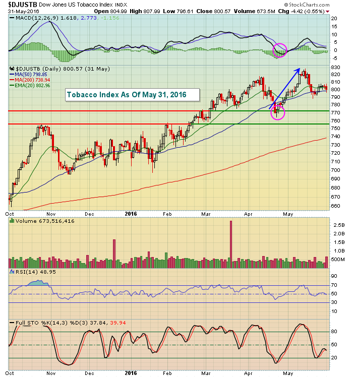 This chart shows the next six weeks of activity. We did see further weakness because of the momentum issues, but check out the quick recovery in tobacco stocks as they moved from April into May! While you could have made this trade based on technical indicators alone, the fact that May typically produces strong seasonal results for tobacco added to the likelihood of a successful trade here. Historical strength would increase my confidence in the trade, not guarantee its results.
During ChartCon 2016, my presentation is titled "Making Money From Repeating Historical Trends". During my discussion, I'll provide interesting facts about both the "Go Away In May" theory and stock market performance around presidential cycles. That will be followed up with very interesting and repeating trends regarding how U.S. equities trade throughout the calendar month. If you don't know that these trends exist, you're leaving profits on the table - it's as simple as that. I'll walk you through how use this seasonal information in a case study or two similar to the tobacco trade above. I hope you'll join all of us at StockCharts.com for a one-of-a-kind event. CLICK HERE to register!!!!
Happy trading and see you this week when we stream ChartCon 2016 LIVE to your office or living room!!!!
Tom
SITTING ON THE EDGE
by John Hopkins | InvestEd Central
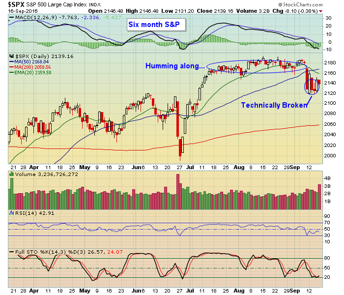
September has a reputation of being a difficult month for traders. So far it is living up to its reputation.
The S&P started out the month pretty much like it had the prior many weeks; going nowhere. And on September 8 the S&P remained within easy striking range of its all time high. But the following day stocks got hammered with the S&P losing almost 2.5% in one session. It also closed below both its 20 and 50 day moving averages, technically wounded and unable to make much progress since.
 While the S&P and Dow suffered technical damage last week, the NASDAQ outperformed, largely due to a 12% rise in Apple's stock price. But just before AAPL went on a tear, the NASDAQ was also showing signs of cracking.
The headlines throughout the week continued to focus on the upcoming FOMC meeting where Fed governors will decide on interest rates, with the hawks jawboning for an increase. However, weaker than expected economic news throughout last week likely pushed any prospects for a rate increase to the end of the year.
It does raise the question, why is September such a challenging trading month? Maybe its because the euphoria of the summer is over and its back to business as usual after Labor Day. Maybe its because traders have set themselves up psychologically to prepare for the worst - a type of self fulfilling prophecy. It is a month that precedes the October earnings season so maybe traders adopt a "show me the money" attitude. It didn't help this year that the market went into narrow consolidation mode for a number of weeks; it was a perfect setup for a big move one way or another and given September's historical reputation a move lower makes some sense.
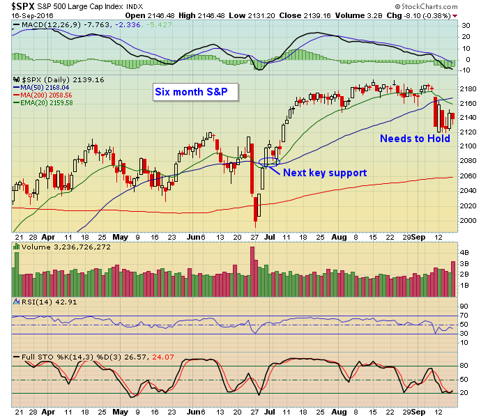
Whatever the reason(s) the market remains vulnerable to additional selling. Maybe AAPL continues to help the NASDAQ outperform but if that begins to wane we could see tech stocks begin to falter as well. In the case of the S&P it challenged the 2120 level four different times last week and held. So that has become an important level of support. If that goes, the S&P could easily fall another 50 points near the 2070 level.
 What can bring the market out of its current funk? Once we get through the Fed meeting this upcoming Wednesday we'll only be a few weeks away from the beginning of the October earnings season. And the market cares more about earnings than anything else. So we might remain in a challenging trading environment until there is further evidence that profits are growing. And even then traders might remain skeptical that higher prices are warranted.
For those who are interested, I'm going to conduct a FREE webinar this Wednesday, September 21 at 4:30 PM eastern after the Fed rate decision has been made to see where the market stands and discuss what might be next. If you want to join me just click here


 Financial stocks have been market underperformers throughout the seven year bull market in stocks. That's most likely due to the fact the Treasury yields have fallen throughout that period. Since the start of the third quarter, however, financial stocks have started to come alive -- both on an absolute and relative basis. That new interest in financials has also coincided with rising bond yields. The main financial groups are banks, brokers, and insurers. All three have turned up since July and are showing rising relative strength ratios. Along with stronger chart patterns. Chart 2 shows the Dow Jones Investment Services Index ($DJUSSB) trading at the highest level this year. Its price trend shows a bullish pattern of "rising peaks and rising troughs" since February, as well as having cleared a major resistance line extending back to last July. Its 50-day average has also climbed above its 200-day. And its relative strength ratio (top of chart) is rising. Investment service stocks have been the strongest part of the financial sector since midyear. That could be interpreted as a new sign of optimism in the stock market. I'm more inclined to view it as a sign that bond yields have probably bottomed.


 While the S&P and Dow suffered technical damage last week, the NASDAQ outperformed, largely due to a 12% rise in Apple's stock price. But just before AAPL went on a tear, the NASDAQ was also showing signs of cracking.
 What can bring the market out of its current funk? Once we get through the Fed meeting this upcoming Wednesday we'll only be a few weeks away from the beginning of the October earnings season. And the market cares more about earnings than anything else. So we might remain in a challenging trading environment until there is further evidence that profits are growing. And even then traders might remain skeptical that higher prices are warranted.
 This blog is in the new bi-weekly format where we'll first analyze the charts I presented to you in my September 2, 2016 blog. After that, we'll present new charts.