 I'm quite certain the title of this article caused curiosity. I often use the word Measure instead of Indicator when referring to indicators that are used to measure something, such as a trend, a level of volatility, etc. I have mentioned Michael Zahorchak before. His book, “The Art of Low Risk Investing,” was THE book that hooked me on technical analysis in the 1970s, recommended by good friend Tom Zellner. While I had read the early classics, it was this book that made it all credible. It has been out of print for decades but I see it offered occasionally, but not cheaply. The process that he described was simple and complete. I think I wrote a little about this before, but in the late 1970s and early 1980s I would drive to the nearest hotel in Dallas, TX to purchase a copy of Barron’s as it had all the data needed for Zahorchak’s process. On Sunday afternoon, I would sit at the kitchen table with graph paper (adequate supply remained after engineering days), a red, green, and blue pencil, a horribly expensive red LED calculator and I would enter the data into a columnar pad and then plot it on graph paper. I also remember having to add graph paper via tape to the right edge and sometimes higher or lower depending upon what the market was doing. I was an early buyer of the Apple II computer because that would easily solve some of the manual drudgery. I started with an Apple II, an old small black and white TV, and a cassette recorder for storage. Truly amazing –– at the time.
I’m going to cover only the basics (no specific details) of the Zahorchak Method and show a couple of indicators I created many years ago. The goal of this article is to show that creating a technical process that you can believe in and follow with discipline is really not that difficult. Well, except for the discipline. And just so you know, the indicators I created are now part of StockCharts.com’s symbol catalog as they will be part of my upcoming market breadth book update.
Chart A shows the NYSE Composite Index in the top plot and my interpretive Zahorchak indicator in the bottom plot. Before I explain it more you can easily see that when the indicator is near the upper portion of the chart the market is generally rising and when near the bottom of the chart, the market is not rising. Also note that this is all accomplished with weekly data. The Zahorchak indicator includes the weekly NYSE Advance Decline Line; if you are not familiar with weekly versus daily breadth, please read this earlier article: Additional and Necessary Information about Market Breadth (CGMBI), the section called Weekly Breadth Data. You absolutely MUST understand the difference between daily and weekly breadth – considerably different than price. Also, you might want to familiarize yourself with Digital Indicators that I covered in the same article.
“There are 10 types of people in this world, those who understand binary and those who do not.”
Digital indicators can be expanded to many levels, both up and down. The digital indicator in Chart A uses different levels and moves from 15 to -15. Each move is triggered by one of the many components of the Zahorchak Method turning on for upward or off for downward moves. The ZM looks at the Weekly NYSE Advance Decline Line and the Weekly NYSE Composite Index using 3 simple moving averages on each; 5, 15, and 40 week moving averages. For example when the 5 week average of the NYSE Advance Decline Line goes above the 15 week average it ticks up one. When it then goes above the 40 week average it ticks up again. When the 15 goes above the 40 it ticks up again. This is also done on the NYSE Composite Index. There are also a few relationships between the Advance Decline line averages and the NYSE Composite averages that contribute to the measure. I think you can see that this weekly measure does a fairly good job of being in the upper area during up moves and in the lower area during down moves. Perfect? Of course not. If you are striving for perfection in technical analysis, you will not succeed. However, if you inherit a lot of money you will at least have fun trying.
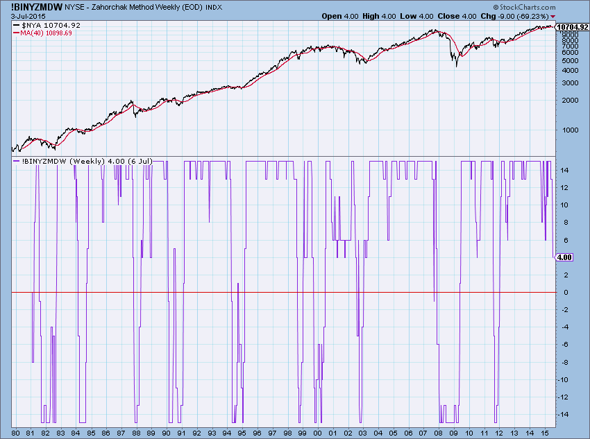 Chart A
Chart B is the same as Chart A except shows fewer years of data. Here you can see the 40 week simple moving average on the top plot of the NYSE Composite Index. The Zahorchak Measure (ZM) is in the bottom plot where I have drawn arbitrary horizontal lines to separate it into quadrants. The process of the ZM is the ongoing relationship of the various averages with each other so that each small up or down move in the ZM represents a change in one of those relationships. You can see that there are many small changes near the extremes as the relationships are quite dynamic. There are many ways one can interpret an indicator like this, not unlike RSI or Stochastics. The simplest is to use the zero line; when above it be invested, when below it be out. Try to avoid drawing lines to fit the data and remove all whipsaws because the biggest whipsaw then is in your future.
You might notice that the 2000-2002 bear did not trigger exceptional downside in the ZM. That bear market was primarily large cap issues tied to the dot com bubble. Most of the smaller issues began their bear in the 1998-1999 era. This is why breadth is such a good measure to use when looking at the market’s big picture. I have dealt with this considerably in previous articles.
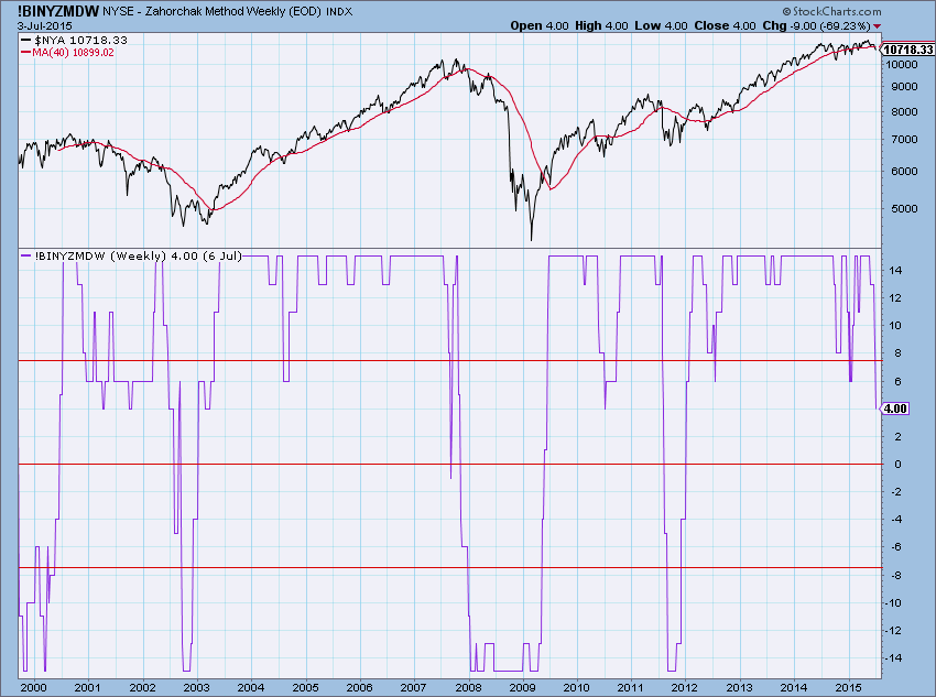 Chart B
The Zahorchak book then goes on to explain how to tie this with selecting and trading blue chip stocks. Again, the 5, 15, and 40 week moving average is used on the stock price along with a set of rules for when to buy it and when to sell it. The rules for stock selection are not much different than the rules with the AD Line and the NYSE Composite.
The Zahorcak Measure symbols are now available on StockCharts.com.
!BINYZMDW Weekly ZM
!BINYZMD Daily ZM
As a reminder, these new indicators all begin with !BI, followed by NY for New York exchange, followed by their abbreviated name (symbol) followed by W for weekly if appropriate, followed by D for digital if appropriate. Remember the D is for digital, not daily.
I created a daily version which uses the 200 day average versus the 40 week, etc. so it will be timelier but also invokes more noise. See Chart C. I prefer the daily version as I think it does a slightly better job.
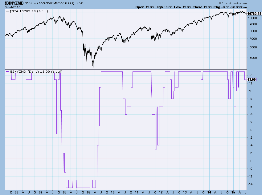 Chart C
If this generates a lot of interest I will write another article that goes into considerably more detail using the catchy title Zahorchak Measure II. I have tinkered with this concept for decades but found it difficult to improve on Zahorchak’s original parameters. Take a look at the daily and weekly version and let me know if you want more detail.
Trade with Process,
Greg Morris