This article will continue the presentation of various performance metrics on our trend strategies. We showed Chart A previously but are including it again before we introduce Chart B. Chart A shows the correlation of our two strategies and several other indices, relative to the S&P 500 Index.
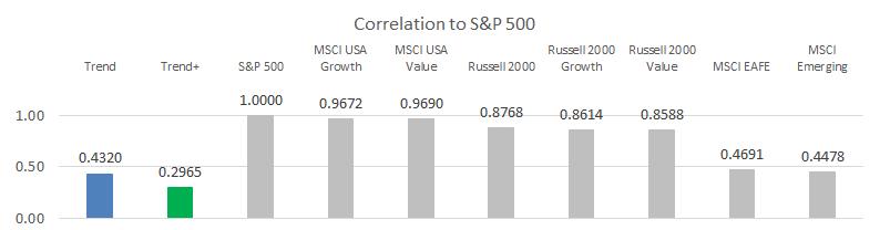
Chart A
Correlation, usually designated as R, is the statistical measure that shows the relationship between two datasets and how they move in relation to each other. That is not the textbook definition for correlation but will suffice for now. Correlation ranges from +1 (totally correlated) to -1 (inversely correlated), with 0 being non-correlated. The direction and strength of the correlation is nice information to know. Low (or negative) correlation between assets and/or strategies is where the diversification benefit comes from (as discussed in the last article).
Chart B shows R-squared (R2), the Coefficient of Determination, also known as the goodness of fit. This is just the square of the correlation coefficient R.
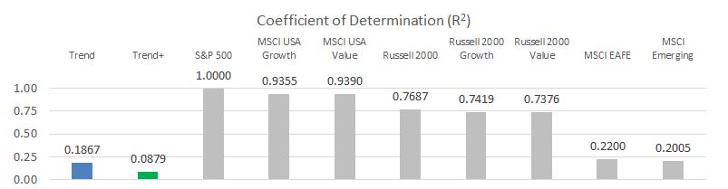
Chart B
Many people look at R2 thinking it is similar to R – R2 is reported on financial websites used to research mutual funds and ETFs – but R2 tells you nothing of correlation. Squaring correlation to get R2 will always give you a positive number between 0 and 1, thereby removing the useful information about how the datasets are correlated (positively or negatively). If you take the correlation in Chart A of 0.432 and square it, you get 0.1867 which is shown in Chart B. If another strategy had a negative correlation of -0.432, it's R2 would also be 0.1867. The coefficient of determination provides less information than correlation, even though it is more widely reported.
In theory, R2 tells you the percent dependency of one variable on the other, and usually in finance and investing this relates to how much of the movement in a fund is explained by movement in the index. It is often mistaken that funds are better if they have a higher R2. This is incorrect, as a higher R2 only tells you that the beta measurement is more reliable. R2 is especially not useful when looking at tactical strategies – those that, by design, do something completely different than the index. Again, most of what is used in modern finance is not very helpful if you do something different than invest with a buy & hold strategy.
Moving on. We also discussed Drawdown in a previous article as being a better representation of risk since it is loss of capital.
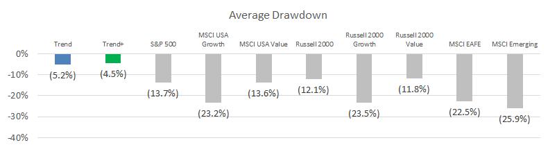
Chart C
The Ulcer index was created by Peter Martin when he wrote The Investor's Guide to Fidelity Funds in 1989. The Ulcer index takes into account only the downward volatility for an issue plus uses a price crossover technique with a 21-period average. The Ulcer index attempts to quantify risk by focusing on both the magnitude of the drawdown and also the amount of time spent in the drawdown. A much more believable risk measure than standard deviation, which is where modern finance hangs their hat.
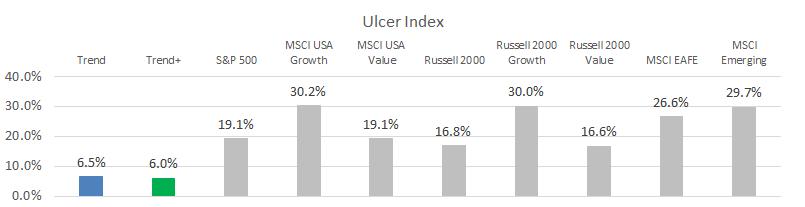
Chart D
A strategy that spends a significant amount of time in a mild-drawdown state might be just as difficult for an investor to stick with as one that has a more severe drawdown but recovers quickly. The Ulcer index attempts to capture this. Trend following is focused on avoiding big losses, so recovery and time spent making new money usually happens quicker, resulting in lower (better) Ulcer index scores.
Dance with the Trend,
Greg Morris