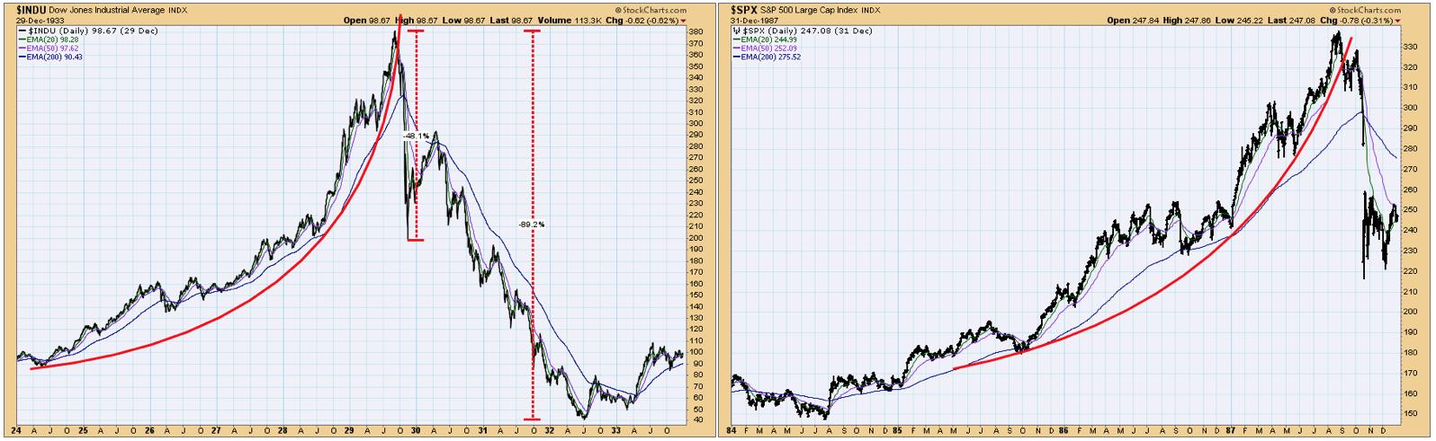
Because of some recent articles I have seen, I decided to discuss the crashes in 1929 and 1987 on Monday's regular DecisionPoint show on StockCharts TV.
What I didn't cover during the show was how the chart patterns of those two iconic events compare to the current market chart, and whether or not the market is presently on the verge of a crash, as some have asked. The quick answer is that there is no similarity between today's market chart and the those historic crashes. Both the 1929 and 1987 tops were the climax of parabolic advances, which are always dangerous.
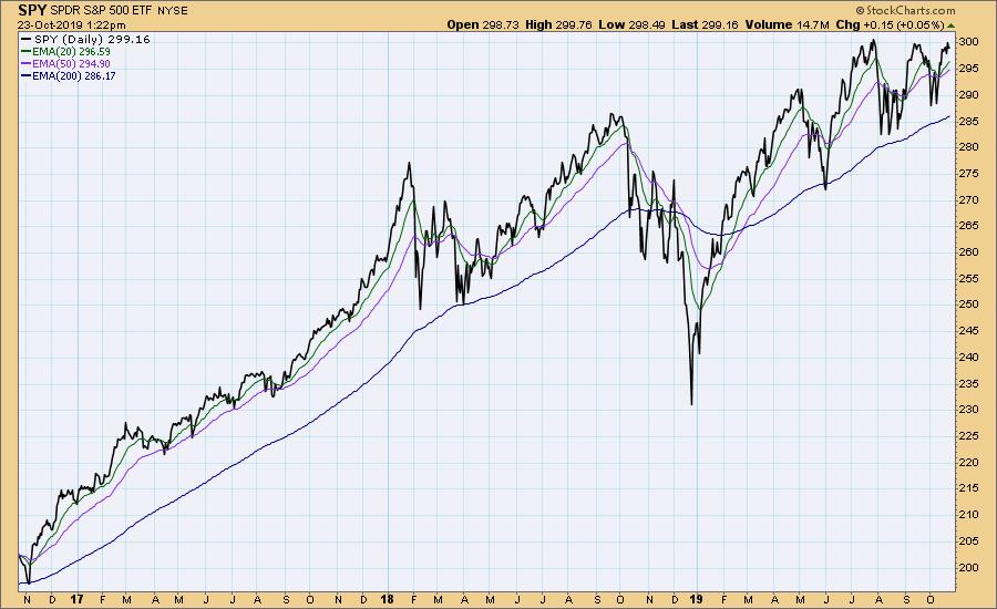
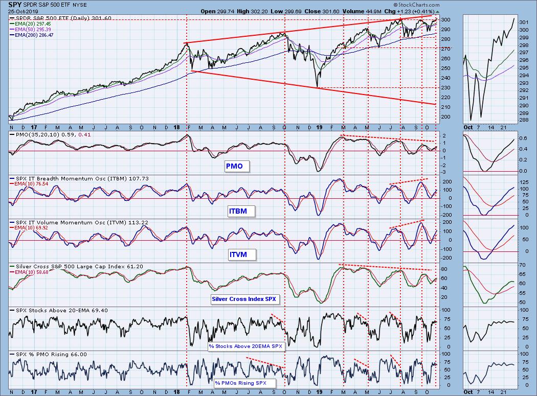
Compare them to the current market chart below, where price arced up from the 2018 low, then rolled over into a sideways pattern. It's kind of the opposite of a parabolic, though not necessarily less dangerous.
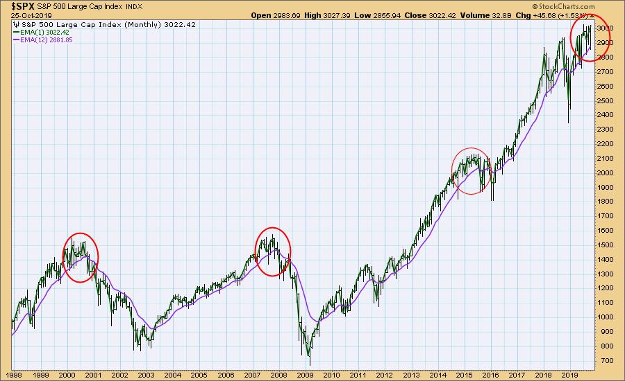
On the monthly chart we can see that the current topping pattern resembles the tops in 2000 and 2007, both of which preceded market declines of over -50%. There is also a resemblance to the 2015 top, which began a modest consolidation, but not a bear market. There are also many interim tops that had benign resolutions, which in a real-time context, might have put observers on edge. I would have to say that, at the very least, we are experiencing such a circumstance now.
The DecisionPoint Weekly Wrap presents an end-of-week assessment of the trend and condition of the stock market (S&P 500), the U.S. Dollar, Gold, Crude Oil, and Bonds.
Watch the latest episode of DecisionPoint on StockCharts TV's YouTube channel here!
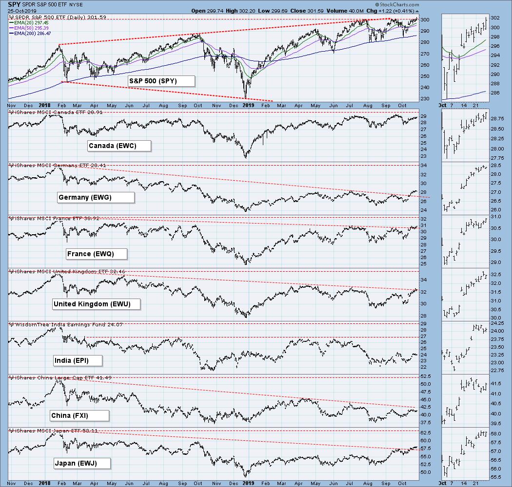
GLOBAL MARKETS
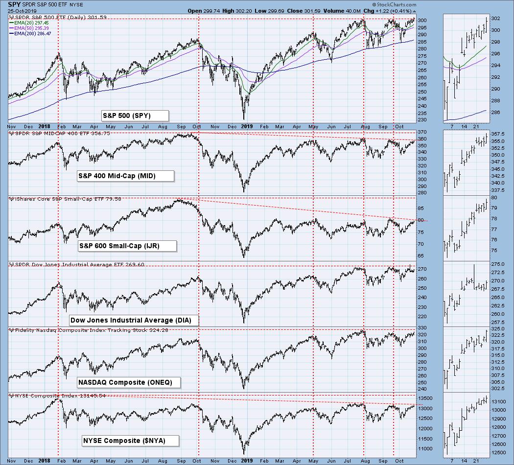
BROAD MARKET INDEXES
SECTORS
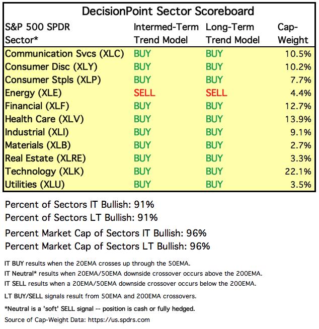
Each S&P 500 Index component stock is assigned to one, and only one, of 11 major sectors. This is a snapshot of the Intermediate-Term and Long-Term Trend Model signal status for those sectors.
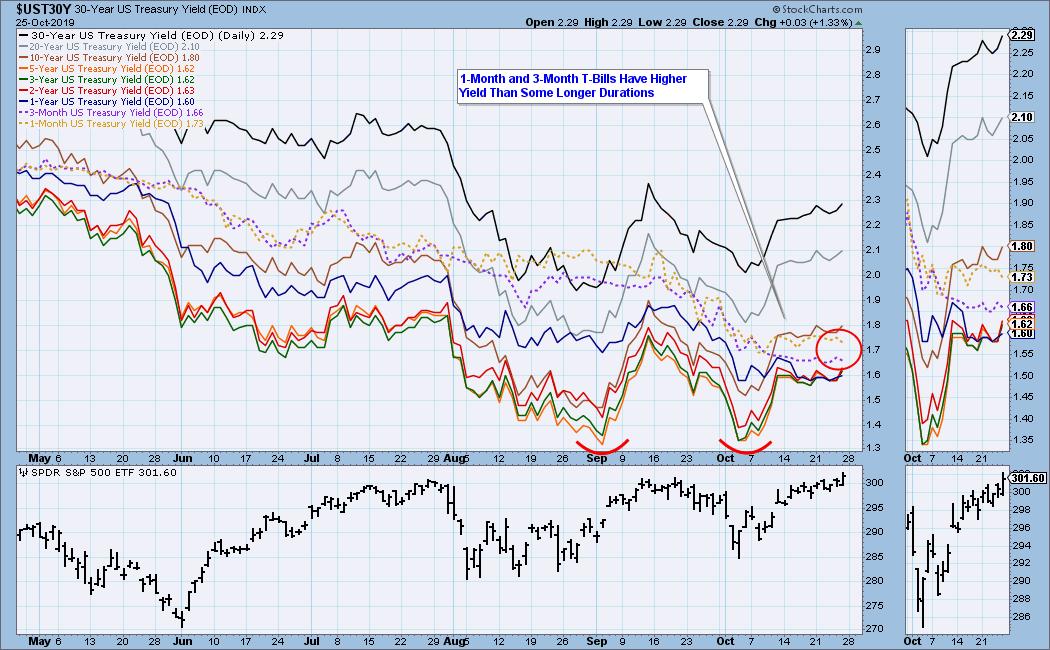
INTEREST RATES
I have included this chart so we can monitor rate inversions. In normal circumstances the longer money is borrowed the higher the interest rate that must be paid. When rates are inverted, the reverse is true. On the chart below, notice that the one-month and three month T-Bills (dotted lines) pay a higher interest rate than some longer durations.
STOCKS
IT Trend Model: NEUTRAL as of 9/6/2019
LT Trend Model: BUY as of 2/26/2019
SPY Daily Chart: The market (SPY) closed at new, but marginal, all-time highs today, but look at the lousy SPX Total Volume.
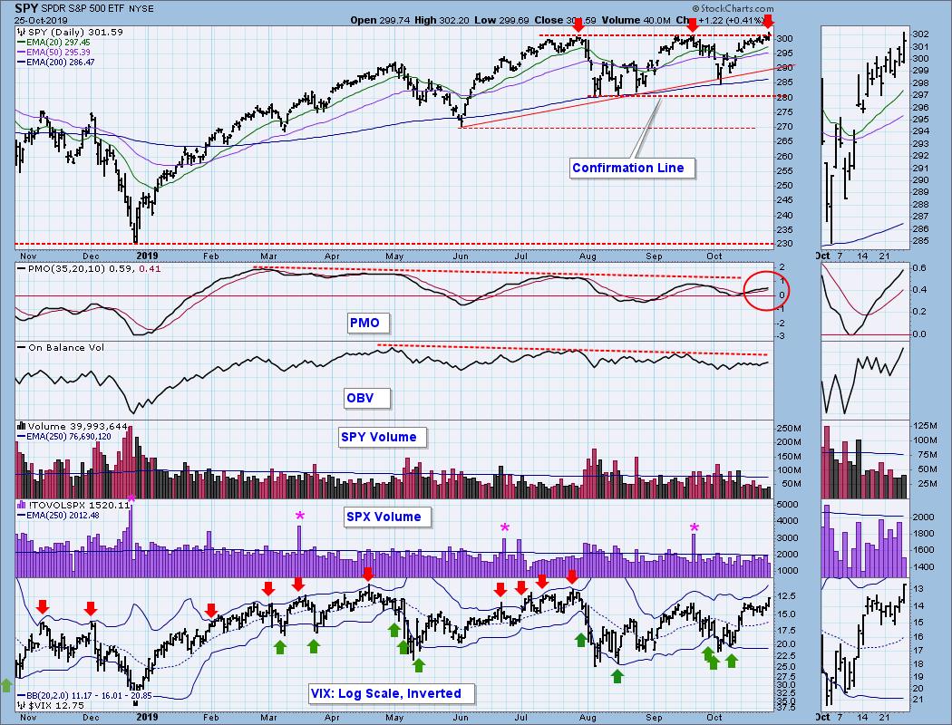
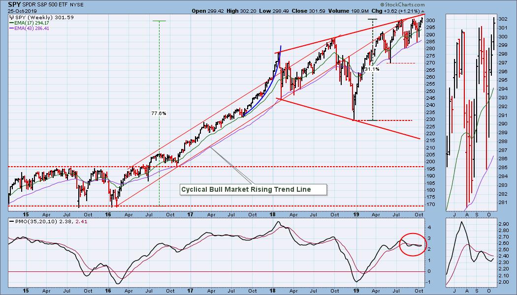
SPY Weekly Chart: Price is still crowding the top of a broadening top formation. The weekly PMO turned up this week, but it is overbought.
Climactic Market Indicators: There weren't any climactic readings this week.
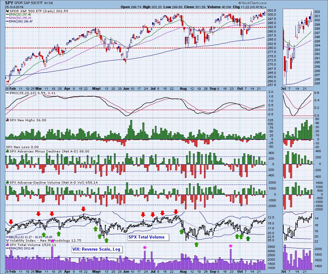
Short-Term Market Indicators: While the market is making new highs, these indicators are weaker than at the September top, but not significantly so.
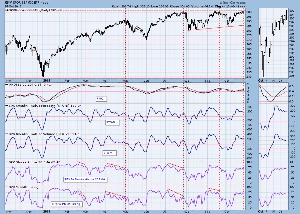
Intermediate-Term Market Indicators: All these indicators are at lower levels than they were in September. The one that really catches my eye is the SPX Silver Cross Index, showing only 61% of SPX stocks have a 20EMA higher that the 50EMA. Also, it has topped, indicating the probability that more weakness is coming.
CONCLUSION: Next week I expect the market to be quiet until the Fed interest rate announcement on Wednesday. Acknowledging that the announcement could have a profound affect on what the market does next, I continue to think we are in a topping process. While the market is at record highs, many internal readings are lower than at previous tops this year, and SPX Total Volume showed a lack of commitment to today's upward push. If price continues higher next week without an appropriate expansion of volume, I'm not a buyer.
In answer to the question posed by the title of this article, the current price configuration and internal weakness does allow for such an outcome, but that is at the extreme of a range of possibilities.
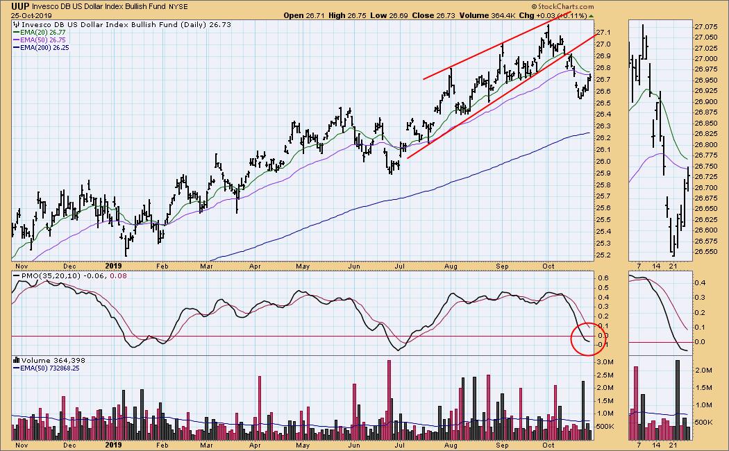
DOLLAR (UUP)
IT Trend Model: BUY as of 7/5/2019
LT Trend Model: BUY as of 5/25/2018
UUP Daily Chart: Price broke down from a rising wedge two weeks ago, but beyond that there are no clear technical clues from which to project in this time frame.
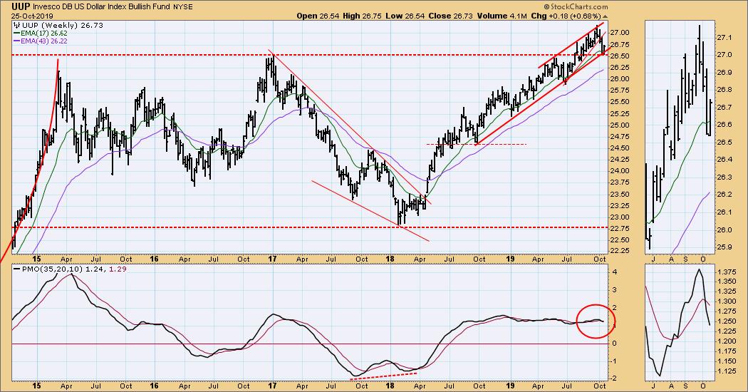
UUP Weekly Chart: In this time frame we can see that UUP bounced off significant horizontal support, as well as a rising trend line. This certainly allows for a continued advance.
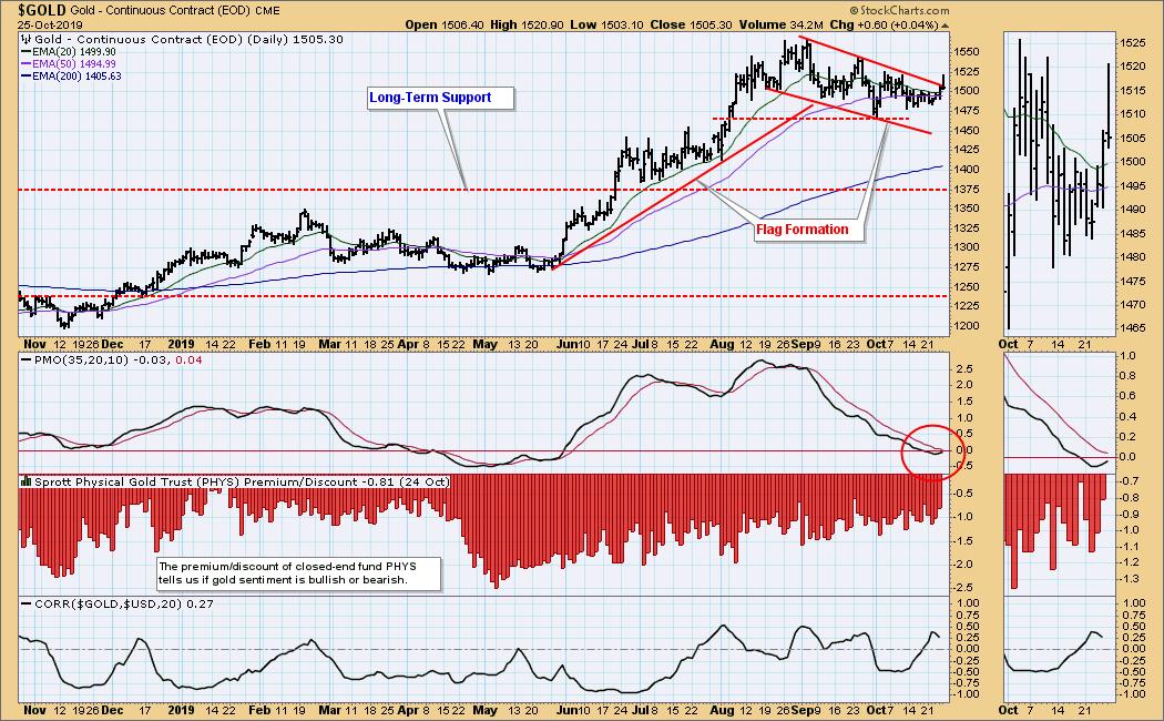
GOLD
IT Trend Model: BUY as of 6/3/2019
LT Trend Model: BUY as of 1/8/2019
GOLD Daily Chart: Gold tried to break out of the top of a declining trend channel, which I have interpreted as a flag formation. The breakout failed, but the daily PMO has bottomed, so it would be reasonable to anticipate continued upside pressure.
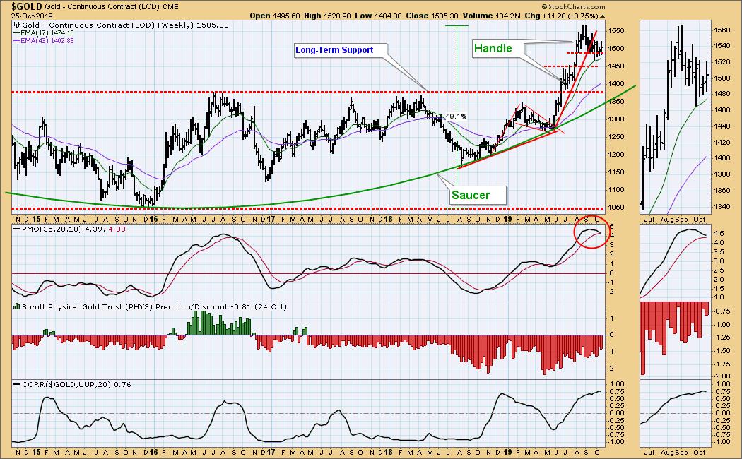
GOLD Weekly Chart: In this time frame the flag formation can be interpreted as the handle on a saucer. Since the weekly PMO is overbought and has topped, the outcome may not be as positive as on we see on the daily chart. I will continue to anticipate an eventual bullish outcome, unless long-term support at 1375 fails.
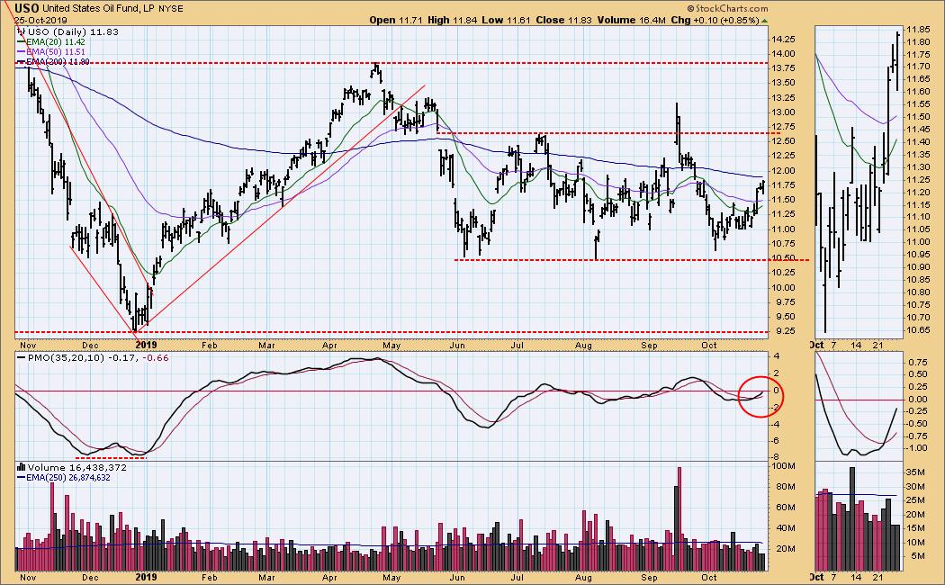
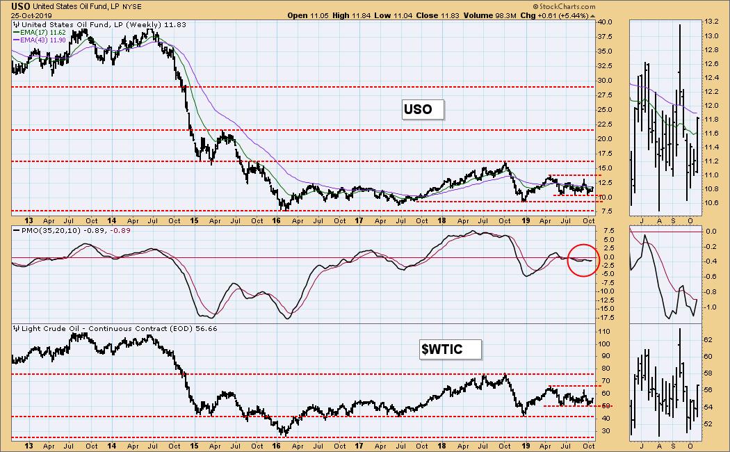
CRUDE OIL (USO)
IT Trend Model: SELL as of 10/2/2019
LT Trend Model: SELL as of 6/4/2019
USO Daily Chart: The range between 10.50 and 12.60 has held for five months, in spite of some negative news, so let's anticipate continued activity within that range.
USO Weekly Chart: The weekly PMO is relatively flat and near the zero line. It also has a slight downward slant, so price may drift down to test support equivalent to WTIC 42.00.
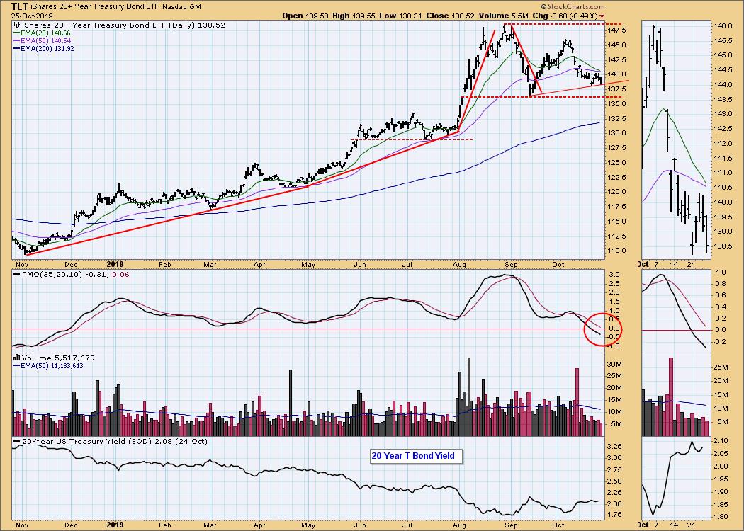
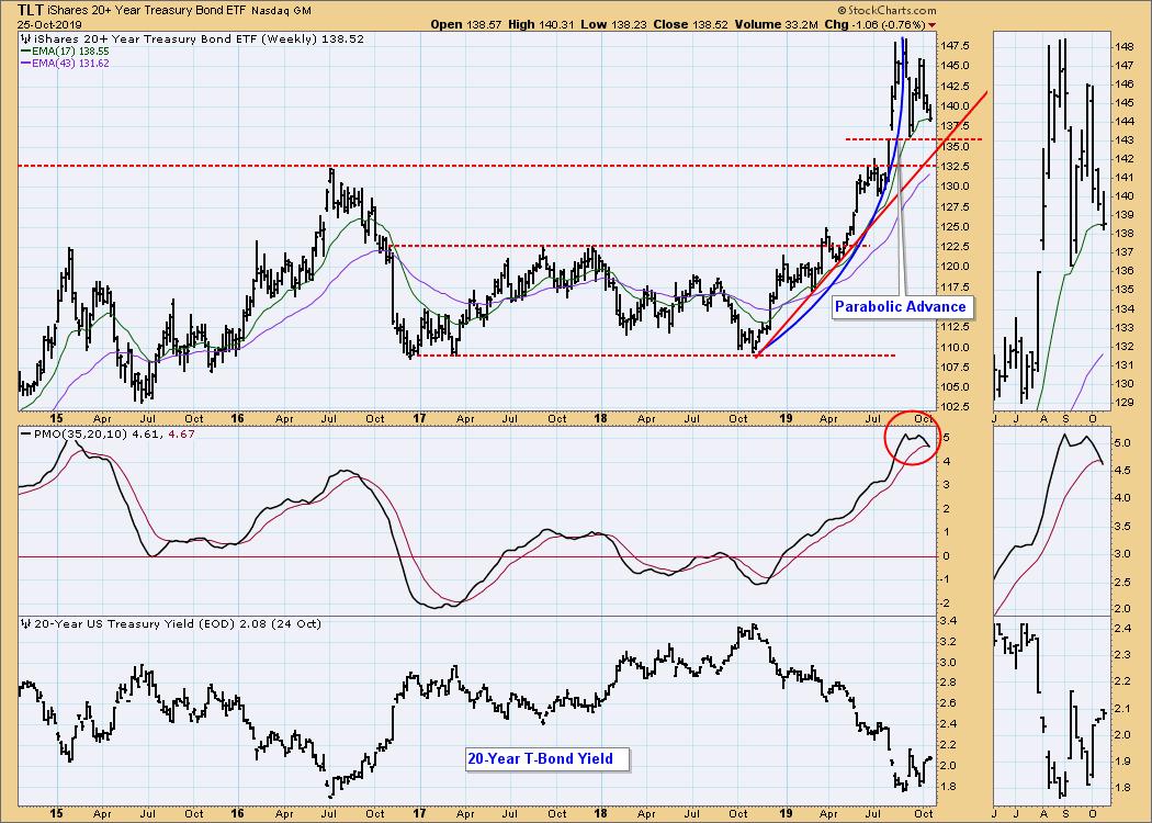
BONDS (TLT)
IT Trend Model: BUY as of 12/6/2018
LT Trend Model: BUY as of 1/2/2019
TLT Daily Chart: The 20EMA is about to cross down through the 50EMA, which will change the IT Trend Model to NEUTRAL.
TLT Weekly Chart: Price is correcting after breaking a parabolic advance. The weekly PMO is overbought, and it has crossed down through the signal line, indicating that bonds are in for a rough patch. There is horizontal support at 136.00, which is reinforced by a rising trend line intersection.
**Don't miss any of the DecisionPoint commentaries! Go to the "Notify Me" box toward the end of this blog page to be notified as soon as they are published.**
Technical Analysis is a windsock, not a crystal ball.
Happy Charting! - Carl
NOTE: The signal status reported herein is based upon mechanical trading model signals, specifically, the DecisionPoint Trend Model. They define the implied bias of the price index based upon moving average relationships, but they do not necessarily call for a specific action. They are information flags that should prompt chart review. Further, they do not call for continuous buying or selling during the life of the signal. For example, a BUY signal will probably (but not necessarily) return the best results if action is taken soon after the signal is generated. Additional opportunities for buying may be found as price zigzags higher, but the trader must look for optimum entry points. Conversely, exit points to preserve gains (or minimize losses) may be evident before the model mechanically closes the signal.
Helpful DecisionPoint Links:
DecisionPoint Shared ChartList and DecisionPoint Chart Gallery
Price Momentum Oscillator (PMO)
Swenlin Trading Oscillators (STO-B and STO-V)