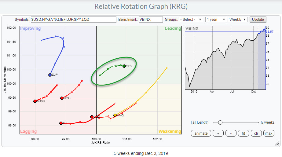
 Weekly RRG for Asset Classes
Asset allocation is the highest point in the investment decision pyramid. The decision to invest in Stocks or Bonds or other asset classes will have far more impact on the final return for an investor than the decision to select specific stocks.
Therefore, the Relative Rotation Graph showing the rotation for various asset classes remains a great anchor and guide in that high-level decision-making process.
Relative Uptrend Intact
At the start of December, we can see stocks are the only asset class inside the leading quadrant, which means that they are still in a relative uptrend against the benchmark (VBINX). This is a typical 60-40 (stocks-bonds) balanced portfolio, one that is used as a benchmark by many RIAs for client portfolios.
At the start of the new month, I always find it helpful to take a look at the monthly charts, as they have just completed their last bar or candle (etc.).
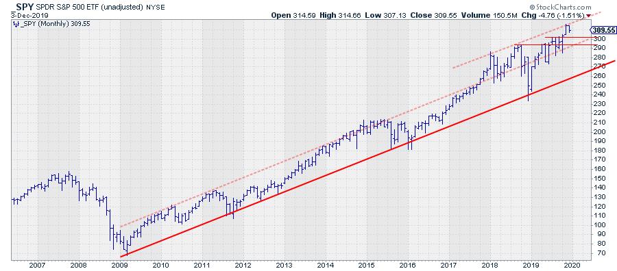 Monthly bar chart for SPY (unadjusted data)
As this image was snapped after the 3 December close, the last bar on the image above represents only two days of trading. The close of the full monthly bar for November was almost, not quite, at an all-time-high.
The most important message sent by this chart is that stocks are NOT in a bear market.
Marking Some Support and Resistance Levels/Areas
With the market almost at all-time-highs, it is difficult to assess a resistance level as there are now historical highs that we can use as reference.
Back in August, I wrote an article titled "This is My Trendline, Which One is Yours?". The trend line I described there still stands as of today and it is the solid red line on the chart above.
As time has progressed, I have tried to add a few more lines/levels that I am watching. The first one is the light red-dashed line that runs parallel, connecting the highs of 2009, 2010, 2011 and the cluster of monthly market highs in 2014 and 2015. That line gave way at the end of 2017, when the market accelerated higher.
Since that break higher, the dashed parallel has served as a support level a few times. When it was broken downward in December 2018, the solid trend line kicked in as support again.
The rally out of that December low throughout 2019 is still in play and, after breaking back above that dashed parallel, it has once again started to serve as support on a few occasions. The market seems to respect that sloping area between the two dashed lines going back to 2018.
As usual, more reliability is found in historical peaks and troughs, especially where multiple ones are lining up around the same level.
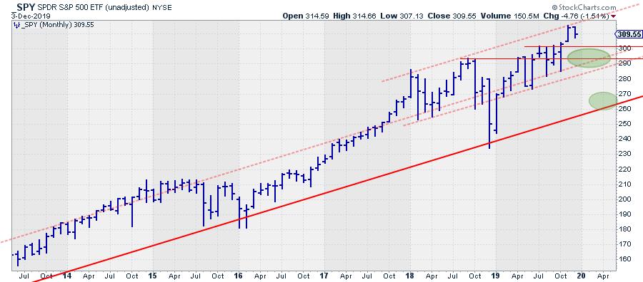 Monthly bar chart for SPY (unadjusted data)
The chart above is a zoomed-in version of the earlier chart of SPY; it shows the last few years of price action in more detail.
I am watching two horizontal levels. The first one is around 292.50, where peaks were formed in September and October 2018 and again in April, May and June 2019. In the following months, SPY tried to break higher but was not really able to push all the way. The result was three monthly highs, July, August and September, with highs around the same level, 300 (actually slightly higher, but let's round it off to a nice big figure). The break above this level at the close of October finally resulted in a clear move away from resistance.
The upper dashed trend line (resistance), which connects the highs of 2018, is still very preliminary, as we have no idea yet if the November high will actually turn out to be a "high." If we move higher in December, that trend line goes out the door, as they should touch at least three subsequent peaks of similar magnitude.
Please do not get sucked into the practice of connecting two random points on a chart and calling it a trend line...
The two horizontal levels mentioned above, ~292.50 and ~300.00, are the areas where I am now looking for support when the market decides it needs a correction. The shaded green oval highlights how this area will start to coincide with the area between the two dashed parallels.
In a worst-case scenario, there is the major trend line, now around 260, that is still in play. Of course, that is far away, and a lot can happen between now and reaching that line, especially in the structure of the market that unfolds above that level. But, for now, this is what is there for us to work with.
So, the conclusion of all this is that stocks are still the leading asset class as we move into the last month of the year.
-- Julius
Want to stay up to date with the latest market insights from Julius?
– Follow @RRGResearch on Twitter
– Like RRG Research on Facebook
– Follow RRG Research on LinkedIn
– Subscribe to the RRG Charts blog on StockCharts
Feedback, comments or questions are welcome at Juliusdk@stockcharts.com. I cannot promise to respond to each and every message, but I will certainly read them and, where reasonably possible, use the feedback and comments or answer questions.
To discuss RRG with me on S.C.A.N., tag me using the handle Julius_RRG.
RRG, Relative Rotation Graphs, JdK RS-Ratio, and JdK RS-Momentum are registered trademarks of RRG Research.
Julius de Kempenaer
Senior Technical Analyst, StockCharts.com
Creator, Relative Rotation Graphs
Founder, RRG Research
Host of: Sector Spotlight
Please find my handles for social media channels under the Bio below.
Feedback, comments or questions are welcome at Juliusdk@stockcharts.com. I cannot promise to respond to each and every message, but I will certainly read them and, where reasonably possible, use the feedback and comments or answer questions.
To discuss RRG with me on S.C.A.N., tag me using the handle Julius_RRG.
RRG, Relative Rotation Graphs, JdK RS-Ratio, and JdK RS-Momentum are registered trademarks of RRG Research.