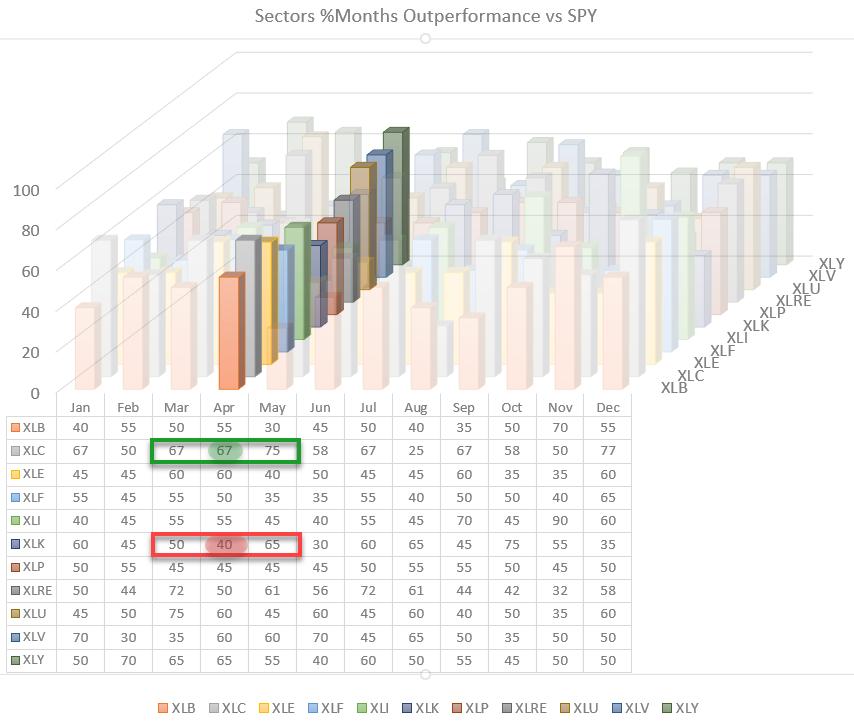
The seasonal trends for sectors vs. the S&P 500 going into April show many 50/50 odds for out- or underperformance. But the two sectors that stand out are interesting and important ones.
Seasonality for Communication services shows that this sector outperformed 67% of the time in April and 75% in May. So, based on this seasonal trend, a good period for Communication Services may be expected. Information Technology, on the other hand, shows outperformance 40% of the time -- or, in other words, an underperformance 60% of the time.
What magnitude of over-/underperformance can be expected?
The table below shows the average relative return per sector vs. the S&P 500.

For XLC, that is an average of 0.9% outperformance over SPY, while, for XLK, that is a 0.4% underperformance vs. SPY, which is in-line with the figures from the first table.
Now how are these sectors currently rotating on the Relative Rotation Graph?

The RRG above shows the rotation for XLC and XLK vs. SPY over the last five weeks. The pattern could not be more clear. XLC is moving further into the leading quadrant, while XLK is pushing into lagging.
This rotation fully matches the seasonal expectations for these sectors.
Information Technology

The "problem" for the technology sector lies primarily on the relative strength chart (blue line below price chart). After six months of sideways movement, relative strength has now convincingly broken to the downside, signaling more underperformance for technology ahead.
The resulting decline of both RRG-Lines below 100 and continuing downward confirms the technology sector's emerging relative downtrend. So far, the price trend has managed to hold up within the boundaries of the rising channel and above horizontal support.
At 26% market capitalization within the S&P 500, technology is an important sector, and its behavior can/will impact the behavior of the S&P 500.
My take from this setup is that as long as XLK can hold inside the rising channel or above the horizontal support level, the negative impact on SPY will be limited and other sectors may be able to keep the market afloat, or even push it marginally higher while waiting for XLK to recover.
As soon as price support in XLK also starts to give way, the damage for SPY will become more constructive and we will likely see a corrective move in SPY as well.
Communication Services

The chart of XLC above shows more or less the opposite image of XLK when it comes to relative strength. After a period of sideways movement, the relative strength of XLC vs. SPY broke out to the upside, signaling a renewed period of outperformance for this sector.
The trend in price for XLC is also holding up well within the boundaries of the rising channel, which supports further strength for XLC going forward.
The Problem

The problem, if you wish, is that XLK is pulling negatively at 26% while XLC is only pulling positively at 11%. I have written a bit more on this in last week's newsletter article "Tech is a Drag," which shows the market capitalization forces at work on a Relative Rotation Graph.
Even though XLC, XLI, XLRE and, to a lesser extent, XLF and XLE are generating positive pull for SPY, their combined power is only 37% versus more than 50% negative drag from XLK, XLY and XLV.
Bottom Line
(long term) UPtrend intact but I'm, getting more, cautious.
Julius de Kempenaer
Senior Technical Analyst, StockCharts.com
Creator, Relative Rotation Graphs
Founder, RRG Research
Host of: Sector Spotlight
Please find my handles for social media channels under the Bio below.
Feedback, comments or questions are welcome at Juliusdk@stockcharts.com. I cannot promise to respond to each and every message, but I will certainly read them and, where reasonably possible, use the feedback and comments or answer questions.
To discuss RRG with me on S.C.A.N., tag me using the handle Julius_RRG.
RRG, Relative Rotation Graphs, JdK RS-Ratio, and JdK RS-Momentum are registered trademarks of RRG Research.