Every first Tuesday of the month, I look at Asset Classes and Sectors' developments using monthly charts. This start-of-the-month routine keeps me on track of the longer-term developments in terms of price trends.
 Yes, Relative Rotation Graphs are all about relative trends and relative strength. And I consider that a vital metric for every investor to keep an eye on. But, at the end of the day, there is only one metric that really matters, which is price. Everything we as technical analysts do revolves around price. Everything else is a derivative. Indicators are a derivative of price; relative strength is a comparison of prices, etc.
Once a month, I want to see how these long-term price trends are developing for the individual sectors and the various asset classes.
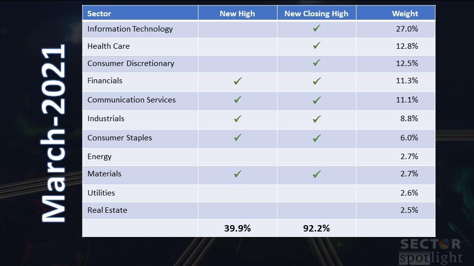
While I was browsing through the charts, preparing the segment for Sector Spotlight, I found myself putting check-boxes next to sectors when they had reached either a new high or a new closing high, or both.
Obviously, these trends greatly impact the trend of the market as a whole, SPY. So, in my head, I started adding up (roughly) the weights for the various sectors that made new highs, etc.
As it was clear quite rapidly that the %% of market cap in an uptrend or showing bullish characteristics is very high, I decided to do a better job. I put them on a table with all the relevant information. (That's the table at the top of the article.)
When you do the math and add up the weight for all sectors with new highs, that adds up to 40%. Which is:

However, when we sum up all sectors that have made a new closing high, it comes out at more than 90%, and THAT is a very significant number.
In other words: In March, eight sectors (90% market cap) reached a new closing high, and five of those sectors (40% market cap) ALSO reached a new all-time high.
Looking at these numbers, it is tough to be bearish on long-term developments.
But... There is always a But ...
In my recent ChartWatchers newsletter article "Tech is a Drag", I printed a Relative Rotation Graph showing the three largest sectors rotating into the lagging quadrant.
Here is the that RRG updated to today.

As you can see, the picture has not changed very much. All three sectors have pushed further into the lagging quadrant, and only XLY started to flatten this week, but we still have three and a half more trading days to go. Therefore, this picture's basic conclusion remains that over 50% of market cap is currently in a relative downtrend vs. SPY.
However, this does not automatically mean a decline in price for SPY.
Here's a little secret. Last week (3/31st), the StockCharts TV team wanted to test some fancy new equipment, and they needed a few presenters to join to do a "mock show." David Keller was hosting, and Grayson Roze and I were guest(ing). The goal was to try out having multiple video feeds (camera shots) on the screen and playing with them while we were talking and chatting about charts. The resulting output was too good to let it sit in the bin, so they threw it online as the "Market Rotation Panel."
Around minute '6, I am answering a question from Dave on "corrections" in markets, and I argue that, for me, corrections do not, by definition, mean a price drop. IMHO, it is very well possible for a market to "correct" in a sideways fashion.
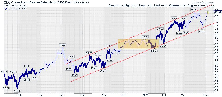
The chart above shows a perfect example of what I mean in XLC, the Communication Services sector. From roughly October-November onward, XLC moved higher within the boundaries of a rising channel. At the start of December, XLC hits the top of the channel, the third higher high since the start of the channel. All in hindsight, of course, as that channel was not clearly present at the time and developed over time with the rise in XLC.
Instead of dropping in price and setting the next "higher low" anywhere above 58.37, as that lower boundary was not very well established yet at that time, XLC moved sideways and set the "higher low" at 64.67 before moving to new higher highs.
The point that I want to make here is that markets can "digest" additional supply in two ways: firstly, by dropping in price until buyers are strong enough to provide enough demand to stop a decline and reverse higher, or secondly, over time. In the latter case, there is enough demand around or slightly below current levels. That demand is strong enough to prevent a drop in price but not (yet) strong enough to wipe out overhead supply and force a break higher.
After six weeks, supply dried up while demand persisted, causing XLC to move higher, in this case without a meaningful correction in price. Needless to say that such a "correction in time" is a positive sign, as it signals strong underlying demand. Breaks from these plateaus are usually good entry points.
What does that mean for the current market?
The long-term trend is up -- the trends on the monthly charts leave no doubt about that. But three large sectors are in the lagging quadrant on the RRG, signaling relative weakness. That means that the remaining sectors need to be extra strong to offset the weakness and pull the market higher. IMHO, that is possible but difficult, so instead of a fierce continuation of the rally, I expect more of a sideways or slightly lower market in the weeks ahead to digest additional supply and shrug off the relative weakness in XLK, XLV and XLY.
#StaySafe, --Julius
Julius de Kempenaer
Senior Technical Analyst, StockCharts.com
Creator, Relative Rotation Graphs
Founder, RRG Research
Host of: Sector Spotlight
Please find my handles for social media channels under the Bio below.
Feedback, comments or questions are welcome at Juliusdk@stockcharts.com. I cannot promise to respond to each and every message, but I will certainly read them and, where reasonably possible, use the feedback and comments or answer questions.
To discuss RRG with me on S.C.A.N., tag me using the handle Julius_RRG.
RRG, Relative Rotation Graphs, JdK RS-Ratio, and JdK RS-Momentum are registered trademarks of RRG Research.