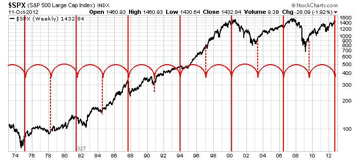
There are 13 lines on this chart. 6 dotted, 7 solid. But that's not spooky.
Keep in mind the scale is 30 years. The spacing is 327 weeks. It is just a best fit cycle. You slide the cycle around till it best fits the majority of inflection points on the chart. Major pivot points demarcated on a chart over 30 years are pretty interesting. What if I said this cycle was about 70-80 % accurate so far.
Now we sit at a red line right now. You'll notice this cycle hit the 1974 low, 1987 top, the 2000 top, and a few other good picks. The recent low in 2009 was missed slightly by the half cycle. The major top in 2007 was 'late' relative to this cycle chart. The top came in about a year late.(let's call it a miss.)
We currently sit right at a red line. OK. So is it marking the start of a major uptrend or is every second line a major, major inflection point meaning the other direction from which it came into the cycle? 1974, 1987, 2000, 2012?
We'll need to be watching as historically it's been a pretty good indicator of major turning points. Is the last three enough data? Some of the other cycle lines marked significant acceleration starts or the end of an uptrend to a sideways trend. I'd say 9 are pretty good, 2 were misses and one was irrelevant in 1996.
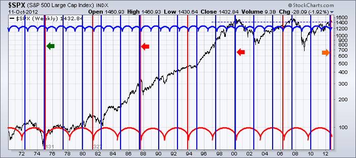
OK, I was going to delay the grand finale till tomorrow, but here it is. Both cycles overlaid. It looks busy and it is. But you can see how the two different time spans hit every now and then marked by the arrows. Check the dates on those.
You will notice that the 1974,1987,and 2000 turns were all coincident with both cycles from yesterdays blue chart and todays red cycle chart. The fact that the 2007 high or the 2009 low was not picked up by the red cycle is a major question as they were obvious major turning points.
The real question is what happens now at this coincident location? Does it mark the start of a wild ride to the moon or to the floor? Or just a trend change from up to horizontal?
The Elliotticians have their Double zigzag corrective counts in place. They expect a large scale correction. The fundamentalists suggest the trend will continue indefinitely. On CNBC the talking heads think we are 1/2 way through the cycle. That would make it the longest cycle ever from a high to a high! I was listening to BNN and a market call participant was scoffing that the market could have a serious retracement here. In these unpredictable times, I would not scoff at a market shooting higher or lower.
I have mentally marked the 2012 top as being in place with the Sept 14th high on the $SPX. I expect a pullback and perhaps in November we'll see if the market has more power. We'll see if it makes a run to retest the highs or if the October 5th push was the final retest of the highs 3 weeks prior. A break between the orignal high and the retest is important. The April 1, 2012 high was tested 1 month later on May 1. Usually a high has to be tested and fail. It feels to me like that happened on Friday Oct 5.
I have a few more cycle charts but you get the point. This is a very important place in time as demonstrated by the 4 cycles above. It is a very important place in price as demonstrated by the overhead resistance in the US market between 1475 and 1575. So what makes a chart spooky? Four cycles terminating at the same point in time when the market is at major resistance. That's what makes a chart spooky to me...oh ya and it's the month of Halloween...just adding spooky seasonality!!
The fundamentalists will list a thousand things going right or going wrong depending on their bias. Technicans have biases too. Our answer is to watch for price confirmation of a trend in either direction. The distribution days along with the price action leads me to believe the top is in. However, I gain some encouragement by India and Australia breaking above resistance. We are in rough seas right here. The world is a mix of bullish and bearish charts on monthly and weekly data. There is no clear global trend and when there is one, the technicians will be the first to know. Our formula on that is to be prepared as the information comes in, rather than blinded by our bias. .
From NYC, at the site of Saturday's Stockcharts.com University
Good Trading.
Greg Schnell, CMT


