Note to the reader: This is the sixth in a series of articles I'm publishing here taken from my book, "Investing with the Trend." Hopefully, you will find this content useful. Market myths are generally perpetuated by repetition, misleading symbolic connections, and the complete ignorance of facts. The world of finance is full of such tendencies, and here, you'll see some examples. Please keep in mind that not all of these examples are totally misleading -- they are sometimes valid -- but have too many holes in them to be worthwhile as investment concepts. And not all are directly related to investing and finance. Enjoy! - Greg
Risk and Uncertainty
Is volatility risk? (Here we go again.)
In the sterile laboratory of modern finance, risk is defined by volatility as measured by standard deviation. However, that assumes the range of outcomes is a normal distribution (bell curve). Rarely do the markets yield to normal.
When an investor opens his or her brokerage statement, it shows the following portfolio data for the last year:
- Standard Deviation = .65
- Loss for the Year =.35 percent
Which one do you think will catch their attention? I seriously doubt any investor is going to call his or her advisor and complain about a standard deviation of .65. However, the .35 percent loss will get their attention. Even investors who have no knowledge of finance or investments know what risk is—it is the loss of capital.
Risk is not volatility; it is drawdown (loss of capital). However, in the short term, volatility is a good proxy for risk, but over the longer term, drawdown is a much better measure of risk. Volatility does contribute to risk, but it also contributes to market gains.
Risk and uncertainty are not the same thing.
Risk can be measured. Uncertainty cannot be measured.
A jar contains five red balls and five blue balls. In the old days we called it an urn instead of a jar. Blindly pick out a ball. What are the odds of picking a red ball? There are five red balls and the total number of balls is 10. Therefore the odds of picking a red ball are 5/10 =.5 or 50 percent.
That is Risk! It can be calculated.
Suppose you were not told the number of red or blue balls in the jar. What are the odds of picking a red ball? That is Uncertainty!
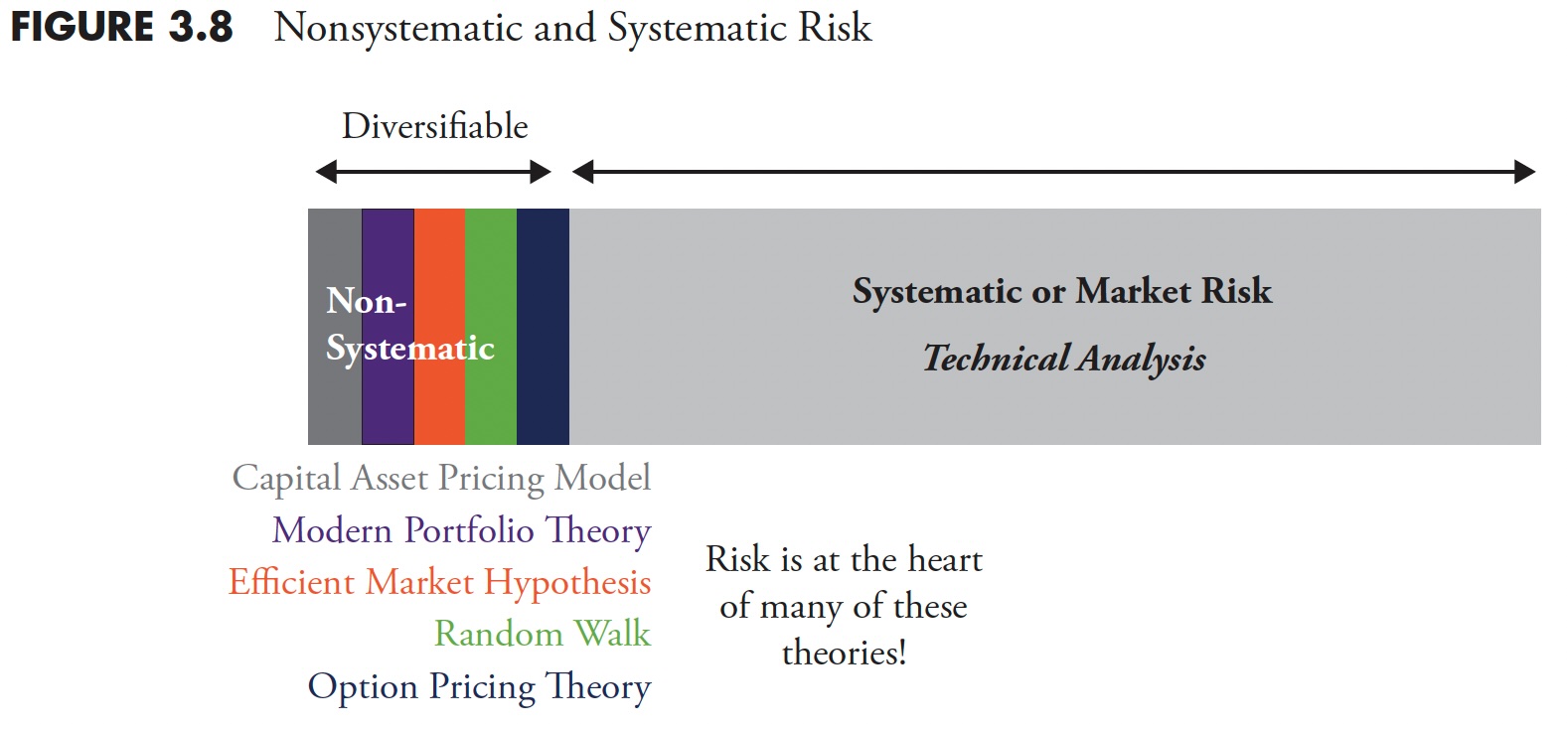 Figure 3.8
Figure 3.8 is an attempt to visualize how modern finance is focused on risk, but have you ever wondered or thought about which element of risk they deal with? Actually they do a great job of analyzing risk; risk is at the heart of all the theories of Modern Portfolio Theory (Capital Asset Pricing Model, Efficient Market Hypothesis, Random Walk, Option Pricing Theory, etc.). The risk that they attempt to deter.mine is known as nonsystematic risk, or you may have heard it as diversifiable risk. Diversification is a free lunch and should never be ignored. The world of fi nance is focused on diversifiable or nonsystematic risk. However, there is a much larger piece of the risk pie, and that is called systematic risk. Once you have adequately diversified, then it seems that you are only dealing with systematic risk. Systematic risk is what technical analysis attempts to deal with. It is also known as drawdown, loss of capital, and in certain situations as a bear market.
Back to the Original Question: Is Volatility Risk?
Two simple price movements are shown in Figure 3.9 ; which represents more risk, example A or example B?
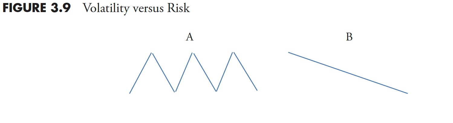 Figure 3.9
Modern finance would have you believe that A is riskier because of its volatility. However, you can notice from this overly simple example that the price ended up exactly where it began; therefore, you did not make money or lose money. B, based on the concept of volatility as risk, has no risk according to theory; however, you lost money in the process. I think it is obvious which is risk and which is only theory.
Is Linear Analysis Good Enough?
Figure 3.10 is known as a Cartesian coordinate system, sometimes referred to as a scatter diagram, used often to compare two issues and derive relationships between them. The returns of one are plotted on the X-axis (abscissa/horizontal) and the returns of the other are plotted using the Y-axis (ordinate/vertical). Those small diamonds are the data points. A concept known as regression is then applied by calculating a least-squares fit of the data points. This is the straight line that you see below. Then, a little high school geometry is used on the equation for a straight line, which is y=mx+b, where m is the slope of the line and b is the where the line crosses the Y axis (a.k.a. the y–intercept). So once you have the linearly fitted line, you can measure the slope and y–intercept, and this will give you the beta (slope) and alpha (y-intercept).
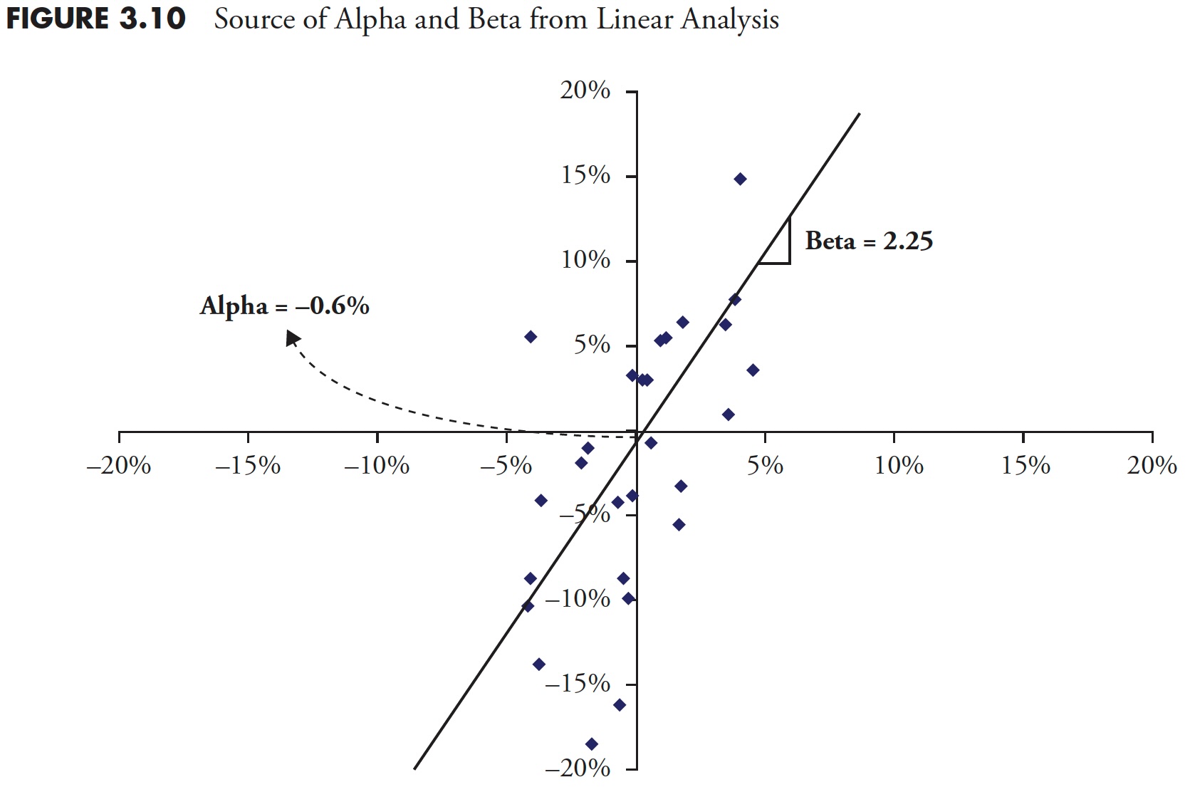 Figure 3.10
The following statistical elements can all be derived from simple linear analysis.
- Raw Beta
- Alpha
- R^2 (Coefficient of Determination)
- R (Correlation)
- Standard Deviation of Error
- Standard Error of Alpha
- Standard Error of Beta
- t-Test
- Significance
- Last T-Value
- Last P-Value
Linear Regression Must Have Correlation
Figure 3.11 is a scatter plot of a fictional fund ABC (Y-axis) plotted against the S&P 500 (X-axis).
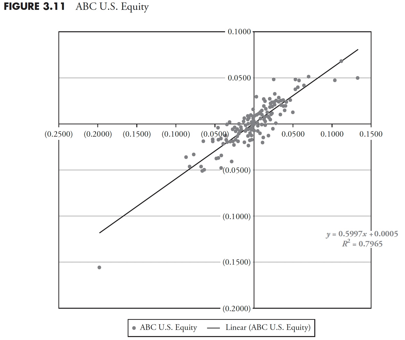 Figure 3.11
The least-squared regression line is plotted and the equation is shown as:
Y = 0.5997x + 0.0005, which means the slope is .5997 and the y-intercept is 0.0005.
A slope of 1.0 would mean that the Beta of the fund was the same compared to the index, and the line on the plot would be a quadrant bisector (if the plot were a square, the line would be moving up and to the right at 45 degrees). So, a slope of 0.5997 means the fund has a lower beta than the index. The y-intercept is a positive number, although barely, but that means the fund outperformed the index.
R^2 is the Coefficient of Determination, also known as the goodness of fit. Now, I understand that dealing with positive numbers has some advantages, but, in most cases, R^2 is also reducing the amount of information. Let me explain. We know that R is correlation, the statistical measure that shows the relationship between two datasets and how closely they are aligned. That is not the textbook answer for correlation, but will suffice for now. Correlation ranges from +1 (totally correlated) to -1 (inversely correlated), with 0 being non-correlated. Nice information to know; is the fund correlated to the market, inversely correlated to the market, or not correlated at all? Squaring correlation will give you an always positive number (remember least squares?), but why remove the information about the level of correlation? R^2 will not tell you if it is correlated or inversely correlated. Actually, I think it is the social science's fear of negative numbers. However, in fairness, R^2 will show the percent dependency of one variable over the other—in theory.
The R^2 in Figure 3.11 is 0.7965, which means there is a fair degree of correlation, we just don't know if it is positive correlation or inverse correlation. To get correlation, merely take the square root of 0.7965 to get R=0.8924684 (yes, an attempt at humor), which means R could also be -0.8924684. Anyway, hopefully you get my point.
Finally, notice how the data points are all clustered fairly closely to the least squares line, which visually shows you that this fund is fairly well-correlated to the index.
Figure 3.12 shows fund XYZ plotted against an index. Notice that the linear least-squared fit equation (y = 0.5997x + 0.0005) is exactly the same as the previous example. However the value of R^2 is 0.2051, which is considerably different than the previous example. Visually, you can see that the data points are more scattered than in the previous example, so, just based on the visual observation, you know this fund is not nearly as correlated as the previous fund ABC. Yet we find that the least squares regression line is oriented exactly the same, so the values of alpha and beta are the same for this fund (XYZ) as they were for fund (ABC) above.
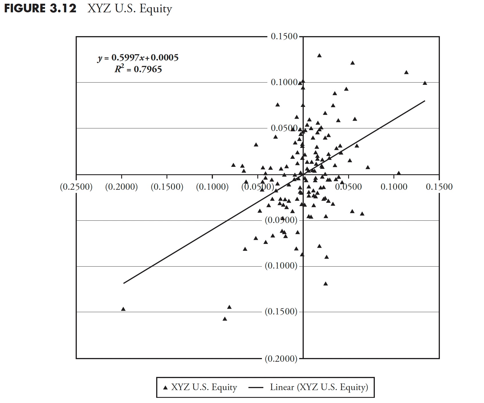 Figure 3.12
So what's the difference, you are hopefully asking? The difference is that one fund is not nearly as correlated as the other. We know that they are both positively correlated from visual examination, but unless the value of R (correlation) is shown, we don't know any more about the correlation. This is one of the horrible shortcomings of this type of analysis. Here is the message: if it isn't correlated, then the values derived for alpha and beta are absolutely meaningless. Yet I see publications ranking funds and showing R^2, alpha, and beta, but never a mention of R. Shame on them!
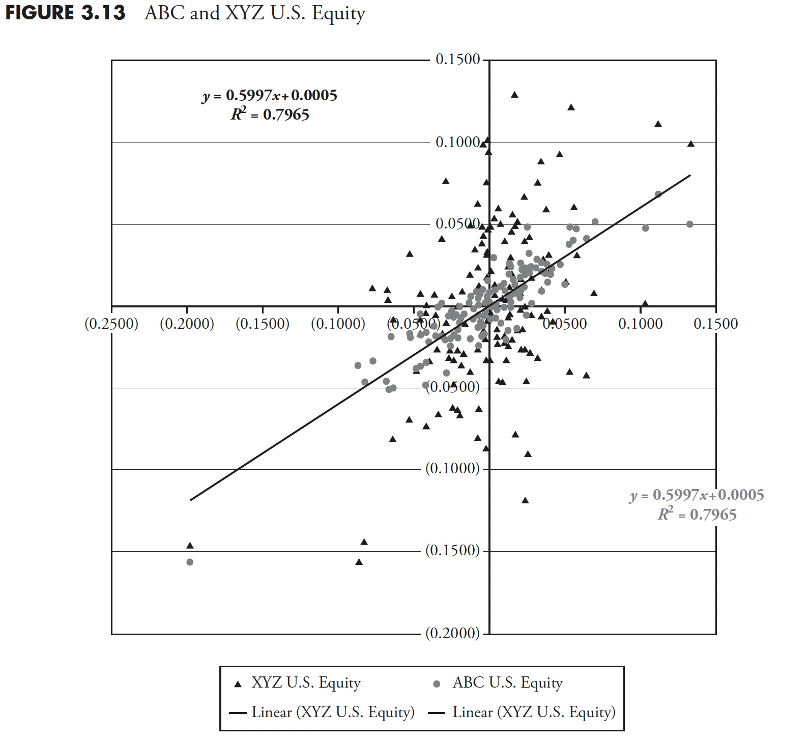 Figure 3.13
The scatterplot in Figure 3.13 shows both funds plotted with the index. You can clearly see that fund XYZ (triangles) is not nearly as correlated as fund ABC (circles). Yet the linear statistics of modern finance does not delineate a difference between the two. My only comment to them is: Stay out of aviation.
The 60/40 Myth Exposed
It is almost impossible to see any performance comparisons that not only show a benchmark, but also a mix of 60% equity and 40% fixed income, known as 60/40 in the fund industry. The efficient frontier is one of those terms that came from a theory developed decades ago on risk management. Modern finance looks at a plot of returns versus risk, and, of course, by risk, it means standard deviation. This is the first mistake made with this concept. Then it plots a variety of different asset classes on the same plot and derives the efficient frontier, which shows you the level of risk you take for the asset classes you want to invest in. Figure 3.14 shows the efficient frontier curve from 1960 to 2010 (an intermediate bond component was used).
Next, if you draw a line that is tangent with the curve and have it cross the vertical return axis at the level for assumed risk free, then the point of tangential is the proper mix of equity and bonds. I did not attempt to do this here, as the determination of the risk free rate to use over a 50-year period presents too much subjectivity. From 1960 to present, that mix of stocks and bonds is about 60/40.
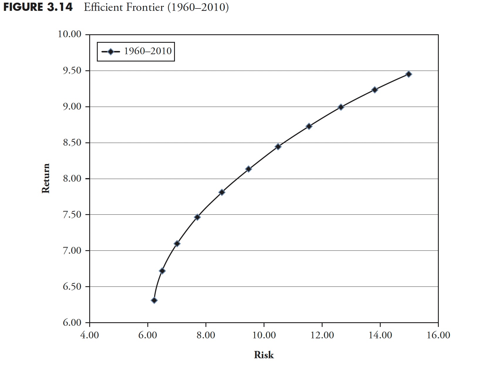 Figure 3.14
The ubiquitous 60/40 ratio of stocks to bonds, which shows up in most performance comparisons, gleans the message that, for over 50 years of data, nothing has changed. Does anyone actually believe that? Figure 3.15 is a chart showing the efficient frontier for each individual decade in the 1960 to 2010 period. Clearly, each decade has its own efficient frontier and its proper mix of equity and bonds. Yet the world of finance still sticks to the often wrong mix of 60/40. It may very well be a good mix of assets, but the data says it is dynamic and should be reviewed on a periodic basis. Notice that the decades of 1970 and 2000 showed similar downward curves, meaning that stocks were not nearly as good as bonds. Conversely the decades of 1980 and 1990 were the opposite.
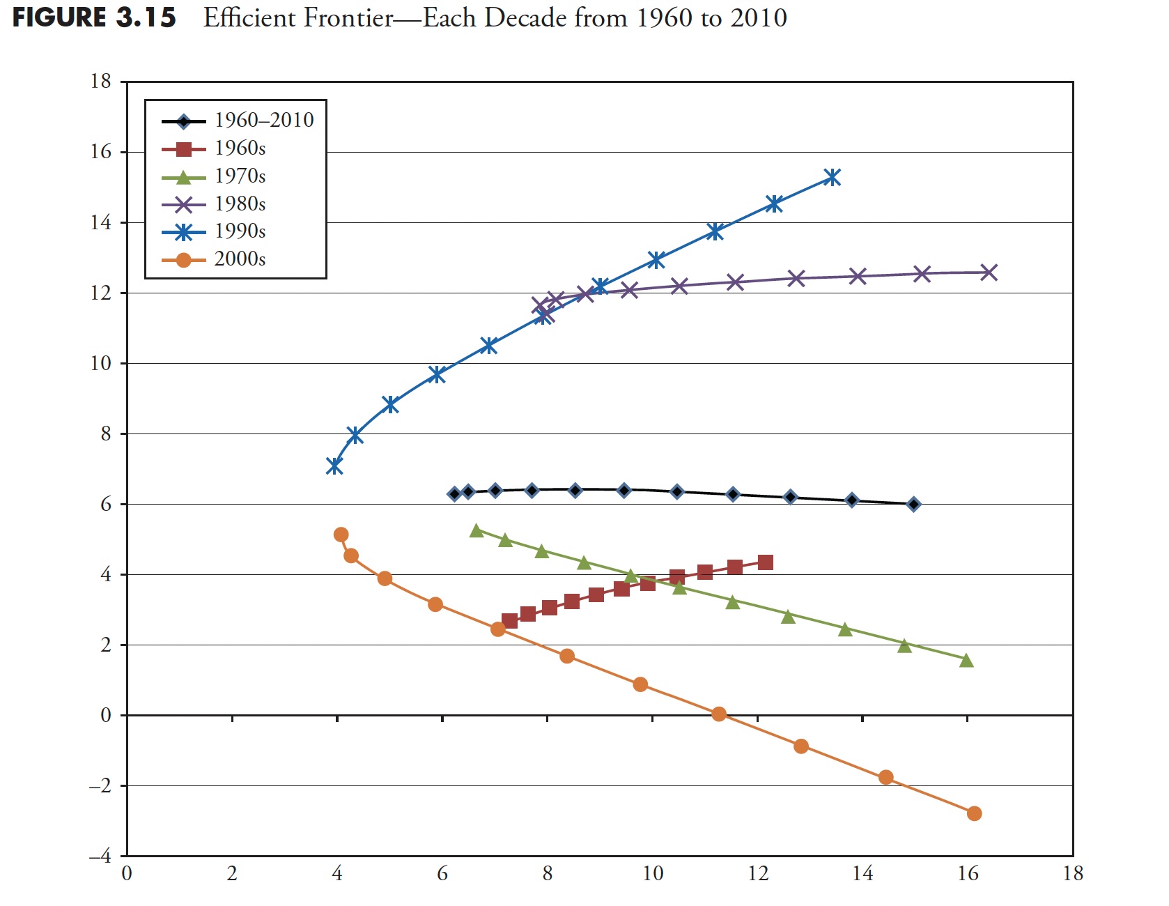 Figure 3.15
In an interview with Jason Zweig on October 15, 2004, Peter Bernstein said that a rigid allocation policy like 60/40 is another way of passing the buck and avoiding decisions. Did you want to be 40 percent invested in bonds during the 1970s when interest rates soared? Did you want to only be invested 60 percent in equities in the period from 1982 to 2000, which was the greatest bull market in history? Of course not! Markets are dynamic, and investment strategies should be too. Finally, some analysis will show that a 60/40 portfolio is highly correlated to an all-equity portfolio.
Discounted Cash Flow Model
When studying modern finance, and after years of hearing about the discounted cash flow (DCF) model, I have this to say about the discounted cash flow model. First of all, you must decide on six values about the future. They are shown below. If you have read this book this far, you probably know what's coming next.
Discount Rate
- Cost of Equity, in valuing equity
- Cost of Capital, in valuing the firm
Cash Flows
- Cash Flows to Equity
- Cash Flows to Firm
Growth (to get future cash flows)
- Growth in Equity Earnings
- Growth in Firm Earnings (Operating Income)
The inputs (above) to the DCF process must all be correct or the model fails completely. The odds of successfully coming up with correct (guesses) inputs are extremely low, yet this is used in modern finance routinely. This reminds me of the Kenneth Arrow story on forecasting in Chapter 5. When asked about the discounted cash flow model, I liken it to the Hubble Telescope; move it an inch and all of a sudden you are looking at a different galaxy.
The goal of this chapter, at the very minimum, is to cause you to challenge what modern finance has provided. I apologize for beating some concepts with a stick, but sometimes multiple approaches to show something are better in the hope that one will remain with the reader. There was enough math to scare the average person; Part 4 focuses on the wide use of the term average. The goal is to show that using long-term averages can be totally inappropriate for most investors.
Thanks for reading this far. I intend to publish one article in this series every week. Can't wait? The book is for sale here.