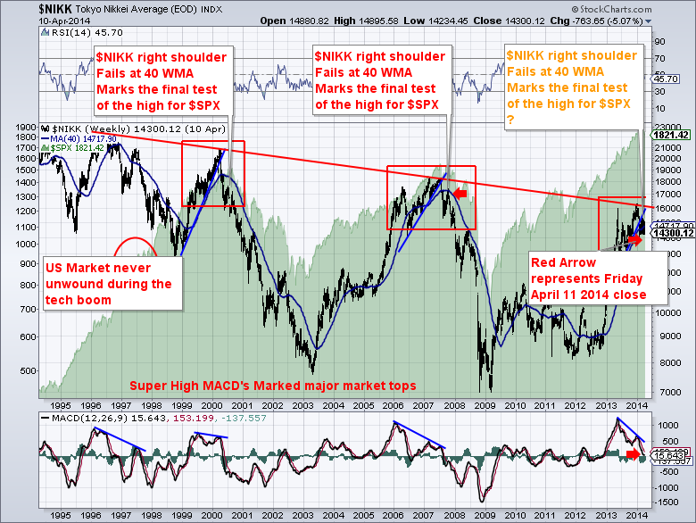
The $NIKK was a leading indicator at the market tops of 2000 and 2007. The $NIKK closed today at new lows after making a big divergent high. How could the $NIKK be a leading indicator? I think the underlying cause is the carry trade with the Japanese Yen. While I think it is a poor indicator of day to day moves, it has been extremely informative in big picture market action.
First of all, the down sloping trendline across the top of the $NIKK chart has not been broken but it was recently tested. On this test, The $NIKK made a higher high while the MACD was making a lower high. If you look across the 2000 and 2007 tops, the NIKKEI made extreme moves in momentum and then rolled over. While the MACD made lower highs in March 2000, the $NIKKEI fell hard in concert with the $COMPQ and $SPX roll over. You will also notice the surge in the $NIKK when the Fed and the other central banks started QE in Q4 2012.It has been a good indicator at major turns.
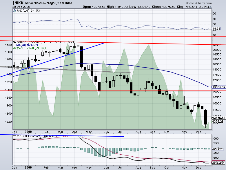
Here is a closeup of the 2000 top from this chart. The horizontal red lines are from the box shown above.
I have written many articles on the $NIKK. Notice how the price action of the $NIKK behaved after being unable to hold the 40 WMA. If you compare the black candles to the shaded green area chart of the $SPX, you will notice the $SPX went on to test the March highs one more time. The $NIKK investors were not so lucky. Readers can search for Kyle Bass to get an indication of all the fundamental issues in Japan. When the weak markets are already breaking down and solid markets start to build topping formations it can be very important.
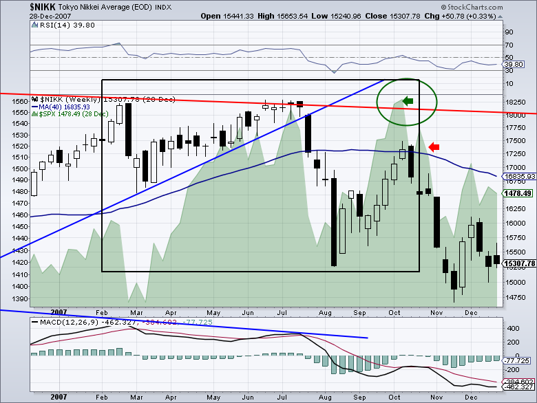
Here is the 2007 top zoomed in. Notice the price action of 2007 within the black box is almost identical to the current action in the $NIKK. The double top in July 2007 a pullback below the 40 WMA, a retest from below and then the chart price action breaks down when it fails to get back above. The green arrow points to the $SPX making a divergent high and topping in October where the $NIKK topped months before. The blue trendline broke very close the the second test of the market top.
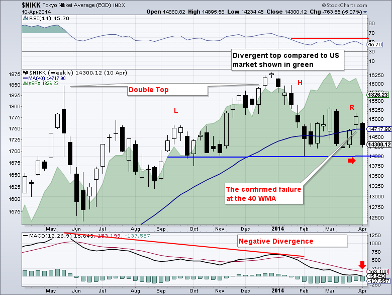
Here is a zoom in of the current $NIKK chart.
The RSI has not been able to bounce back up after going below 50. That is just cautionary. The price action of the Nikkei is particularly compelling to me. The lower highs after making a double top and the price action at the red arrow today will make a confirmed lower low when posted end of day.
Failing to get back above a 40 WMA is extremely bearish. I will say that it makes a good line in the sand to trade off of. Should it get back above, that would be bullish. Until then, the bears have the edge.
To summarize, the market with the carry trade is breaking down. The May 2013 spike high with a test after grinding higher for 7 months is important. The failure at the double top was big. The break of the trend line was confirming. Now the break of the 40 week MA is a final nail. If the global markets have canaries, the $NIKK closing below 14000 would be a big one of mine after testing the 40 WMA from the bottom side. Even the timing of the $SPX top being three months after the $NIKK has topped would be similar to 2007.
Having the US Bond market break out is also confirming. The rotation to defensives like conventional utilities and REITS has been building for a while. The Walmart chart is showing improving strength. Tech leaders letting go as a group and a rotation away from the Nasdaq outperformance and Russell into $SPX and $INDU. All the pieces are fitting like we are at a major market top. It's early days and the Fed may wish to reinvigorate the bulls with new strategies. But tops wear out both the bulls and the bears.
While this all may break down and not play out as it did before, so far the $NIKK is behaving like a market indicator. The similarities of the $NIKK price action at the 2007 top to today are remarkable in my mind.
Caution is advised. I truly believe the US market won't be the cause of the next market storm. But will the US markets be able to navigate around the 'Iceberg Dead Ahead' signal?
Good trading,
Greg Schnell, CMT
We try to keep our articles informative and entertaining. Make sure you check out the other blog writer articles in Mailbag, Chartwatchers, Traders Journal, Decision Point and The Canadian Technician. All of these articles are free to subscribe to. The subscriber button is top right on most articles. One of the little known secrets of StockCharts is our Blog or Articles section. The Blog tab will bring up a view of some of the most recent articles. StockCharts.com Subscribers have two additional daily feature articles.
Lastly, Chartcon 2014 in Seattle is rapidly booking up. Click here for more information.


