RRG Charts June 28, 2017 at 10:52 AM
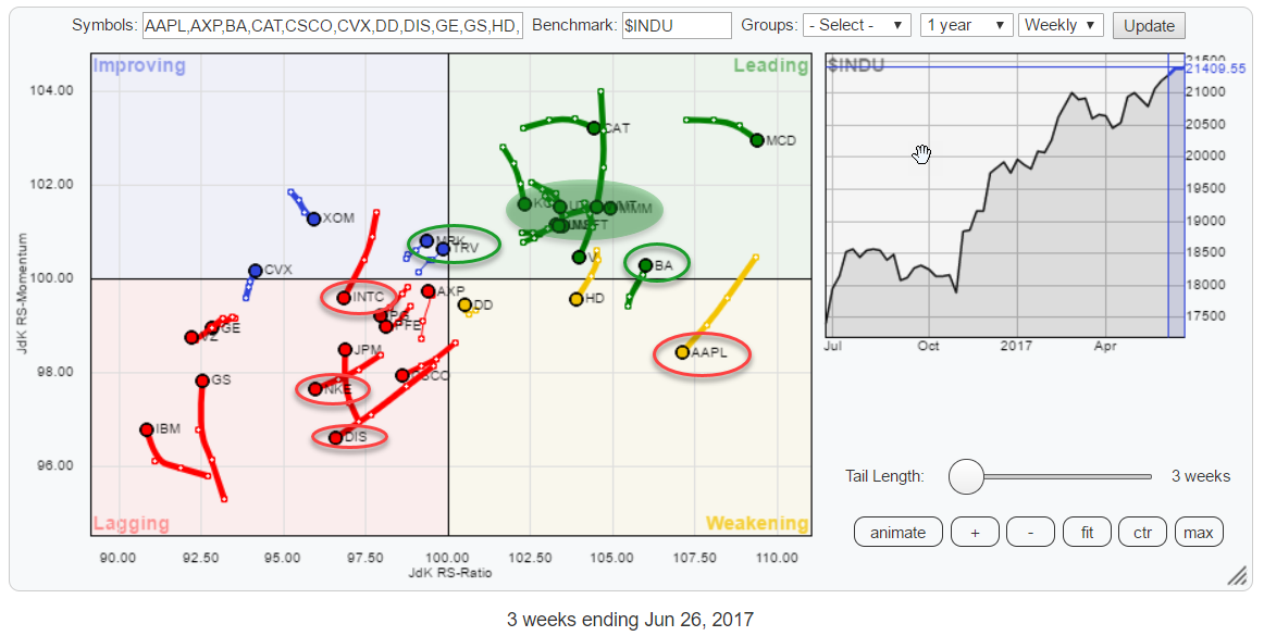
Watching the 30 members of the Dow Jones Industrials index on a Relative Rotation Graph always provides a great insight into what's going on under the hood of that universe... Read More
RRG Charts June 14, 2017 at 09:36 AM
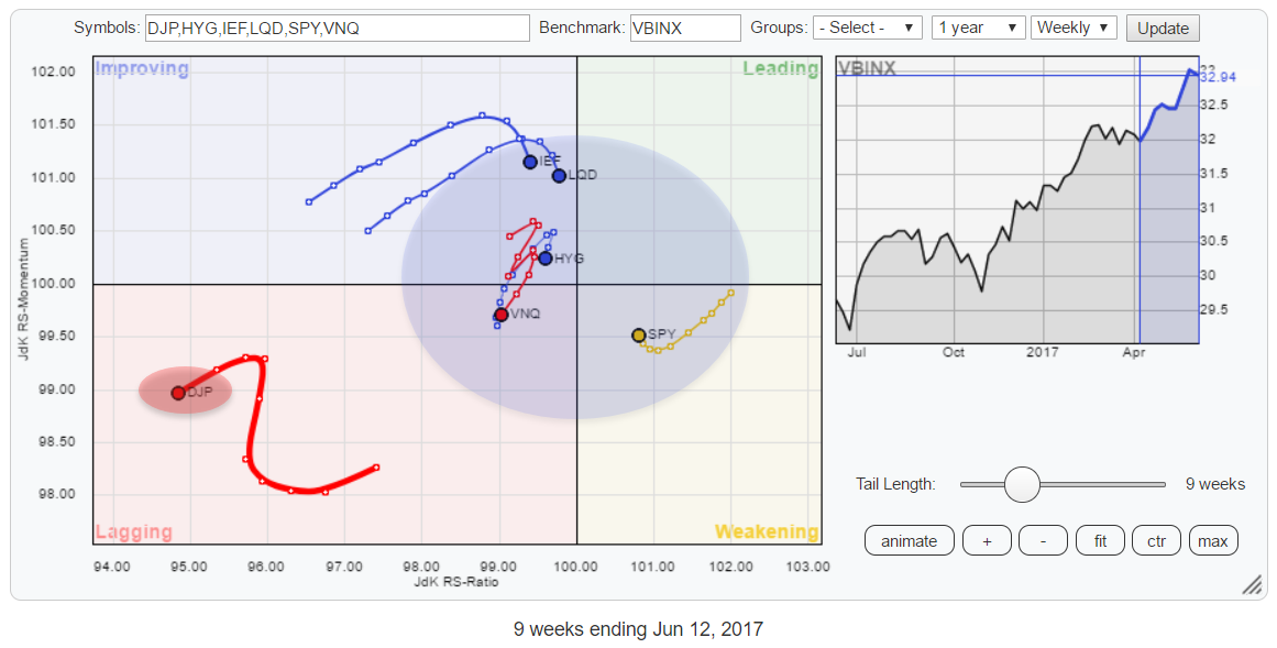
This Relative Rotation Graph for Asset Classes shows Commodities (DJP) far away in the bottom-left corner of the chart, completely detached from the others... Read More
RRG Charts June 02, 2017 at 05:18 PM
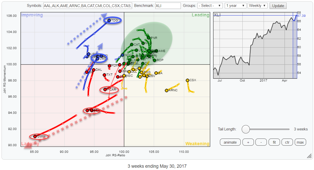
This Relative Rotation Graph holds the top 50 (based on market cap) members of the S&P 500 Industrials sector index (XLI). This sector accounts for just over 10% of the S&P 500 market cap and is the fifth largest sector in this index... Read More