In my article for the ChartWatchers newsletter this weekend, I wrote about the rotation of various stock markets against the DJ Global Index. On that Relative Rotation Graph, Europe had moved into the leading quadrant, but has since almost immediately started to lose relative momentum. The US market (SPY) had already rotated out of the leading quadrant into weakening and is now heading for the lagging quadrant.
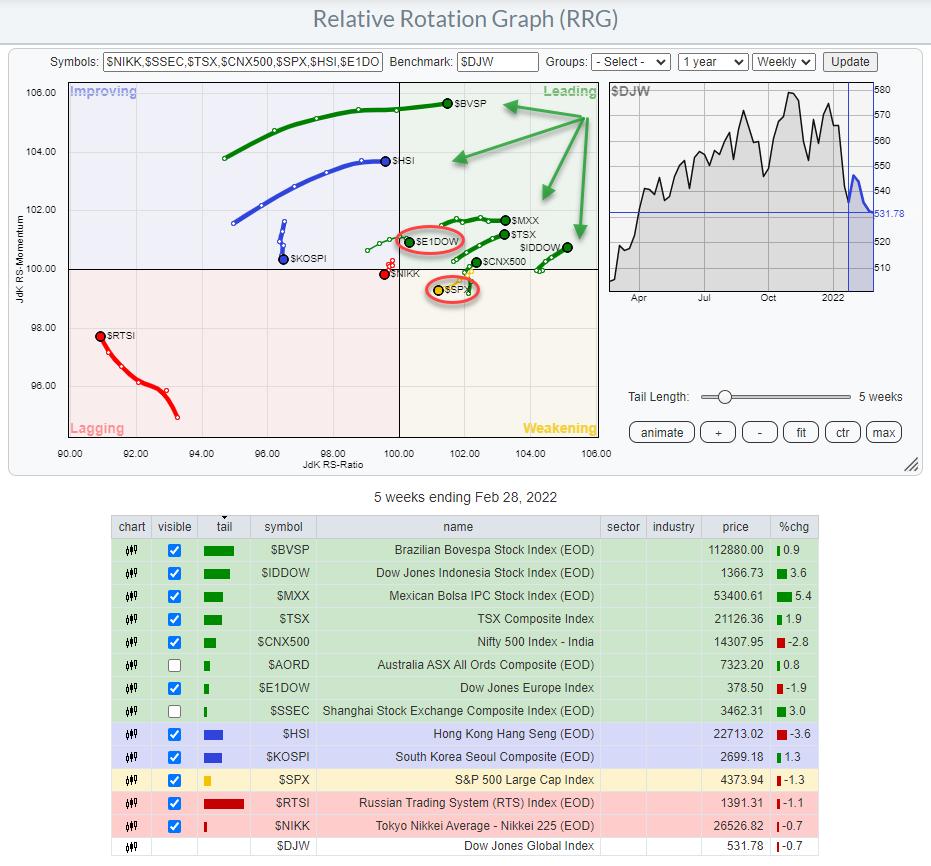
On the graph, I have unchecked the tails for $AORD and $SSEC, as they are very close to the benchmark and interfering with a few other tails. What is a clear takeaway from this picture is that major markets, like the US and Europe but also Japan, are currently at a negative RRG-Heading.
That means that the performance and the possibility to "outperform the world" needs to come from elsewhere. In last week's episode of Sector Spotlight, we discussed this International rotation and concluded that (US) investors need to look abroad for opportunities. Indonesia popped up as a possibility, but, from the RRG above, you can see that more markets (green arrows) are in a better (relative) shape than Europe or the US.
With the current events in Europe, it makes sense to have a closer look at the European markets and how they are behaving at the moment.
Dow Jones Europe Index

If we start with the price chart for the DJ Europe index, we can clearly see a topping formation that started back in the summer of 2021, when the price started to run into resistance just below 420. Over time, a range developed between roughly 390-420. Last week, $E1DOW dropped below the lower boundary of that range, essentially confirming that a top is in place now. So, from a price perspective, things have worsened for Europe, as they already did for the US a few weeks ago.
The RS-chart and the RRG-Lines below are plotted against SPY to get a 1-1 comparison between Europe and the US. At the start of 2022, things started to improve for Europe; RS-Momentum was able to push above 100 and pull RS-Ratio upward. But, with the RS-Line hitting its multi-year falling resistance line, in combination with the deterioration on the price chart, it is now becoming questionable whether this improvement can continue.
As long as the falling resistance in relative strength against SPY remains intact, the US remains the better choice of these two. However, both are very vulnerable from a price perspective at the moment. So, if you are looking for absolute performance, neither of these markets looks like a good idea at this moment in time.
Inside Europe

In order to get a more detailed view of the behavior of European markets, we can plot the indexes for the major European stock markets on a relative rotation graph and use $E1DOW as the benchmark to see which markets are providing better shelter than others. The RRG above shows these rotations and it's immediately clear that two markets seem to be on a much stronger rotational path than the others. These are the Spanish $IBEX and the Portuguese $PSI.
Both are inside the leading quadrant and traveling at a positive RRG-Heading. An interesting side note is that these are the two markets that have been massively underperforming the rest of Europe for many years.
*I have linked the RRG for European countries to a live graph that you can save as a bookmark to pull it up again.
Europe at Sector Level

This RRG shows the rotation for European sectors against $E1DOW. A pretty clear split is visible. Inside the leading quadrant, we find:
- Oil & Gas
- Basic Materials
- Telecommunications
- Financials
- Utilities
Out of these sectors, financials have just started to roll over, while Utilities seem to be picking up relative strength again after a short dip in momentum.
All in all, these are the sectors to watch, as they are in relative uptrends that are still improving, with the exception of financials for the time being.

The Consumer Goods sector has just dropped from leading into the weakening quadrant and, at the same time, this sector is completing a large double-top formation on the price chart, which opens up a lot of downside risk while, after the break, there is only very limited upside potential. All other sectors are inside the lagging quadrant and pushing further into it.
Technology is clearly the weakest sector, with no signs of improvement anytime soon. Consumer Services tried to rotate back into improving, but is now rapidly reversing and back inside lagging.
Finally, the Healthcare sector has started to curl up a little bit, which signals an improvement in its relative strength. Or, better phrased, it is getting less negative.

But, just like many of the other sectors, a heavy top-formation was recently completed, which is blocking the way up. So, in terms of return, the improvement is primarily relative in nature. The price-performance is likely to remain very weak.
Summary
- All in all, the outlook for stock markets around the world remains weak; the US, as well as Europe, are weakening vs. the world.
- Opportunities are to be found in markets like Indonesia and Canada.
- Inside Europe, Spain and Portugal are standing out positively.
- At the sector level, the best outlook is for Oil & Gas, Telecommunications and Basic Materials.
#StaySafe, --Julius
Julius de Kempenaer
Senior Technical Analyst, StockCharts.com
Creator, Relative Rotation Graphs
Founder, RRG Research
Host of: Sector Spotlight
Please find my handles for social media channels under the Bio below.
Feedback, comments or questions are welcome at Juliusdk@stockcharts.com. I cannot promise to respond to each and every message, but I will certainly read them and, where reasonably possible, use the feedback and comments or answer questions.
To discuss RRG with me on S.C.A.N., tag me using the handle Julius_RRG.
RRG, Relative Rotation Graphs, JdK RS-Ratio, and JdK RS-Momentum are registered trademarks of RRG Research.