I like to find interesting comparisons between seemingly unrelated data, as they offer insights that some people might not have thought of. Someone asked me recently how I come up with such comparisons. My answer is that sometimes it stems from asking the data what relationship there might be, while other times I see a chart pattern that is familiar (because I stare at charts all day) and seek to put the two together. That latter method is the case for this week's chart.
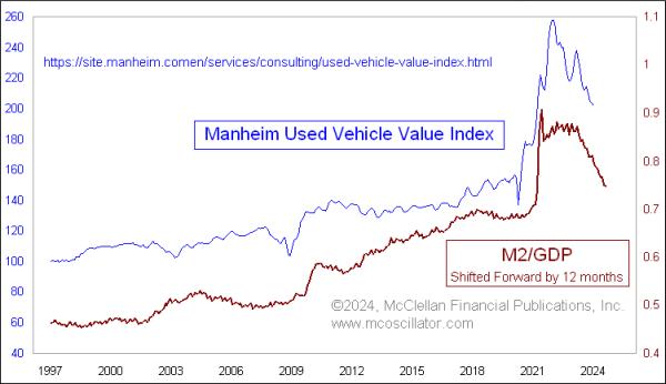
It has been widely reported in the news that used car prices have been falling from their big COVID-related spike. That's good for consumers, and good for the input from those data-into-inflation measures like CPI. What struck me in seeing the chart was how similar it looked to the plot of the ratio of M2 to GDP, something I have addressed here in past articles. Sure enough, that correlation is a genuine one, especially when I shift the plot of M2/GDP forward by 12 months. That is the same lag time I use when comparing M2/GDP to stock price behavior.
With this understanding of that relationship, it is not a surprise, then, to see that used car prices are falling. They are just doing what they are supposed to do in following this measure of money supply growth or shrinkage. And it helps us to see that the big spike in used car prices during 2020-21 was really just a reflection of how much excess money was sloshing around, looking for something to do, so people used that excess money to buy used cars, and renovate their homes. The relationship implies that we should expect used car prices to continue falling for at least another 12 months, or maybe longer if the M2/GDP ratio keeps on falling.
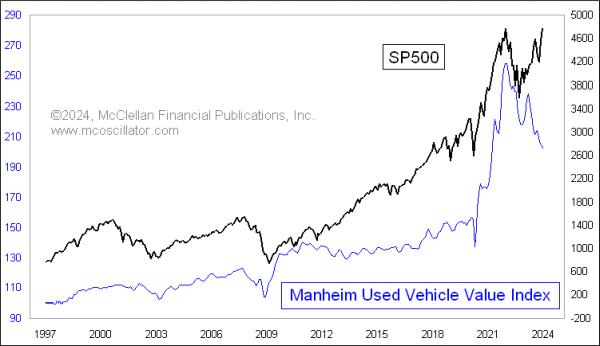
Because M2/GDP also serves as a leading indication for stock price movements, I thought it would be natural to compare the Manheim Used Vehicle Value Index to the S&P 500:

Not surprisingly, there is a very strong positive correlation, or at least that was the case until just recently. A positive correlation makes sense. When the stock market is doing well, people become more confident, and are willing to part with their money more readily to make other investments, like buying a car. When stocks are in a bear market, people pull in and hoard their money, not spending on anything that is not absolutely necessary. Stock prices drive moods, which then drive actions.
It makes less sense, though, to see the big divergence happening since early 2023, with the S&P 500 pushing up to new all-time highs (barely), but used car prices are falling. This type of divergence happened one other time, back in 2012-13, and it resolved by having the small decline in used car prices give way to a small upturn, to better track with the rise in the S&P 500. That instance is a sample size of 1, and the Manheim data only go back to 1997, so it may be dangerous to draw too many conclusions from that instance for what is happening right now.
So which price plot is right now, used cars or stocks? That is going to be a fascinating question. The Manheim Index is arguably returning back to its prior trend, getting back to "fair value", which is a term that people try to apply to stocks that does not always work out well. Stock prices, on the other hand, are rising despite the message from a shrinking money supply, and from the Federal Reserve still doing "quantitative tightening", plus applying restrictive interest rate policy with the Fed Funds Target Rate a full point higher than the 2-year T-Note yield.
I doubt that this divergence can persist forever, given the strength of the positive correlation before 2023. So that means that 2024 is probably a good time to buy a used car, or sell stocks, or perhaps both.
